Designing for accessibility with Jaspersoft
Good product managers and developers understand the importance of accessibility when it comes to reporting and dashboards. Inclusive design is vital for usability and user engagement. It is also essential from a regulatory standpoint.
Today, many consumer-facing businesses must ensure compliance with several accessibility laws, such as the Americans with Disabilities Act (ADA) and the European Accessibility Act (EAA). Additionally, recent surveys indicate that 85 percent of B2B organizations now consider digital accessibility a competitive edge. As such, accessibility in reporting isn’t just a nice-to-have feature — it’s functional, legal, and in demand.
This guide will explore what accessibility means and how businesses can work to meet the various requirements for accessible reporting and use Jaspersoft to design for accessibility. Let’s dive in.
What is accessibility in reporting?
Accessibility refers to creating reports that everyone — including people with disabilities — can easily read, navigate, and understand. These users may include individuals with visual, auditory, motor, neurological, and cognitive impairments. In practice, accessibility usually involves including features in reports that remove barriers for these users.
Accessibility’s main goal is to ensure that every user has an equal experience when using reports. This is vital for preventing the exclusion of certain users from accessing important information.
At Jaspersoft, we understand this all too well. That’s why we view accessibility as a shared responsibility — we provide the technology, and you use it to produce reports that are accessible.
POUR as a framework for accessibility in reporting
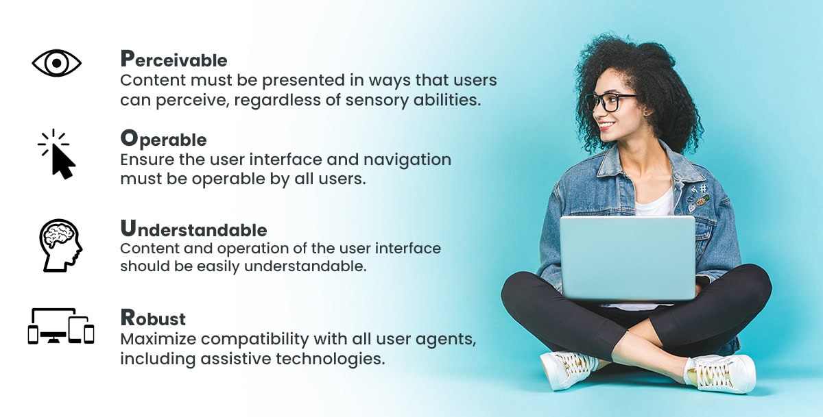
To better understand and adopt accessibility in reporting, businesses can leverage the POUR principles of the Web Content Accessibility Guidelines (WCAG):
Perceivable
This principle requires a reporting tool to present reports in a way that information and user interface functions are usable to all the senses of the user. Product managers can ensure that reports meet the perceivable guideline by including any or all of the following:
Text alternatives: Also known or referred to as “alt text,” text alternatives provide information for any non-text content in reports, such as images, graphs, and charts. This makes it possible for screen readers to describe the content or turn it into other forms, like braille or speech, depending on the disability of the user.
Color contrast: WCAG standards have two main color contrast ratios that organizations need to know — a 4.5:1 contrast ratio for standard text and a 3:1 contrast ratio for large text. This helps to ensure that users don’t struggle to read the report because of the colors.
Captions and transcripts: If the report contains any video or audio content, transcripts and captions can help hearing-impaired individuals or non-native speakers to fully understand the content.
Resizable text: Reports should also allow users to zoom in and out, so they can adjust the size of text.
Operable
For reports to be deemed accessible, the interface shouldn’t require an interaction that a differently-abled user can’t perform. To ensure the reporting application meets this guideline, it should have:
Keyboard navigation: Some users cannot use a mouse due to mobility issues. Therefore, reporting tools should allow users to navigate every interactive element on a report (like buttons, forms, and links) with only a keyboard.
Clear focus indicators: It’s not enough for reports to just allow keyboard navigation — users should be able to tell which element they’ve selected. You can achieve this by using indicators like bold red outlines.
Non-flashing content: Users with seizure conditions are extremely reactive to flashing lights and rapid animations. On top of harming these individuals, reports with these elements become useless to them. You can prevent this by, for instance, ensuring that the content doesn’t flash more than three times per second or providing warnings before displaying the content if unavoidable.
Sufficient time: Dynamic reports or forms with time limits should provide users with enough time to interact with the content. This is vital for users with cognitive disabilities because they usually need more time to understand information. Reports can achieve this by removing automatic timeouts in content or using clear and simple language.
Understandable
Reports should allow users to fully comprehend the information or content they possess. This means that the content and its user interfaces should be easy and simple to use. Examples of features that can make reports understandable include:
Clear, concise, and simple language: Not every user will have the same cognitive understanding. Therefore, reports should use plain language that avoids using heavy jargon. And if technical terms are unavoidable, reports should include glossaries.
Logical structure: A well-structured report is easy to read and understand. As such, reports should use proper heading hierarchies — H1 > H2 > H3, and so forth.
Predictability: This feature makes your reports easy to understand because it helps users better anticipate how certain elements will behave. One way to implement this in reports is by ensuring a consistent design and layout across all pages. Buttons and links in your reports should also behave in a predictable and consistent way.
Robust
Robust content means that several user agents, usually assistive technologies, can easily access and interpret it. One of the ways reports can achieve this is by ensuring compatibility with technologies, like magnifiers, screen readers, braille displays, and voice control software. Reports should also use clean and well-structured code, with complete tags, so that assistive tools can easily parse the content without crashing.
Why is accessibility hard to achieve?
Following accessibility standards shouldn’t be too hard, right? Wrong. While they might seem self-explanatory and easy to implement, these standards are always evolving. Additionally, they have various depths, meaning they’re not one-size-fits-all. For instance, WCAG contains varying levels of conformance (A, AA, and AAA), and each has its own strictness and complexity. Other reasons include:
Diverse report formats and tools
The variety in report delivery options and formats is one of the biggest reasons why accessibility falls short. For one, PDFs, while being the most commonly used format for reports, may not allow for full accessibility. This is because a truly accessible PDF report may involve additional steps beyond “print to PDF,” such as creating alt text. Many reporting tools may not inherently do this, so this gets added to the designer’s job. On the other hand, while web-based reports may have inherent accessibility features, they still require intensive and careful workarounds.
Complexity of data visualization
Reporting tools rely heavily on visual data representation, such as interactive dashboards, graphs, charts, and tables. These may pose challenges for accessibility in varying degrees:
Screen reader limitations: Screen readers may have problems interpreting visual content due to complexity and spatiality. This is especially true if the designer hasn’t provided meaningful alternative descriptions.
Beyond alt text: Alternative descriptions (alt texts) may not be sufficient for screen readers to interpret the data. Designers must provide detailed text summaries or descriptions of patterns so the message is available in an accessible format.
Interactive elements: If a report has interactive elements, like interactive charts and filters in a report, designers must ensure that users can access them, for instance, by making the components fully operable using a keyboard. This can be technically demanding for designers.
Color reliance: Relying on different colors to differentiate data points in charts or graphs can limit the reliability of reports for colorblind users.
Dynamic and interactive content
Dynamic content adds another layer to accessibility complexity. For instance, if a report has real-time updates, assistive technologies may have problems accurately tracking and announcing any changes that may take place. In some cases, updates may confuse these technologies, which can lead to misinterpretation of data or disorientation of the user.
Lack of awareness and training
Despite WCAG and other global accessibility standards being widely accepted, most designers lack the knowledge to effectively implement them. This may lead to unintentionally excluding differently-abled users.
Sometimes, even with training and enough awareness, some designers don’t actually prioritize accessibility. It’s often treated as an afterthought, usually at the end of the development cycle. What many don’t realize is that doing this (retrofitting) is usually more costly and cumbersome. Just imagine trying to add new toppings to a pizza after it is already out of the oven.
Organizational and budgetary constraints
Designing for accessibility has a cost, and it can be a resource-intensive undertaking. Think about training staff, from developers to designers, product managers, and the QA team. This requires a lot of time and capital, which for many organizations may not make sense.
Studies show that the average cost of training employees is $774 per staff member. So, if you have a large team that needs training, this can quickly get out of hand.
Additionally, if an organization relies on legacy reporting systems, adapting to accessibility standards may not come easily. As a result, these organizations may end up delaying or completely ignoring accessibility. This can then lead to costly consequences, like non-compliance, fines and penalties, legal issues, and lost business opportunities.
Why use Jaspersoft to design for accessibility
Report accessibility is imperative. It requires designers and product managers to understand the diverse needs and abilities of users, adopt inclusive design practices for development, and have the right tools in place to make it happen.
A reporting and embedded analytics tool like Jaspersoft allows you to design accessible reports that meet user needs while following accessibility standards. JasperReports Server implements level A and AA of WCAG 2.1. This means that the end users with mobility issues can easily navigate reports created via Jaspersoft with keyboard navigation.
Additionally, assistive technologies, including voice recognition and screen readers, make accessing reports easier. With Jaspersoft, you get to build a better, more inclusive experience for your users.
Try Jaspersoft for free for 30 days
Efficiently design, embed, and distribute reports and dashboards at scale with Jaspersoft.
Related Resources
Join our live Jaspersoft demo with Q&A
Hosted by our Solutions Engineers.
See key features in action.
Get answers to the questions important to you.
Accessibility in Jaspersoft
WCAG 2.1 level A and level AA standards have been implemented in JasperReports Server. Assistive technology such as, screen reader and voice recognition systems, can be used to access the application.
Designing accessible reports with JasperReports Library
A collection of samples demonstrating how to design reports that produce accessible content. JasperReports Library accessibility support currently covers HTML and PDF export formats and allows screen readers to correctly identify and read through specific types of structured content.