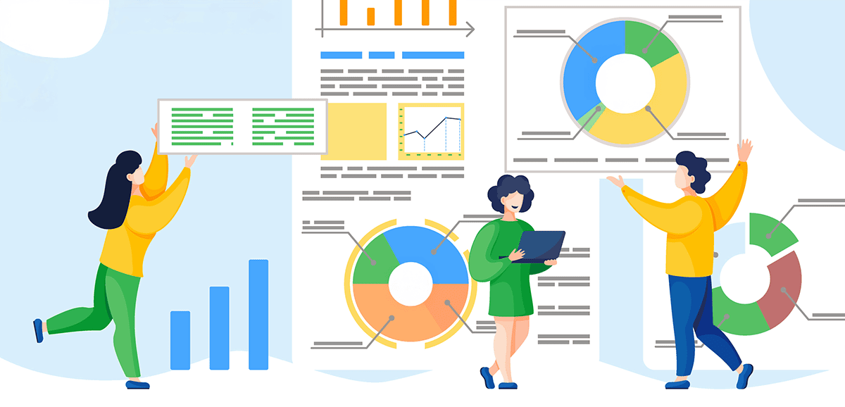
Experience the full potential of embedded analytics with better dashboard UI designs
Dashboards can be a quick way to show numbers. However, when dashboards live inside a product, especially one that’s used by teams every day to guide their decision-making, they need to do more than display charts and graphs. They need to feel native to the end user, behave consistently as expected within the application, and guide the end user toward insight without slowing down operations.
That’s why dashboard UI design in embedded analytics is essential. It lets organizations create dashboards that match their application’s feel and design their data with intent. This guide will dive deep into dashboard page UI design, how it works in embedded environments, and how teams can get more value from data to drive decisions.
Why dashboard UI design matters in embedded analytics
The main purpose of embedded analytics is to make insights readily available to end users inside an application. There are several reasons product managers care about dashboard UI design, which include:
Transforming complex data into actionable insights
Dashboards inside an application don’t exist for decoration. They’re supposed to give teams the confidence to act on information quickly. When the design is clean and focused, it highlights what matters most, whether that’s key performance indicators (KPIs) for project management or sales targets.
But embedded dashboards have an extra layer of responsibility. They need to balance visualization elements with technical accuracy, especially when used for regulated reporting, financial statements, or customer-facing data. If the design creates noise or distracts from what’s important, the insight gets lost, and decision-making slows down.
Balancing functionality and simplicity for every user
Different user personas need different levels of detail. Developers might look at system performance. Product managers might track adoption. Executives want a snapshot. When the dashboard design is flexible enough to support these roles without overwhelming them, it becomes an asset rather than an obstacle.
This is why personalization and role-based access matter. A good dashboard shouldn’t make someone think “What am I supposed to do with this?” It should feel tailored to what they need today.
Key principles of effective dashboard UI design
The best dashboard UI design examples will usually feature the following components:
Consistency and visual hierarchy
End users rely on patterns. When spacing, typography, and chart styles are consistent, the brain spends less energy interpreting layout and more energy understanding data. A clear hierarchy helps the most important insights rise to the top, both figuratively and literally, with visualizations. Small design decisions compound into big wins for usability and engagement.
Customization and user control
The best dashboard UI designs support multiple layers of interaction, such as filters, drill-downs, and the ability to export pixel-perfect outputs for distribution. Rather than treating these input controls as an afterthought, product managers insist they are integral parts of the user's workflow to enhance the user's experience. For instance, if a user changes a parameter, the visualization automatically refreshes itself and updates related components to provide a new view without forcing the entire dashboard to reload.
Developers also need the ability to configure how these controls behave. With the right design tool, they can set default states or lock certain inputs for compliance and accuracy.
Accessibility and responsive layouts
Accessible dashboards aren’t just important for regulatory compliance. They help expand the reliability of the insights teams depend on. That means designing for a wide range of users, such as those who require assistive technologies, and guaranteeing a seamless, focused experience across every device, whether that’s a desktop, embedded view, or lightweight mobile experience. For instance, if a dashboard struggles on a small screen or relies too heavily on color alone, it loses part of its audience.
Embedding dashboards seamlessly with Jaspersoft
Jaspersoft gives teams and organizations the ability to design dashboard UIs within embedded analytics. Teams can start with simple components or go all the way to a fully branded, native analytics experience, depending on their use case and how deep they want to embed intelligence for their business.
With Jaspersoft, this is possible with features, such as:
White-labeling
Branding is part of the user experience. When dashboards match the host application’s typography, colors, spacing, and layout, the analytics feel like they belong there. For teams delivering a client-facing product, this matters a lot. Jaspersoft’s white-label reporting capability makes this easy. Its UI kits let developers completely customize the interface so the analytics experience is indistinguishable from the rest of their software.
API-first design
For a development team, the ease of integration is a huge factor in the "buy vs. build" decision. A platform built with an API-first mentality provides the building blocks for a truly customized fit. Jaspersoft’s flexible APIs give developers the control to manage and style reports, dashboards, and data visualizations programmatically, ensuring the analytics integrate smoothly into complex, existing architectures and unique business logic.
Interactive dashboards
A beautiful, seamlessly embedded dashboard is a great start, but static reports have limited power. The real engagement comes from an interactive dashboard design featuring components like:
Drill-downs, filters, and real-time updates: Unlike static dashboards, interactive dashboard software features let users move from a high-level view to the exact details they need with a single click. Drill-downs, dynamic filters, and up-to-date data all help reduce the guesswork.
Contextual insights for faster decision-making: A good dashboard doesn’t simply show a number. It helps the user understand why that number matters. Contextual insights, comparative ranges, or quick summaries create more confidence. They also reduce the need for additional reports or deep analysis tools.
Flexible deployment
Analytics must conform to an organization’s infrastructure — not the other way around. With Jaspersoft, teams have the freedom to deploy on-premises, on the cloud, or via a managed service. This flexibility also helps prevent vendor lock-in and unnecessary rework, and supports future growth. It also helps to ensure organizations are compliant with operational, security, and data governance requirements.
Building smarter organizations through better design
When dashboard and report designs (1:01:30) are intuitive and actionable, more people use them. When more people use them, organizations become more data-driven. Users want clarity, speed, and a sense of control that the tool is helping them do their job. A thoughtful design with better embedded analytics supports that strategy.
Jaspersoft has spent over twenty years helping companies build embedded analytics solutions with pixel-perfect outputs when reports truly matter. We understand that your data, your brand, and your user experience are inseparable. Our focus is on providing a powerful, flexible, and precise embeddable reporting and analytics engine that lets you deliver pixel-perfect reports and intuitive, self-service dashboards on your terms.
Ready to see how a purpose-built embedded analytics platform can transform your application’s data experience?
Try Jaspersoft free for 30 days.
Try Jaspersoft for free for 30 days
Efficiently design, embed, and distribute reports and dashboards at scale with Jaspersoft.
Related Resources
Join our live Jaspersoft demo with Q&A
See key features in action.
Get answers to the questions important to you.
Hosted by our Solutions Engineers.
Unlocking the Power of Jaspersoft Dashboards
For a comprehensive understanding of Jaspersoft's rich feature set and functionalities to maximize your dashboard's potential, this webinar dives into the intricacies of data visualization, customization options, near real-time analytics, and much more to help you make data-driven decisions, streamline your workflow, and enhance your project's performance.
Deep Dive into Dashboards and Report Design Using Jaspersoft
See how easy it is to create stunning reports and dashboards no matter your technical skill level. Jaspersoft empowers you to build pixel-perfect reports and dashboards, with the flexibility to handle any volume, format, or security requirement.