



What is a Candlestick Chart?
A candlestick chart is a graphical representation used in financial analysis to display the price movement of an asset. This may include a stock, currency, or commodity, over a specified period of time. It consists of individual "candlesticks," each representing a specific time frame (e.g., a day, hour, or minute).
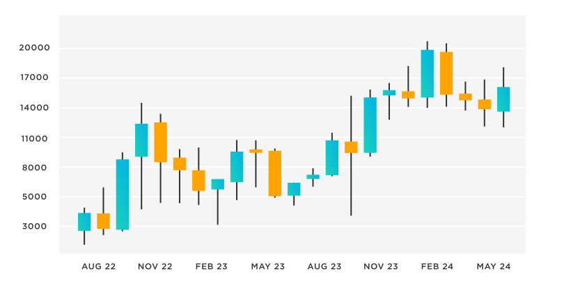
These sticks display the asset's opening, closing, high, and low prices during said timeframe. The main body of the candlestick, known as the "real body," illustrates the price range between the opening and closing prices.
The "wick" or "shadow" above the real body indicates the highest price reached, while the wick below it represents the lowest price during the same time frame. Candlestick charts are widely used by traders and analysts to identify patterns, trends, and potential reversals in market prices, aiding in informed decision-making.
Candlestick charts are like a window into the world of financial markets. They provide traders, analysts, and investors with a straightforward view of how prices move. By using these charts, people can gather important information and make smarter decisions.
{{cta-1}}
Understanding Candlestick Charts
As discussed, a candlestick chart is a graphical representation widely used in financial analysis to visualize the price movements. Its primary purpose is to present the fluctuations in asset prices over specific time periods in a visual and easily interpretable manner.
This way, candlestick charts enable analysts and traders to quickly grasp the trends and patterns in price movements.
Origins & Historical Significance
The origins of candlestick charts date back to 18th century Japan, where they were developed to analyze the price patterns of rice in the commodity markets. The technique was refined over time and became an integral part of technical analysis. It became a method for forecasting future price movements based on historical data.
Candlestick charts were initially used by Japanese rice traders, who recognized their ability to convey valuable insights into market sentiment and price dynamics. This historical significance highlights the enduring effectiveness of candlestick charts in capturing essential information about price trends.
Comprehensive View of Price Movements
Candlestick charts excel in providing a comprehensive representation of price movements within a chosen timeframe. Each unit of time, whether a minute, an hour, a day, or more, is depicted as a single "candlestick."
These candlesticks consist of several elements at the same time. These elements encapsulate crucial price data:
- The opening price
- The closing price
- The highest price reached
- The lowest price attained
The body of the candlestick represents the price range between the opening and closing prices. At the same time, "wicks" or "shadows" extend from the body, indicating the full price range. This amalgamation of elements allows analysts to quickly discern patterns, trends, and shifts in market sentiment.
Anatomy of a Candlestick
A candlestick comprises distinct components that collectively convey essential information about an asset's price movement during a given timeframe. Understanding these components is crucial for interpreting the implications of each candlestick on a chart.
Components Breakdown: Body, Wick (Shadow), and Tail
Body
This central rectangular portion of a candlestick is called the "body." It represents the price range between the opening and closing prices of the asset for the chosen time period. When the closing price is higher than the opening price, the body is usually filled or colored, often in green or white.
Conversely, if the opening price is higher than the closing price, the body is typically unfilled or colored, often in red or black.
Wick (Shadow)
Extending from the top and bottom of the body are thin lines known as "wicks" or "shadows." These lines represent the highest and lowest prices reached during the specific time period. The upper wick stretches from the top to the highest price, while the lower wick extends from the bottom to the lowest price.
Tail
The sum of the upper wick and the lower wick forms the "tail" of the candlestick. It showcases the full price range covered by the asset during the selected timeframe. The tail's length provides insights into the extent of price volatility and market sentiment.
Role of the Body in Depicting Prices
The body of a candlestick plays a fundamental role in conveying the relationship between the opening and closing prices. When the closing price is higher than the opening price, the body is often filled or colored to illustrate a price increase.
On the other hand, if the opening price is greater than the closing price, the body remains unfilled or colored to signify a price decrease. The length of the body further highlights the extent of price change; a long body suggests substantial price movement, while a short body indicates minor fluctuations.
Wick & Tail for Price Range
The wick and tail of a candlestick provide insights into the price range covered during the selected timeframe. The upper wick represents the highest price reached, indicating the level to which prices temporarily rose before retracting.
Similarly, the lower wick reflects the lowest price attained, marking the lowest point before prices rebounded. This also represents the entire length of the candle. By closely looking and wicks and tail, traders can gauge market volatility.
If there are longer wicks and tails, there is greater price oscillation and vice versa, showcasing relative stability.
Mastering the interpretation of these components enables traders and analysts to glean valuable insights from candlestick charts, assisting them in identifying trends, reversals, and potential trading opportunities.
Differentiating Bullish & Bearish Candlesticks
Candlestick charts are particularly effective in illustrating the battle between buyers (bulls) and sellers (bears) in the financial markets. Understanding the distinction between bullish and bearish candlesticks is pivotal in deciphering market sentiment and potential price movements.
- Bullish Candlesticks: A bullish candlestick forms when the closing price is higher than the opening price, signifying that buyers have dominated the market during the given period. This suggests optimism, as the asset's value increased over the timeframe.
- Bearish Candlesticks: A bearish candlestick emerges when the closing price is lower than the opening price. This indicates that sellers have had the upper hand, implying a pessimistic sentiment and a decline in the asset's value.
Identifying Bullish & Bearish Candlesticks
There are two primary indicators that you need to consider when identifying bullish and bearish candlesticks:
- Color: The color of the candlestick body provides a quick indicator of its nature. Bullish candlesticks are often green or white, while bearish ones are typically red or black. This color coding aids in swift visual recognition.
- Shape: Beyond color, the shape of a candlestick's body and its surrounding components offer valuable insights. For instance, a small-bodied candlestick with long upper and lower wicks suggests indecision in the market, irrespective of its color. On the other hand, a long-bodied candlestick with minimal wicks highlights substantial momentum in one direction.
Examples of Bullish & Bearish Candlestick Patterns
Here are some examples to consider:
- Bullish Patterns: Engulfing, Hammer, and Morning Star are examples of bullish candlestick patterns.
- An engulfing pattern features a small bearish candlestick followed by a larger bullish one, signaling a potential trend reversal.
- The hammer pattern, characterized by a small body and a long lower wick, indicates a possible upward shift in price.
- A morning star involves a sequence of a bearish candlestick, a small indecisive one, and a large bullish one, hinting at a bullish reversal.
- Bearish Patterns: Shooting Star, Dark Cloud Cover, and Evening Star exemplify bearish candlestick patterns.
- The shooting star showcases a small body with a long upper wick, indicating potential downward movement.
- The dark cloud cover presents a bearish reversal with a large bearish candlestick following a bullish one.
- An evening star consists of a bullish candlestick, a small indecisive one, and a larger bearish one, forecasting a potential bearish reversal.
Being able to identify these patterns empowers traders and analysts to anticipate market shifts, supporting informed decision-making in trading strategies.
Common Candlestick Patterns
Candlestick patterns offer traders a valuable tool for interpreting market dynamics and forecasting potential price movements. Here, we delve into some widely recognized candlestick patterns that play a crucial role in technical analysis:
Doji
The doji is a candlestick pattern where the opening and closing prices are nearly identical, resulting in a small-bodied candlestick with almost no real body.
This pattern signifies market indecision and suggests a possible trend reversal. A doji at the end of a downtrend could indicate a bullish reversal, and vice versa. Traders commonly use the doji pattern in conjunction with other indicators to confirm potential reversals.
Hammer & Hanging Man
The hammer is characterized by a small real body and a long lower wick, resembling a hammer.
It suggests that sellers were initially in control but lost momentum, potentially signaling a bullish reversal. Conversely, a hanging man occurs after an uptrend and could indicate a bearish reversal. Traders often look for confirmation from subsequent candlesticks or price action.
Shooting Star & Inverted Hammer
A shooting star features a small real body with a long upper wick, indicating potential bearish reversal after an uptrend.
An inverted hammer, with a small real body and a long upper wick, could signal a bullish reversal after a downtrend. These patterns are typically utilized alongside other technical analysis tools to validate potential reversals.
Engulfing Pattern
The engulfing pattern involves two candlesticks, where the second's body engulfs the previous one's body.
A bullish engulfing pattern after a downtrend may suggest an upcoming upward movement. On the other hand, a bearish engulfing pattern after an uptrend could indicate a potential downward shift. Traders often seek confirmation from volume and other indicators.
Morning Star & Evening Star
A morning star pattern comprises a series of three candlesticks: a bearish candlestick, a small indecisive one, and a bullish candlestick. This pattern could signal a bullish reversal. The evening star follows a similar pattern in reverse and may forecast a bearish reversal.
Traders usually combine these patterns with trend analysis to enhance their accuracy. These patterns are significant because they can indicate potential changes in market sentiment and help traders make informed decisions.
Using Candlestick Charts in Technical Analysis
Candlestick charts serve as a cornerstone in the realm of technical analysis, offering traders and analysts valuable insights into market dynamics and potential price movements. Here's how candlestick charts help you make informed trading decisions:
- Role in Technical Analysis: Candlestick charts are pivotal in understanding market sentiment, as they vividly depict the battle between buyers and sellers over a given period. They help analysts identify shifts in supply and demand, aiding in predicting trend reversals, continuations, and potential price levels.
- Informed Trading Decisions: Traders use candlestick patterns to glean valuable information. For instance, identifying a bullish engulfing pattern after a downtrend might prompt a trader to anticipate an upward move.
- Recognizing a bearish shooting star following an uptrend could signal a potential downturn. These patterns guide entry and exit points, enabling traders to capitalize on price movements.
- Integration with Technical Indicators: Candlestick patterns are most powerful when combined with other technical indicators. Traders often employ tools like moving averages, Relative Strength Index (RSI), and MACD alongside candlestick analysis. This convergence of indicators offers a more holistic perspective, validating the signals derived from candlestick patterns.
{{cta-3}}
Applying Candlestick Patterns: Real-World Examples
Understanding candlestick patterns is not limited to theoretical knowledge – it is a skill that finds practical utility in real-world trading scenarios. Traders and analysts leverage these patterns to decipher market dynamics and make informed decisions. Let's explore some real-world examples of how candlestick patterns have been applied to trading strategies:
Example 1. Bullish Engulfing Pattern in Forex Trading
Imagine a scenario in the foreign exchange (forex) market where a currency pair has been experiencing a downtrend. Traders notice a bullish engulfing pattern – a large bullish candlestick following a smaller bearish one. This pattern signals a potential reversal of the downward trend.
Traders interpret this as a signal that buying pressure is increasing, potentially driving prices upward. They might decide to enter a long trade, anticipating a trend reversal. By combining the bullish engulfing pattern with other technical indicators and fundamental analysis, traders aim to validate their decision and manage risk effectively.
Example 2. Hammer Pattern in Stock Trading
In the context of stock trading, a company's shares have been on a decline due to unfavorable news affecting the industry. Traders spot a hammer pattern – a small-bodied candlestick with a long lower wick. This pattern indicates that despite the bearish sentiment, buyers stepped in and managed to push the price up from its lowest point.
The hammer pattern suggests a potential reversal and offers an entry point for traders looking to capitalize on the upward momentum. Traders may set up buy orders or further investigate the company's fundamentals to validate their decision. Additionally, combining the hammer pattern with volume analysis can provide greater confirmation of the potential reversal.
Example 3. Evening Star Pattern in Cryptocurrency Trading
In the volatile realm of cryptocurrency trading, a particular coin has been experiencing a strong uptrend. Traders observe an evening star pattern – a bullish candlestick followed by a small indecisive one and a larger bearish one. This pattern raises a cautionary flag for traders, indicating a potential trend reversal.
Cryptocurrency traders may take this as a signal to consider taking profits or implementing risk management strategies. The evening star pattern prompts them to reassess the coin's momentum and evaluate other technical indicators, such as moving averages or Relative Strength Index (RSI), before making trading decisions.
Example 4. Doji Pattern in Commodities Trading
Commodities, such as gold or oil, often experience periods of high volatility. Traders monitoring the price of a commodity notice a series of doji patterns – candlesticks with nearly identical opening and closing prices. These patterns reflect market indecision and uncertainty.
In this scenario, traders may interpret the doji patterns as a signal to exercise caution. The lack of a clear trend direction suggests that the market is in equilibrium. Traders may choose to wait for a stronger signal, such as a confirmed trend breakout or a combination of doji patterns with other technical indicators, before making trading decisions.
Benefits, Limitations & Considerations of Candlestick Charts
Benefits
Candlestick charts offer numerous advantages that make them a preferred tool for traders and analysts in the financial markets. These benefits contribute to their popularity and effectiveness in interpreting price movements and trends:
Enhanced Insights into Market Sentiment
Candlestick charts provide insights into the psychology of market participants. The color-coded nature of the charts (bullish and bearish) helps traders gauge market sentiment, allowing them to identify periods of optimism or pessimism among investors.
Dynamic Representation of Price Movements
Unlike line charts or bar charts, candlestick charts offer a dynamic representation of price movements. Each candlestick encapsulates a wealth of information, including opening, closing, high, and low prices, all in a single visual unit.
Quick Interpretation
The visual nature of candlestick charts allows traders to quickly interpret price dynamics and patterns. A glance at the chart can reveal trends, reversals, and key price levels, making them a valuable tool for making timely trading decisions.
Limitations & Considerations:
While candlestick charts are a powerful tool, it's important to be aware of their limitations and approach their analysis with care:
False Signals and Subjectivity:
Candlestick patterns can sometimes produce false signals, leading traders to make incorrect predictions. Additionally, the interpretation of patterns can be subjective, varying from one analyst to another. Traders should be cautious and consider other technical indicators and fundamental analysis to validate their decisions.
Context Matters:
Interpreting candlestick patterns in isolation might not provide a complete picture. It's essential to consider the broader market context, news events, and fundamental factors that can influence price movements. A pattern that appears bullish in one context might have a different meaning in another.
Continuous Learning & Practice:
Effectively using candlestick charts requires a commitment to continuous learning and practice. Traders should invest time in understanding different patterns, their implications, and the nuances of various market conditions. As with any skill, experience and practice enhance proficiency.
All this is to say that candlestick charts offer an array of benefits that make them a valuable tool in financial analysis. Their ability to depict market sentiment, provide dynamic price representations, and enable quick interpretation contributes to their popularity.
However, you should be mindful of their limitations, including potential false signals and the need for a contextual understanding. With ongoing learning and practice, candlestick charts can become a powerful asset in a trader's toolkit.
Ready to give it a spin?
Start your 30-day trial now.

Try Jaspersoft - Free Trial
Efficiently design, embed, and distribute reports and dashboards at scale with Jaspersoft.

Build versus Buy: An In-depth Guide
This whitepaper provides a framework for the decision-making process and critical trade-offs between building or buying an embedded BI and reporting tool.
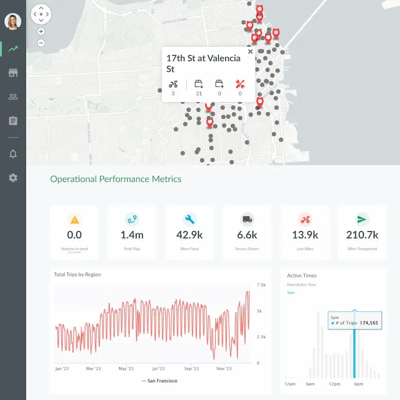
Interactive demo: Bikeshare Embedded BI, supported by Jaspersoft
Experience how to turn data into valuable insights that you and your customers can use to make better decisions.
