What is a Spline Chart?
A spline chart is a type of line chart that uses smooth curves instead of straight lines to provide a graphical representation of multiple time-dependent variables.

Today, many industries use these specialized line charts for data analytics, interpolation, and comparison, including finance, healthcare, and manufacturing. Their ability to capture, streamline, and centralize various information types and sources makes them extremely versatile for communicating complex data relationships seamlessly. Hence, users can leverage valuable insights to enable and improve data-driven decision-making (DDDM).
This page will delve deeper into the key components of a spline chart. We’ll also discuss its main applications and benefits in detail, along with a comprehensive chart creation and interpretation guide.
The Components of a Spline Chart
A spline chart comprises the following components that work together to enable data discovery, visualization, and advanced analytics:
Data Points
Every spline chart requires individual data values on the x and y axes to plot the spline curve. The x-axis typically represents independent variables, such as categories, factors, distance, customer segments, locations, time, etc. Conversely, the y-axis contains dependent variables like values, quantities, profit, sales volume, population, rates, etc.
Spline Curve
A spline curve is a smooth, continuous curve plotted using the data points on the x and y axes. Computer or AI-generated spline charts use mathematical algorithms to smoothen the curve to minimize sharp angles or changes. The curve also serves as a forecasting or BI reporting tool, helping users identify trends and patterns through trajectory extrapolation.
Interpolation
Most advanced spline charts feature interpolation algorithms that allow users to estimate value between plotted data points without manual calculations. They can tap anywhere on the curve or hover their cursor over data points. The curve’s smoothness makes it easier to visualize interpolated values more accurately.
Data Labels & Legend
Spline charts usually feature data labels to display the specific values of plotted or interpolated data points, making it easier for users to interpret them. Similarly, legends help separate multiple categories or series to avoid confusion when reading the chart.
Gridlines
Most graphical charts have gridlines to help gauge the data point values more precisely by referencing them against the x and y axes.
Spline Chart Title
Finally, every spline chart has a title to help users understand the values. Examples include customer engagement, subscription renewal, sales performance, etc.
Key Benefits of Using a Spline Chart
A spline chart offers several benefits to different applications and industries, making it an ideal data analytics and BI reporting tool. Key benefits include:
Smooth Data Representation
Spline charts are excellent visual analytics tools for different data types. They connect data points smoothly, making the representation more appealing and easier to understand. Unlike conventional charts with inconsistent lines and angles, spline curves help readers quickly identify and quantify trends and data changes.
Visualization of Complex Data Relationships
Modern businesses relying on data-driven decision-making often analyze multiple complex datasets to identify patterns and trends. With spline chats, they can easily integrate multiple data points and visualize how different categories, factors, and independent variables affect each other. They can better understand complex relationships between different touchpoints to make more informed decisions.
Multi-Domain and Multi-Industry Applications
Spline charts support BI reporting tools by enhancing data visualization and analytics. Hence, professionals in different domains and industries can use them to visualize time-series data, continuous changes in data, and spatial patterns. The chart’s adaptability makes it incredibly versatile for decision-makers at every value chain level. We’ll share how common industries use spline charts in the next section.
Continuous Insights
One of the core benefits spline charts offer is revealing actionable insights continuously based on gradual data changes. They can analyze changes at small intervals, offering a more detailed view of data evolution during its transition between two periods.
Enhanced Trend Identification
Spline charts are excellent for illustrating long-term trends and patterns within complex datasets. The smooth curves allow users to easily identify the slope and direction to generate valuable insights for decision-making quickly.
How Different Industries Use the Spline Chart
Spline charts are commonly used across multiple industries, including (but not limited to):
Manufacturing
Spline charts are excellent for monitoring continuous production. Manufacturing plant and factory teams use them to visualize independent variables like quality control metrics, production rates, equipment reliability, and safety hazards. For example, a beverage company can use spline charts to improve its post-production supply chain processes by visualizing inventory levels, distribution routes, order management, etc.
Construction
Construction project managers and engineers leverage spline and other data visualization charts to visualize project milestones, daily tasks, completion percentages, and timelines. Using this powerful data analytics tool, they can make more informed decisions to ensure timely completion with little or no issues, such as scope creeping, poor resource allocation, or overspending.
Government
Governments rely heavily on public data to make decisions on a macroeconomic scale. Using complex spline charts, they can visualize multiple economic indicators, demographic trends, and other data types to make policies that better align with the public’s needs and resolve their issues, including employment, inflation, healthcare, etc.
Education
Many modern schools and colleges with advanced data infrastructures use spline charts to visualize student lifecycles, enrollment trends, academic outcomes, and administration costs. They generate actionable insights to improve their processes and better meet the needs of students while increasing their revenue.
Real Estate
Real estate companies use spline charts to analyze market trends and fluctuations, including property demands, rental prices, inflation, investor sentiment, etc. Identifying and understanding shifts in commercial and residential real estate dynamics can help homebuyers and investors make more informed purchase decisions.
Shipping and Logistics
The shipping and logistics industry plays a significant role in the global economy, ensuring the distribution of goods and commodities worldwide. Hence, shipping companies and carriers utilize various tools and technologies to simplify and improve their operations, including data analytics software like transportation management platforms. Many modern platforms display information using spline and other charts for fleet benchmarking, route optimization, and other efficiency enhancement processes. For instance, trucking companies can use spline charts to display metrics like cost per mile, fuel consumption, idling trends, delivery schedules, and revenue to identify improvement areas.
Healthcare
Hospitals, clinics, and research facilities can use spline charts in various departments, from diagnostics to administration, IT, and customer (patient) service. For instance, modern surgical units are equipped with digital spline charts displaying real-time patient vitals, including heart rate trends, blood pressure variations, and blood glucose levels. Therefore, they play a significant role in helping healthcare practitioners accelerate and simplify decision-making for faster interventions and better overall patient care.
Retail
Retail companies, eCommerce stores, pharmacies, and supermarkets utilize spline charts for various purposes, including inventory tracking, behavioral analysis, customer segmentation, and financial analysis. These charts offer a visually appealing way to assess performance, identify issues, and monitor trends for actionable insights and proactive strategy adjustments.

Finance
Spine charts are vital tools in various sub-sectors of the finance industry. For instance, stock exchanges and trading platforms use them to visualize stock prices, market trends, and performance indices. Hence, analysts and traders can use the gradual changes (fluctuations) to identify investment or selling opportunities to maximize profit or prevent losses. Similarly, banks and credit unions leverage spline charts to assess creditworthiness for loan applicants by visualizing trends in debt, credit scores, and transaction history.
Energy & Environment
Utility companies, production plants, and environmental agencies use spline charts to visualize different trends, from energy consumption to distribution, emissions, and resource management. They help users showcase practically unlimited measurable metrics that simplify and improve decision-making. For example, a solar panel manufacturer can analyze light intensity and wind patterns in a specific location to modify panel design for efficiency enhancement and durability.

How to Create a Spline Chart
Creating a spline chart is relatively straightforward, especially if you’ve collected all the necessary data to plot. Below is a step-by-step guide you can use to transform that data into clear, actionable insights:
Define Your Data
To create a spline chart, you must proactively define and understand the data you want to visualize. In other words, you need to outline the independent and dependent variables on the x and y axes so readers can understand the represented data.
Choose Your Software
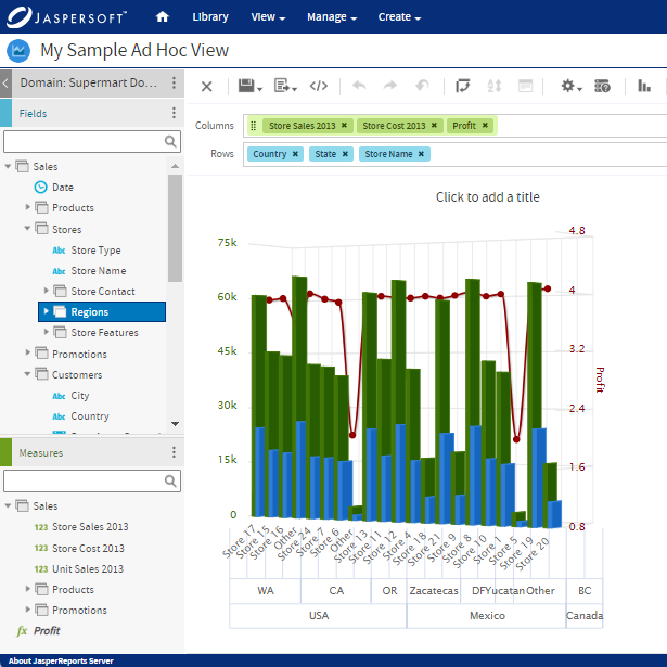
You need charting software, such as Jaspersoft, to create a spline chart. Ideally, you should opt for advanced solutions that provide more powerful data visualization tools to create more dynamic and interactive charts.
Input Your Data & Create Your Chart
Once you’ve selected your preferred charting solution, organize your x-axis and y-axis data proactively in columns, lists, arrays, or data frames, depending on the software you’re using.
Customize the Chart
Following the creation, you can customize your chart’s visuals with titles, labels, legends, gridlines, and other components. You can also choose from different chart styles, change the color schemes, and magnify the axis scale for easier interpretation.
Share & Present
Finally, once your spline chart is ready, you can present it to your target audience and extract the information for reports, strategy development, and other use cases. Ensure you refine the data points to maximize integrity and accuracy.
How to Read & Interpret a Spline Chart
Spline charts aim to help users recognize trends and inflection points to extract actionable insights from the data visualized. Here’s a detailed guide on reading and interpreting a spline chart:
Understanding X and Y Axis
The key to successfully interpreting the data visualized on a spline chart is recognizing and understanding the relationship between the x and y axes (independent and dependent variables). For instance, in a boiler pressure tracking spline chart at a power plant, the independent variable could be time in days. Meanwhile, the dependent variable would be bars. By studying the chart, plant engineers can discern how pressure changes affect production capacity and efficiency.
Series Identification
The next fundamental aspect of reading and interpreting a spline chart entails identifying multiple lines representing distinct data series. Most spline charts use legends to label these series to help readers distinguish and compare trends seamlessly. You can think of series as book chapters separated by a legend labeling them.
Trend Analysis
Next, you must learn how to identify line direction and curvature. A downward slope indicates a decline, and vice versa. Sudden changes in the graph’s slope signify a massive change in the dependent variable as the chart gradually changes over time.
Inflection Points
Inflection points indicate where curves change directions, indicating a shift in trend. Identifying and understanding these points is among the most crucial aspects of reading a spline chart. A great example of this is the performance of a stock. A direction change signals a trend from bullish to bearish, or vice versa, prompting traders to buy or sell stocks.
Types of Spline Charts
Below are some of the most common variations of traditional spline charts:
Multiple Series Spline Charts
A multiple-series spline chart is the most common variation of spline charts, used to compare trends between multiple datasets and identify relationships. In other words, these charts have multiple curves and are differentiated using labels, legends, or colors. For example, retail companies use them to monitor and analyze sales performance for different product categories.
Stacked Spline Charts
A stacked spline chart is a derivative of a multiple-series spline chart. However, it stacks the spline curves vertically to help users identify cumulative trends from different categories. It’s a smart alternative to Pareto charts since it illustrates the contribution of each category. For example, marketers can use it to determine which segments convert the most.
Percentage Spline Charts
Finally, a percentage spline chart is a variant of a stacked spline chart. Along with displaying cumulative trends, it also displays the percentage contribution of each data series or category to help users better understand their collective and individual impact over time according to market changes.
Examples of Spline Chart Applications
Below are examples of supply chart applications from two popular industries – Retail and Manufacturing:
Retail – Sales Performance Analysis
A retail company specializing in furniture and home décor with dozens of branches worldwide is looking to adjust its sales strategy to increase conversion and revenue. The key challenge it faces is seasonal fluctuations, which are difficult to understand and predict. Hence, the company wants to visualize growth trends and monthly sales to adjust its marketing, supply chain, and production strategy accordingly.
To implement these changes, the company collects monthly sales data for different product categories to create a spline chart to visualize performance. The company plots the data points for each category and separates them using the legend. The x-axis represents the month, and the y-axis represents the sales in dollars.
By creating a spline chart, the furniture company identifies the best-selling products each month and notices a sharp spike from October to December due to holiday sales. The company also noticed a sharp decline in overall sales from January to March. Hence, it tweaks its marketing strategy to separately target on and off seasons. During low-sales months, the company offers discounts to entice buyers to take advantage of limited-time offers. Similarly, during the holiday season, it decides to increase its marketing budget to expand its reach further.
To summarize, the furniture company leveraged spline charts to represent their sales trends visually to aid in strategic planning, enabling them to generate insights that improved their sales during peak and off-peak seasons.
Manufacturing – Energy Consumption Tracking
A manufacturing plant specializing in canned goods is looking for ways to reduce its daily energy consumption as part of its sustainability drive. The plant also aims to reduce production costs and maximize revenue by reaping energy-saving opportunities. However, its key challenge is accurately tracking energy consumption and metrics like peak/off-peak usage times, consumption patterns, waste sources, and top consumption areas in its facility.
The plant's energy audit team decided to gather hourly energy consumption data to create spline charts for visual representation. The chart includes power usage for different equipment, key consumption areas, and waste sources. Using the chart, the company determines its peak consumption periods during manufacturing and adopts alternative power generation solutions to share the load and reduce billing.
The spline chart also shows unusual consumption spikes, which indicate inefficiencies or bad practices during operations, such as machinery idling, air conditioning usage in unoccupied rooms, and line leaks. Hence, the plant devises new policies to enhance efficiency and optimize electricity usage during operations. It also plans to switch to energy-efficient lighting and equipment gradually in the next three years to reduce billing further. The chart will continue to monitor their usage and consumption patterns to help them stay on track.
Spline Charts with Jaspersoft
Related Resources
Jaspersoft in Action: Embedded BI Demo
See everything Jaspersoft has to offer – from creating beautiful data visualizations and dashboards to embedding them into your application.
Creating Addictive Dashboards
Learn how to build dashboards that your users will love. Turn your data into interactive, visually engaging metrics that can be embedded into your web application.