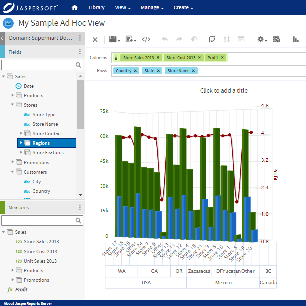
What is an Interactive Dashboard?
An interactive dashboard is a business data management tool that allows users to interact with data by tracking, analyzing, monitoring, and displaying key business metrics.

By using an interactive dashboard, users can dig deeper into an organization’s operational information and filter it in several ways. Financial and operational data can be merged onto this central platform to handle all functions and related processes at a corporate level. Interactive dashboards also allow organizations to create and track key performance indicators (KPIs). This allows for data to be inspected from various perspectives, right down to every tiny detail.
Data-driven decisions are only possible when all relevant data is coordinated to create a clear, understandable display of business-related figures. Techniques – such as simple headlines on the dashboard – can help users understand what the display covers without a need to analyze complicated data sets.
Organization-wide analytics solutions connect enterprise resource planning (ERP) data and all other relevant data. Once combined, users can analyze all information. The analytics software takes the bulk of the work and feeds information to display on interactive dashboards.
Because dashboards are shared with relevant stakeholders – from business colleagues to partners and customers – everyone who needs to can access the information. Using interactive dashboards, organizations can effectively communicate relevant business figures to those within and outside the organization. These dashboards can be tailored so employees can have limited access and only see what is appropriate for their role.
Interactive dashboards add a more visual element to presentations. This means people can more easily understand the numbers, ramifications, and outcomes of the data. Techniques (such as simple color coding of red, yellow, and green) use existing visual frameworks to ensure easy interpretation.
Features of an interactive dashboard – like drill-downs or advanced dashboard filters – not only help viewers of the data see the information from multiple perspectives but allows them to drill down to a granular level, if needed.

Interactive Dashboards vs. Static Reporting
There was a time when static presentations were the norm. Initially, actual paper charts were used, then PowerPoint and Excel-based presentations. Considering the amount of time taken by analysts to source and analyze data manually, the information was often outdated.
With the advent of interactive dashboards, businesses can gain a level of insight that was not possible before. All the data is on a single screen and is easily shareable. Results can be examined right down to the granular level wherever needed. Analysts save time and increase productivity.
There are a range of benefits of interactive dashboards over static reporting such as agile decision making, reduced redundancies, empowered business users, immediate updating, and increased productivity.
Agile Decision-Making
Powered by interactive analysis, any business-related question can be answered with the most current set of information. This ability to examine data from a macro and micro perspective (from multiple points of view using up-to-the-minute data) takes quality decision-making to the next level. Interactive dashboards give the user the ability to zoom in and out of data, examine time intervals, filter information based on several parameters, and remove or hide parameters they may not want—showing a holistic data view.
Removal of Redundancy
A traditional static presentation requires multiple slides that are not interactive. It displays fixed data that cannot be updated during the presentation. Conversely, interactive dashboards use real-time data. This means that if there is a change to any data, the slides are dynamic enough to include the new data or simply remove slides from the presentation that may have been rendered redundant. These dashboards can be set to alarm each time there is a change. With neural networks incorporated into the system, smart detection leading to forecasting is possible.
Empowering Business Users
With interactive dashboards, users can conduct immediate analysis requirements without having to send requests to the IT department. This goes a long way in saving valuable IT resources, reducing the demand for database inquiries and complex customizations. IT professionals can be better utilized for tasks that go beyond paperwork and reporting.
Immediate Updating
Speed is key to business success, especially when competition is fierce. With traditional approaches to reporting and presentations, data has to be recorded and updated manually. This can be a time-consuming process. With built-in reporting tools, data updating takes place in real-time and enables immediate data presentation.
Higher Productivity
Static reports have historically been key to improving productivity in any organization. However, considering the levels of competition a business faces, static data is no longer good enough. The amount of data collected for analysis is increasing by the day, and static methods cannot quickly analyze petabytes of data.
There are several self-servicing business information (BI) tools that allow a user to work on their own analysis. Using interactive dashboards, business users can create an intuitive experience with their dashboard, making vast amounts of information easier to understand. Businesses can easily realize opportunities and grow by spotting new trends and removing irregularities.
Interactive dashboards can be used enterprise-wide. The various features help visualize data better, and the filters help dissect information to investigate data in depth. Besides interactivity, interactive dashboards make presentations much more engaging with great visualization templates and features to customize based on requirements.
Must-Have Interactive Dashboard Features
Interactive dashboards are the ideal choice for businesses looking to enhance productivity and improve their bottom line. There are some important features that interactive dashboards must have to deliver the expected outputs.
Drill Down Features
A key benefit of an interactive dashboard is its ability to drill down and interact with the granular details of data. Users can easily see data sources to better understand overarching ideas; they can also choose to view specific elements by taking a single element, drilling down, and examining it.
This data can be presented in charts or graphs, which can be difficult to understand solely in number form. In a dashboard, users can click through into the source data, intuitively following the trail of information to find out what they need. With a drill-down capability, you can access many benefits:
- Gain better insights by scrutinizing data from several perspectives
- Create and present data in detailed layers, ensuring no part is missed in the analysis
- Choose between data views depending on complexity
- Examine data sets closely, understanding of how each of them influences KPIs
An interactive dashboard should contain details while not overwhelming the user and diluting insights. With the flexibility that drill-downs provide, the dashboard view is clutter-free, with the option of digging deeper with just a click.
Features to Highlight Important and Relevant Data
Interactive dashboards should clearly display specific user data. If it does not, the organization needs to reconfigure them to be user-friendly. Interactive dashboards should be dynamic and able to display personalized information easily. There are several key features:
- Placement: English speakers read left to right, so English readers tend to look at the top left part of the screen instinctually. This is where organizations can place key data. For an Arabic presentation, words read right to left. A truly interactive dashboard should be able to provide the organization with various options to suit their culture and norms.
- Color: Color is instrumental in data visualization. The dashboard should provide users with relevant color-coding abilities. The key to using colors in data visualization is to ensure that they are already associated with common interpretations (green for go, red for stop).
- Size: The bigger the chart, the faster the attention is drawn to it. But, if the dashboard is cluttered, users may simply glance over important charts. Dashboards should provide users with flexibility in size and volume. A simple way to draw attention to a chart is to introduce white or negative space, which highlights the chart.
Features to Find Commonalities Between Data Sets
With interactive dashboards, several data sets are presented simultaneously. This means it becomes easier to spot connections between various metrics that users may not have noticed earlier. When put in different or unexpected contexts, data sets can appear differently. Interactive dashboards can help users identify commonalities, developing a better understanding of the data’s significance.
Easy and Effective Data Sharing
Organizations need an easy way to share data. Interactive dashboards ensure that data is easily shareable. With data located in one place, organizations can easily disseminate it in flexible displays. These features ensure that employees are not bombarded with irrelevant information. Some other features available include:
- Cross tab filters: provide a range of filters across all tabs to save time and increase the speed of analysis
- Time interval widgets: help improve personal time scales on various charts on dashboards with interactive drill-down functionality
- Custom chart tooltips: aid in adjusting hovering information over a snippet that users may be discussing
- Advanced data options: provide users with instant access to raw data to address questions that come up in discussions immediately
- Show (or hide) chart values: enable merging and visualizing data sets irrespective of the silos they may be in or the languages they made be coded in
- Dashboard widget linking: unifies the organization’s dashboard with the use of links
- Hierarchical filters: provide a clear understanding of the impact of a filter on another
- Dynamic text boxes and images: prevent overlooking key information in the course of a presentation
- Information tooltips: provide hovering box information over points made in a presentation, reducing the clutter on the dashboard

Strengths and Challenges of Interactive Dashboards
Interactive dashboards are primarily focused on providing the ability to make quick decisions, extensive collaboration, and data exploration.
Dashboards are regularly used for recurring projects that track something specific. With reports scheduled at specific times, usually weekly or monthly, interactive dashboards remove the monotony of creating these reports each time. Users can view simple reports and the latest metrics without needing to re-run an entire report.
The interactive dashboard carries immense potential in terms of its agility and ability to take on iterative work consistently. Such boards are regularly used by market researchers to show clients results in real time. They are also great for dealing with follow-up questions.
There are few solutions in the market that work on creating template-based dashboards specifically for ad hoc research. Here, reports are built and are dashboards in themselves. Each time results of the research come in, the report parameters are populated, and the user gets real-time results.
While this is extremely useful, it also means that any questions asked have to be tailored specifically to the report. There can be no leeway with framing them and asking them.
Interactive dashboards possess the ability to connect with end-users quickly and engage with them, adapting to their level of technical expertise to ensure an intuitive experience. This is done with small, easily comprehended insights. The return on investment is better since trends are quickly spotted and can be acted on. By bringing interactive business intelligence dashboards into the workspace, businesses will have the ability to scrutinize vast amounts of data sources from a single screen in their hands, without the need for extensive technical capabilities. It is easily usable by an individual and can be operated with just a few clicks.
Interactive Dashboards with Jaspersoft
Related Resources
Jaspersoft in Action: Embedded BI Demo
See everything Jaspersoft has to offer – from creating beautiful data visualizations and dashboards to embedding them into your application.
Creating Addictive Dashboards
Learn how to build dashboards that your users will love. Turn your data into interactive, visually engaging metrics that can be embedded into your web application.
