



Key performance indicator dashboard examples for OEM and ISV applications
A dashboard stuffed with charts, tiles, and color-coded numbers may look informative, but it may not answer whether your account is healthy right now.
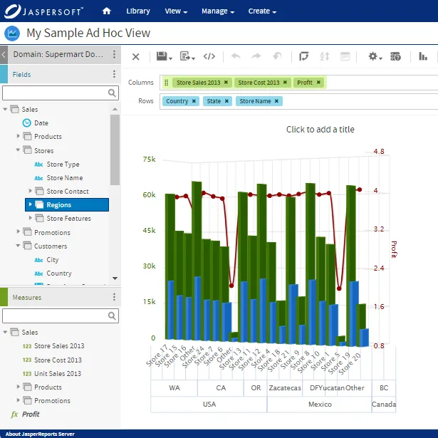
If your team is building analytics into their own product, that ambiguity can lead to a build-or-buy decision: you can either spend engineering time on custom filtering or start with a platform that already has ad hoc reporting. If you're choosing the latter, it's vital to pick the right edition, since that can affect which features you get. For example, Jaspersoft's commercial edition offers ad hoc reporting out of the box, while the free Community edition doesn't.
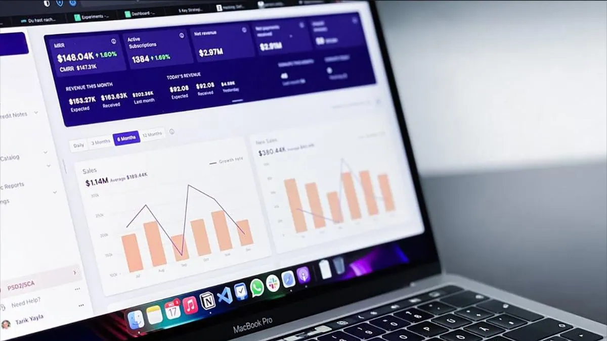
Here are four types of dashboards you might be building, and what it takes to make numbers solid enough to export or hand off to an auditor.
Multi-tenant SaaS usage and engagement dashboard architecture
In a multi-tenant application, every dashboard query must answer two questions: what does the data show, and whose data is it?
The second question has two layers. The first is tenant isolation, which teams must enforce so a misconfigured query or dropped filter never leaks one account's data into another's view. This means ensuring row-level security tied to tenant ID, so every query is scoped to a single tenant before it reaches the dashboard.
The second layer is who within that account can see it, since not everyone needs to see the same view. Jaspersoft's commercial edition includes role-based access control (RBAC) out of the box, so teams can assign permissions by role without building an access control layer from scratch. The Community edition doesn't include this, so teams must code and maintain their own permission logic on top of the reporting layer.
Two types of KPIs matter in a multi-tenant model
The first is engagement metrics, which show whether accounts are using what they're paying for. Examples include daily or weekly active users, feature adoption rate, session frequency, and time to first action for new users. While these numbers are useful for your team, they’re even more valuable to customers when the program lets them explore the data themselves. Tracking these metrics also lets you spot an account quietly disengaging before it turns into a support ticket or a churn risk.
The second type of KPI that matters in a multi-tenant model is resource consumption metrics, which show how each account uses the system through the interface. Examples include API calls, storage usage, and license seats consumed against the contracted total. When your team sees usage rising toward a plan limit, they should reach out before the account hits a wall. These metrics also function as a record if an account disputes an invoice.
Embedded cost and usage dashboards for precision reporting
A cost dashboard in a customer-facing product carries a different weight than an internal one. Since the figures customers see must match their invoices exactly, precision drives the entire design. It also affects how you balance interactive charts with flawless, exportable financial statements.
Interactive charts are great for exploration. But they're not built for a customer's own accounting or audit process. When a customer needs a document to file or reconcile against a purchase order, an interactive chart can't guarantee that the layout, pagination, or exact figures will remain consistent across viewings. Meanwhile, pixel-perfect export reproduces the same numbers in a fixed print-ready layout across viewings.
To ensure compliance, make sure every number in a financial dashboard has a documented trail. If a customer questions a charge, the team should be able to trace it back to its source. Version control for historical restatements is also useful, so that customers comparing reports across months can be confident that figures are consistent.
Operational SLA monitoring and system health examples
Operational KPI examples in this category include uptime percentage, response latency, throughput, and error rate, all measured against SLA thresholds. These metrics serve infrastructure and support teams, so the dashboard must support fast triage over open-ended exploration.
Here's a breakdown of how they work:
- Uptime percentage tracks whether the system was available when it was supposed to be.
- Latency measures how long a request takes to receive a response.
- Throughput tracks how many requests the system handles per second. It flags capacity problems before they turn into outages.
- Error rate tracks the percentage of requests failing outright, which is often the first signal that something is wrong.
A good rule of thumb is to use dashboards to spot gradual trends, like rising latency or a slowing region, and automated alerts to trigger when a threshold is crossed and immediate action is needed.
To get access to these alerts, you need to choose the right software edition. Jaspersoft's commercial edition includes built-in dashboard scheduling and alerting. The Community edition doesn't include this layer, so teams on that tier must build and maintain the logic themselves.
Regulated operations and compliance dashboards
In audit-heavy industries like healthcare, finance, and legal services, a dashboard must hold up months or years later when someone asks why a number looked the way it did on a specific date.
As such, every high-level KPI, like an overall compliance score, must link down to the records that support it. A performance dashboard architecture built only for live exploration won't hold up here, because live views tend to show only the current state.
Compliance dashboards also can't quietly overwrite old data with new data. Point-in-time snapshots, or, at a minimum, a reliable audit trail showing what changed and when, must be built into the architecture from the start.
That’s why pixel-perfect export matters. With that function, you can give an auditor who wants a record of a specific compliance score a fixed, exportable snapshot, rather than a live view that can change with a simple refresh. Jaspersoft’s pixel-perfect reporting recreates the same layout and numbers every time, giving compliance teams a document they can hand over exactly as it appeared on the date in question.
Strategic integration of dashboards and pixel-perfect reports
Every KPI above hovers around the same binary choice: ad hoc exploratory dashboards versus high-volume, pixel-perfect report generation. Generally speaking, use a dashboard for ongoing exploration and an alert for anything urgent. Use a scheduled report for anything that needs to leave the platform in a fixed format, such as an invoice or an audit package.
For both, consider embedded dashboard reporting tools like Jaspersoft to better support integrating dashboards and pixel-perfect reports from a single data model, ensuring consistency across outputs.
Try Jaspersoft today to see how you can integrate KPIs that drive action into your product.
Ready to give it a spin?
Start your 30-day trial now.

Try Jaspersoft - Free Trial
Efficiently design, embed, and distribute reports and dashboards at scale with Jaspersoft.

Build versus Buy: An In-depth Guide
This whitepaper provides a framework for the decision-making process and critical trade-offs between building or buying an embedded BI and reporting tool.
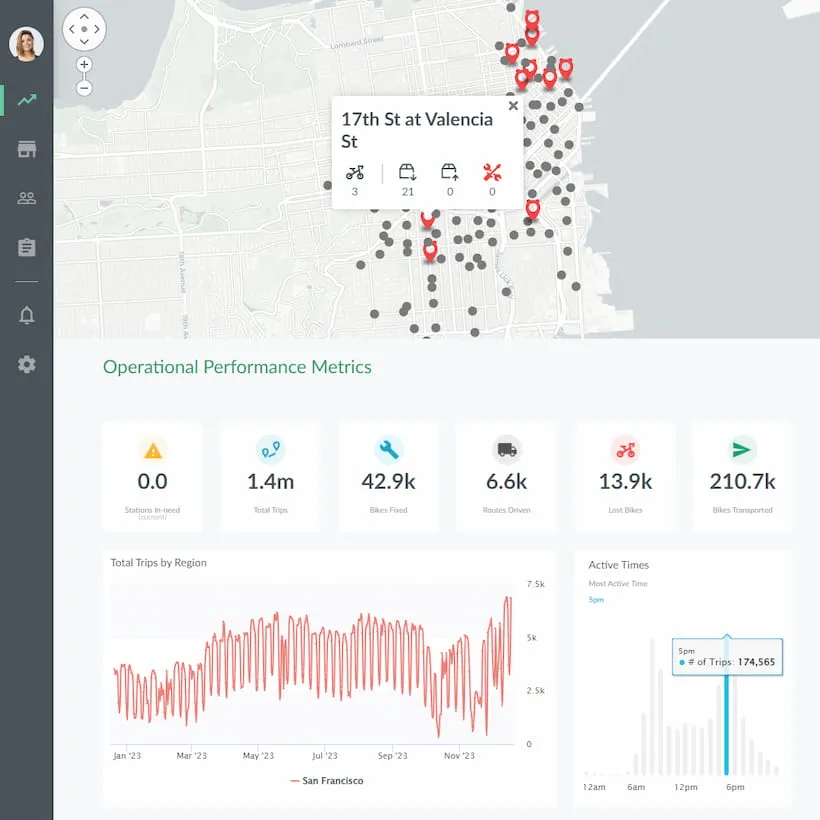
Interactive demo: Bikeshare Embedded BI, supported by Jaspersoft
Experience how to turn data into valuable insights that you and your customers can use to make better decisions.
