What is a Box Plot?
The box plot is a data visualization tool that provides a concise overview of data distribution, from central tendencies to potential outliers. It demystifies complex information by converting abstract numbers into visual representations, making it accessible to both novices and experts.

The strength of the box plot resides in its simplicity and the breadth of insights it offers at a single glance. Its unique ability to reveal the core aspects of a dataset, from its median to its range, has made it an indispensable tool for statisticians and data analysts alike.
History and Origin of the Box Plot
The box plot, a modern statistical visualization staple, owes its origin to the brilliant mind of John Tukey. Tukey was an American mathematician best known for his contributions to data analysis and statistics. In the 1970s, when tables and numerical summaries dominated the landscape, he introduced the "box-and-whisker plot" as an instrument for exploratory data analysis. The goal of this visualization was to present a five-number overview of datasets: minimum, first quartile (Q1), median, third quartile (Q3), and maximum.
Tukey’s innovation was groundbreaking for several reasons. In contrast to many modern methods that rely extensively on complex numerical data, the box plot presented a concise visual summary. This made it easy to identify not only central tendencies and variances, but also outliers and nuances in data distribution.
The box plot has evolved over time to incorporate software tools and accommodate increasingly complex data sets. From its manual, pen-and-paper beginnings in the 1970s to its digital implementations on platforms such as R and Python today, its fundamental principle has remained the same. The plot remains a great tool for expressing the essence of data distribution in a concise and informative manner.
Today, the box plot continues to be a testament to John Tukey's vision of simplifying complex data for improved comprehension and interpretation. Its continued use in statistical analysis attests to its enduring effectiveness and adaptability.
Anatomy of a Box Plot
At first glance, a box plot may seem like a simple diagram. However, its minimalist design contains a wealth of information about the distribution of a dataset. Let us take a closer look at the essential components of this remarkable visualization tool.
Central Box – Interquartile Range and Quartiles
- Interquartile Range (IQR): The IQR is the range in which the central 50% of the values fall. It is calculated by subtracting the first quartile (Q1) from the third quartile (Q3): IQR = Q3 - Q1.It measures the distribution of the data and provides insights into its variability. A larger IQR indicates that the middle half of the data is more dispersed.
- Q1 (First Quartile): This is the value below which 25% of the data falls. It represents the boundary between the lowest 25% and highest 75% of values. It is the bottom margin of the central box in the box plot.
- Q3 (Third Quartile): This represents the value below which 75% of the data falls, serving as a border between the lowest 75% and highest 25% of values. It is represented by the top edge of the central box on the box plot.
Whiskers – Significance and Range
The whiskers of the box plot extend from the central box to the minimum and maximum data values that are not considered outliers. They provide a graphical representation of the majority of the data's distribution. There are several ways to draw whiskers:
- The lower whisker typically extends to the smallest data value that exceeds Q1 - 1.5 x IQR.
- The upper whisker extends to the greatest data value that falls below Q3 + 1.5 x IQR.
Outliers – Identification and Representation
Outliers are data points that deviate significantly from other data points, typically due to data variability or errors. In a box plot:
- Outliers are often represented by individual points or symbols outside the whiskers. They are usually data values that are less than Q1 - 1.5 x IQR or greater than Q3 + 1.5 x IQR.
- Recognizing outliers is crucial because they can significantly affect the mean and standard deviation of the data, and understanding them can reveal unusual patterns or anomalies within the dataset.
Median – Center of the Data
The median is the value that divides the dataset into two equal halves, with 50% of the values falling below it and 50% falling above it. In the box plot a line (or sometimes a distinct mark) inside the central frame represents the median. Given its position, it provides a clear view of the center of the dataset and allows for comparisons when multiple box plots are displayed side by side.
Advantages of Using a Box Plot
The box plot, also known as the whisker plot, is a data visualization technique revered for its precision and simplicity. There are numerous reasons for its pervasive use in statistical analysis, and here we explore some of the primary benefits of utilizing this visualization:
Visual Clarity in Representing Data Distributions
While raw data presented in tabular form can be difficult to interpret, a box diagram provides an instant visual representation of the data distribution. One can identify the central tendency, spread, and skew of the dataset at a glimpse. Its condensed representation distills enormous data into a concise picture, allowing for immediate understanding.
Those who must make quick, informed judgments based on data will find the box plot's visual clarity invaluable.
Comparative Analysis between Multiple Data Sets
One of the most notable advantages of box plots is their utility in comparing multiple data sets side by side.
Suppose researchers are comparing test scores from various courses, or that analysts are analyzing monthly sales over a number of years. Multiple box plots can be displayed adjacently in this situation, offering a clear visualization of differences in medians, quartiles, and variability among the datasets. A side-by-side comparison can reveal trends and abnormalities that numerical summaries may miss.
Quick Identification of Outliers
In data analysis, outliers have the potential to distort results and interpretations. Box plots, with their distinct portrayal of outliers as separate points outside the whiskers, make it simple to identify these abnormal data points.
This instant visual indicator can prompt analysts to check whether these anomalies are genuine data variations or errors that require correction.
Efficient Representation of Data Quartiles and Medians
The central box of the box diagram represents the interquartile range and contains 50% of the values in the dataset. By indicating the first quartile (Q1), the median, and the third quartile (Q3), the box plot effectively illustrates the dataset’s quartile distribution. This provides insights into the data's dispersion and central tendency, delivering a more nuanced understanding than measures such as the mean alone.
In addition, the median's distinct representation, which is typically a line within the box, clearly indicates the center of the data set.
Comparing Box Plots to other Data Visualization Tools
Different tools in the vast field of data visualization provide unique perspectives on data sets. While box plots offer a thorough snapshot of data distribution, other tools such as histograms, scatter plots, and bar graphs are useful for other analytical needs.
Here is a comparison of these tools in relation to box plots:
Histograms vs Box Plots
- Histograms: These depict the distribution of data by forming bins along the data's range and then sketching bars to indicate the number of observations that fall within each bin. The height of each bar indicates the frequency of data points within a given interval.
- Comparison: Histograms, as opposed to box plots, display the shape of the data distribution, making it simpler to identify modes (peaks) and understand the overall distribution pattern, whether it is normal, skewed, or bimodal. In contrast, box plots emphasize quartiles, medians, and potential outliers.
- Usage Scenarios: Histograms are optimal for analyzing the structure and distribution of massive datasets. Box diagrams excel at comparing multiple datasets and quickly identifying data quartiles and outliers.
Scatter Plots vs Box Plots
- Scatter Plots: These indicate the relationship or correlation between two variables by displaying individual data points on a two-dimensional axis.
- Comparison: Box plots provide a comprehensive view of a dataset's distribution, whereas scatter plots are best for observing relationships and identifying patterns or trends between two datasets. In contrast to medians and quartiles, scatter graphs excel at displaying correlations.
- Usage Scenarios: Scatter plots are ideal for regression analysis, correlation evaluation, and observing temporal data trends. On the other hand, box plots are better suited for analyzing the central tendencies and distribution spread of a single or multiple datasets.
Bar Charts vs Box Plots
- Bar Charts: These illustrate data with rectangular bars whose lengths are proportional to the values they represent. Bar charts can categorize data and are often used to compare values across categories.
- Comparison: Box plots provide insight into data distribution, including medians, quartiles, and outliers, whereas bar graphs emphasize discrete data, focusing on the magnitude of values across categories. Distribution characteristics, such as skew and kurtosis, are not apparent from bar charts.
- Usage Scenarios: Bar charts excel at representing and comparing data across distinct categories as well as displaying changes over time, particularly for nominal or small ordinal datasets. Box plots, meanwhile, are better suited for studying the distribution properties of interval or ratio data.
Creating a Box Plot: A Step-by-Step Guide
The box plot or whisker plot is a graphical representation of a dataset's central tendencies, distribution, and outliers. While there are many software and tools for quickly generating a box plot, grasping the manual process provides insight into its underlying mechanics. Here is how to create a box plot from scratch:
Data Collection and Visualization
Box plots provide a comprehensive view of data distribution, and their creation can be a systematic procedure involving the following steps:
Data Collection and Organization
- Gather Data: Begin by gathering the data set you wish to represent. This may include survey results, experimental data, or any other quantitative dataset.
- Organize Data: Arrange the data in ascending order to make it easier to find the quartiles and the median in the subsequent steps.
Calculating Key Values
- Median: Determine the middle value of your data set. If the number of observations in the data set is even, the median will be the average of the two middle values.
- First Quartile (Q1): This is the number in the middle of the smallest number in the set and the median.
- Third Quartile (Q3): This is the median of the second half of the data set, which is the intermediate value between the median and highest values.
- Interquartile Range (IQR): The IQR is the difference between Q3 and Q1 and provides an idea of the data set's value distribution.
Identifying Outliers
Outliers: These values do not lie within the range defined by Q1 - 1.5(IQR) and Q3 + 1.5(IQR).
Drawing the Box Plot
- Sketching: On graph paper or using software, make a scale that encompasses the data set's range. Mark the positions of the first quartile, the median, the third quartile, and any outliers.
- Constructing the Box: Draw a rectangle with Q1 and Q3 serving as the lower and upper limits, respectively. Draw the median line within this box.
- Adding Whiskers: Extend lines from the top and bottom of the box to the highest and lowest non-outlier values in the dataset. These are your ‘whiskers’.
- Marking Outliers: If there are any outliers, represent those using dots or asterisks outside of the whiskers.
Interpreting Box Plots in Real-World Scenarios
Box plots are widely utilized in a range of industries due to their ability to simply and succinctly illustrate data distribution. They can provide valuable insight into a dataset's central tendencies, spread, and prospective outliers.
Here are some examples of how box plots are used in the real world:
Finance
Box plots are used by financial analysts to study stock price distributions over time or to compare the performance of multiple stocks.
By examining the whiskers, for instance, they can quickly determine the volatility of a stock. The position of the median, meanwhile, can help predict the overall direction of stock performance over a specific time period. Outliers may reflect an unexpected market event or company news that has an impact on stock prices.
Biology
Box plots can be used in biological research to compare data distributions across multiple experimental settings or groups.
Consider comparing the heights of plants grown under different light situations. The box plot would quickly reveal if one group had greater variation in height or if any plants in a particular group were unusually tall or short.
Manufacturing
Box plots can help with quality control in manufacturing by comparing product dimensions or performance measures across multiple production batches.
If a single batch has a median value outside of the intended range or displays greater variation (a wider interquartile range), this may indicate inconsistencies in the production processes.
Common Misconceptions and Pitfalls
Misconceptions
- Misconceptions about Medians: A common misunderstanding is confusing the median (the line inside the box) with the average. While they both provide a measure of central tendency, they can differ significantly, particularly in skewed datasets.
- Overemphasis on Outliers: If a data point is an outlier, it does not automatically indicate an error or that it should be discarded. It is essential to understand the context behind outliers before disregarding outliers.
- Whisker Lengths: Some may erroneously believe that the lengths of the whiskers always denote errors or standard deviations. In reality, they cover the minimum and maximum data points within the acceptable range.
Pitfalls
- Oversimplification: Using only box plots can result in an oversimplified comprehension of data. They summarize data distributions but do not provide granular information such as individual data points or specific distributions like bimodal patterns.
- Missing Data Patterns: While box plots identify outliers and provide a sense of the overall data spread, they may overlook subtleties such as clusters and gaps in the data.
Box plots, a product of statistical visualization, have proven indispensable for obtaining a concise yet comprehensive view of data distributions in a range of disciplines. Their strengths range from visual clarity in portraying medians and quartiles to effective detection of outliers.
However, box plots, like any other tool, are not without misconceptions and pitfalls. While they provide a condensed overview, a deeper dive into the data is often required for a more thorough understanding. Utilizing box plots as part of a larger toolkit is essential for ensuring that data is properly presented and evaluated in any analytical activity.
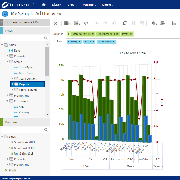
Box Plots with Jaspersoft
Related Resources
Jaspersoft in Action: Embedded BI Demo
See everything Jaspersoft has to offer – from creating beautiful data visualizations and dashboards to embedding them into your application.
Creating Addictive Dashboards
Learn how to build dashboards that your users will love. Turn your data into interactive, visually engaging metrics that can be embedded into your web application.