What is a Histogram Chart?
A histogram is a statistical graph that represents the distribution of a continuous dataset through plotted bars, each representing a particular category or class interval. The bar height reflects the frequency or count of data points within each group. In essence, histograms reveal patterns, trends, and insights hidden within unordered, raw data - exhibiting an organized picture that makes interpretation and analysis much more manageable and effective.

The utility of histograms extends across various industries and disciplines, including finance, public health, environmental science, manufacturing, and social studies. They are critical for tasks such as identifying patterns within large datasets, detecting outliers, ensuring quality control, estimating statistical parameters, and effectively communicating findings to stakeholders. Additionally, histograms serve as a stepping stone for more complex statistical concepts and methods.
Anatomy of a Histogram: Breaking Down the Components
In order to create a histogram, the dataset is divided into a set of evenly spaced intervals or bins. The width of the bins can vary, making it flexible to adapt to different data distributions and desired levels of detail.
After parsing the dataset, the number of data points falling within each bin is counted and represented by the height (or occasionally the area) of each corresponding bar. Thus, a histogram allows us to grasp important characteristics of the data at a glance, such as central tendency, spread or dispersion, symmetry, tail length, and the presence of any gaps or spikes.
When dissecting a histogram, it is crucial to understand its components and the role they play in revealing valuable insights from the data. The following sections break down the key elements of a histogram and delve deeper into their significance.
Data
The very foundation of a histogram is the data upon which it is built. Typically, histograms represent continuous or discrete quantitative data, making it an ideal tool for visualizing the underlying patterns and distributions in the dataset. The data can stem from various sources, such as measurements, observations, or simulations.
Bins (or Class Intervals)
Bins, also known as class intervals, are created by partitioning the data into equally sized intervals. The range of a bin represents the interval in which the data points fall. How many bins and which size are determined by the analyst, who may consider factors such as the amount of data, the desired level of granularity, and the underlying distribution.
Careful consideration should be given when choosing the bin size and number, as it may significantly impact the resulting visualization. A bin size too small might result in a "noisy" histogram, making it challenging to discern patterns or trends. On the other hand, an excessively large bin size may oversimplify the data, causing a loss of vital information and possibly concealing underlying patterns.
Frequency (or Density)
Frequency, the crux of a histogram, is the number of data points falling within each bin. The frequency is represented by the height (or, in the case of density histograms, the area) of the corresponding bar in the histogram. The chart's vertical axis typically reflects each bin's raw frequency, percentage, or probability density, depending on the type of histogram.
Higher bars in the histogram signify a greater concentration of data points within that interval, whereas lower bars indicate a lower frequency of data points in that range. By analyzing the overall shape and height of the bars, one can better understand the distribution, central tendency, and potential outliers within the data.
Axes
Histograms consist of two main axes: the horizontal (x-axis) and the vertical (y-axis). The x-axis represents the bins and covers the entire range of the data, whereas the y-axis depicts the frequency, percentage, or probability density based on the type of histogram.
An important distinction between histograms and bar charts is that histograms visualize continuous or discrete quantitative data and present a continuous x-axis, whereas bar charts typically represent categorical data with gaps between individual bars.
Shape
The overall shape of a histogram is a visual representation of the data's distribution. Examining the shape allows analysts to identify crucial characteristics such as modality (unimodal, bimodal, or multimodal), symmetry, skewness, and the presence of gaps or spikes. Data distributions like normal (bell-shaped), uniform, or exponential can be easily recognized by the shape of their histograms, leading to better understanding and decision-making.
By dissecting and understanding the core components of a histogram, one can effectively analyze the dataset's distribution, leading to insights that may otherwise remain hidden. The simplicity and versatility of histograms make them an indispensable tool in a broad range of academic and professional applications, enabling users to unlock the potential of their data.
The Benefits of Using a Histogram
Histograms have stood the test of time, dating back to the late 19th century. Their continued use in an array of disciplines, from finance to public health, testifies to their value in simplifying complex information and providing comprehensive insights into data. Here are some of the key benefits of using histograms:
Increased Comprehensibility
One of the standout strengths of histograms is their inherent simplicity. Even complex datasets can be distilled into an easily comprehensible form, aiding both data analysts and stakeholders in understanding the data's characteristics. Histograms provide a streamlined vision of how the data is distributed over intervals, revealing patterns, trends, and anomalies that could otherwise be lost inside raw numbers or even tables. This vivid, intuitive coverage of information makes histograms an incredible tool for data communication, transcending language and technical barriers.
Insight into Data Distribution
The fundamental objective of creating a histogram is to understand and visualize a dataset's distribution. Unlike other charts, histograms depict the dataset's entire spread, painting a broader and more richly insightful picture. This includes identifying the center of the data, the range, and the presence of any skewness or symmetry. Crucially, histograms also help identify outliers and gaps, which are significant in any data analysis, enabling necessary adjustments to be made in data cleaning or further investigation into these anomalies.
Aid in Decision Making
Histograms have a profound impact on decision-making processes by qualifying and quantifying patterns in data. By clearly exhibiting the frequency of values in each bin, histograms allow easy comparison of different categories, which can guide the identification of strengths, weaknesses, opportunities, and threats. They also assist in suggesting feasible solutions, making them a crucial part of the decision-making arsenal in areas like quality control, process improvement, marketing, and investment.
Versatility
Histograms are astonishingly versatile, capable of handling different types of data and finding utility in various fields. Whether one is handling test scores of a class of students, measuring heights of individuals, tracking changes in stock market prices, analyzing customer spending habits, or studying the effects of treatments in medicine, histograms prove invaluable in each scenario.
Basis for Further Statistical Analysis
Histograms serve as an excellent starting point for more detailed and complex statistical analyses. By providing a rapid, comprehensive view of a dataset's distribution, they help analysts decide whether additional tests, such as ANOVA, Chi-square, t-test, or regression analysis, should be run. Histograms quickly identify the characteristics of the data, signifying whether it meets the necessary assumptions, such as normality, homogeneity of variances, etc., needed to run such statistical tests.
Time-Efficiency and Economical
Given the complexities of big data, the cost and time required to analyze large datasets can be formidable. However, histograms provide an economical solution as they summarize large data sets graphically with relative ease, permitting quick analysis and decision-making. This efficiency proves instrumental in today’s fast-paced, data-centric industries.
Easy to Create and Interpret
Histograms, in essence, are easy and straightforward to construct, especially with the help of software and programming languages like Python, and R. Likewise, their interpretation is equally unpretentious, requiring no specialized statistical training or in-depth subject knowledge.
Regardless of the complex, multifaceted nature of modern-day data, histograms continue to provide a clear, concise, and comprehensive visualization of patterns and trends, proving that, sometimes, simple tools make the biggest impacts.
Alternatives to Histograms: Other Data Visualization Techniques
However powerful and versatile histograms may be, they are not always the best-suited tool for every task in data visualization. Certain scenarios may call for other visualization methods that target more specific insights or present data characteristics more effectively. Here are some of the most widely used alternatives to histograms:
Box Plots
A Box Plot, or a Box-and-Whisker plot, is a robust tool used for displaying a dataset's distribution and identifying outliers. It shows the median (the central line inside the box), the first and third quartiles (the bottom and top of the box, respectively), and potential outliers (the dots beyond the 'whiskers'). Box plots provide a compact yet detailed synopsis of a dataset, showing valuable statistical measures in a single view. They are especially useful when comparing multiple groups or datasets, as they take up little space and clearly depict differences in distributions.
Density Plots
Density Plots show the distribution of a variable in the form of a smooth curve, akin to making a topographic map of data. They are similar to histograms but display the distribution in a more fluid manner without the distraction of 'binning bias' — the potential distortion of data distribution based on the chosen bin size. Density plots can reveal the structure and shapes of data to a more sophisticated level, including subtle patterns that may not be so apparent in a histogram.
Dot Plots
Largely used for small datasets, Dot Plots have each dot represent a data point. This one-to-one correspondence between data points and dots lends a precise quality to dot plots. They not only show the distribution and frequency of a dataset similar to histograms but also retain the exact values and are much easier to read when it comes to datasets with discrete or few unique values.
Violin Plots
Violin Plots offer a combination of the box plot and the density plot by displaying a box plot inside a slightly rotated mirrored density plot. This contrast allows a more comprehensive understanding of the distribution, showing both the density of values at different points and the box plot's quartile information. Violin Plots are excellent for visualizing and comparing the distribution and frequency of data across different categories.
Stem-and-Leaf Plots
Stem-and-leaf plots come into play when it's crucial to retain the exact data values and their frequency. As the name suggests, stem-and-leaf plots break down each data point into a "stem" and a "leaf," where the "stem" is the leading digit(s) and the "leaf" is the trailing digit. This plot is useful when dealing with moderately sized datasets, and one wishes to keep the exact data values intact for further analysis.
Cumulative Frequency Plots (Ogive)
Cumulative Frequency Plots, or Ogives, plot the cumulative frequency or cumulative percentage of data points less than or equal to the value on the x-axis. Unlike a histogram, which gives the frequency, an ogive provides a running total of frequencies, allowing one to understand not only the data's spread but also the total frequency up to any given point.
Each of these alternatives has its own strengths and contexts. Determining the most appropriate visualization technique largely depends on the type of data, the goal of the analysis, and the desired insights from the dataset. Thus, data analysts should equip themselves with a diversity of visualization methods to tackle various data scenarios and express the story of the data most effectively.
Creating a Histogram – A Step-by-Step Guide
Creating a histogram involves several crucial steps of data preparation, partitioning, and visualization. Here is a step-by-step guide on how to construct a histogram:
Step 1: Data Collection
The first step in creating a histogram is gathering the data. Depending on your field of study or work, this could involve collecting field data, conducting surveys, leveraging existing databases, or working with simulated datasets. This raw data should be quantitative, as histograms are used for visualizing numerical data and its distribution.
Step 2: Data Preparation
Prepare your data by ensuring that it's clean and reliable. This might involve removing any outliers or erroneous values, handling missing data, or performing other necessary data-cleaning tasks. Make sure that your data is ready and suitable for a histogram.
Step 3: Define the Number of Bins
Once the data is prepared, the next step is defining the number of bins or class intervals. Bins are ranges of data points and the basis of each bar within the histogram. The choice of the number of bins often depends on the dataset's size and variability.
There isn't a definitive rule, but common ways to define the number of bins include Sturges’ Rule, Rice Rule, or Scott’s Rule. In general, more bins can reveal more details and complexity but might also be visually overwhelming; fewer bins make a simpler visual but might overlook critical details or patterns.
Step 4: Calculate the Bin Width
The bin width (or class width) is the range of each bin. It's calculated by dividing the total range of the data (highest value - lowest value) by the number of bins. All bins should have the same width to ensure equal representation of data points in the histogram.
Step 5: Prepare the Frequency Table
A frequency table helps map the number of data points falling within each bin or class interval. This step involves counting the number of data points within each bin. The frequency of data points within these bins will later define the height of the bars in the histogram.
Step 6: Draw the Axes
Next, you need to draw the horizontal (x-axis) and vertical (y-axis) axes. The x-axis represents the bins or class intervals and spans the entire range of the collected data, while the y-axis represents the frequency or count of data points in each bin.
Step 7: Draw the Histogram Bars
Each bar in your histogram corresponds to a bin, with its height representing the frequency within that bin. The bars in a histogram are adjacent with no space in between (unless there is a class interval without any data), showing that your data is continuous or close to continuous. Draw the bars for each bin according to their corresponding frequency, making sure each bar touches the adjacent bars.
Step 8: Refine and Review
Once the bars are plotted, refine your histogram by providing essential elements such as a title, axis labels, and a key or legend if needed. Review your histogram, ensuring it accurately represents the raw data and provides a clear and comprehensible view of the distribution. It's helpful to also reference the context in which your histogram will be used or viewed, catering to your specific audience's knowledge level or needs.
History and Origin of the Histogram
The histogram, a remarkable tool for understanding data tendencies, owes its origin to a bright French scientist and philosopher named François-Marie Arouet, better known as Voltaire. However, it is noteworthy that what Voltaire created was not exactly the histogram in its current form but rather a primitive form of it. He was the first to divide data into classes (or bins) and counted how many values fell into each category. He documented this in the late 17th century to show what the patterns in changes in the English stock market prices looked like.
Though Voltaire pioneered the idea, the person most commonly associated with the development of the histogram is none other than Karl Pearson. Pearson was an influential mathematician who made pivotal strides in statistics and its applications in the late 19th and early 20th centuries. Intriguingly, Pearson’s initial work was centered around philosophy and metaphysics until he stumbled upon the important papers of Francis Galton, an accomplished Victorian statistician and eugenicist. Galton's work sparked a profound interest in Pearson, and he ultimately switched his research focus to statistics.
The First Histogram Was Versatile and User-friendly
Since its invention, the histogram has gained popularity and widespread use in various fields. Its simple visual nature makes it incredibly versatile and user-friendly, allowing people across various professions to benefit from understanding data distribution. Despite its age, the histogram remains a powerful and indispensable tool in any data analyst's toolkit.
Conclusion
Among the various data visualization tools at our disposal, histograms stand out due to their simplicity, versatility, and profound informative value. They not only present an intuitive snapshot of data distribution but also lay a foundation for more advanced statistical analyses.
However, in certain scenarios, histograms may not serve as the most effective choice for data visualization. Alternatives like Box Plots, Density Plots, Scatter Plots, Violin Plots, Stem-and-Leaf Plots, and Cumulative Frequency Plots provide alternative perspectives, each with their unique strengths and contexts where they shine.
In the end, the choice of a visualization technique hinges on the type of data, the objective of the analysis, and the insights needed from the data. Regardless, the importance of effective data visualization skills cannot be overstated in today's data-driven era.
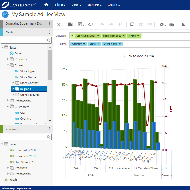
Histogram Charts with Jaspersoft
Related Resources
Jaspersoft in Action: Embedded BI Demo
See everything Jaspersoft has to offer – from creating beautiful data visualizations and dashboards to embedding them into your application.
Creating Addictive Dashboards
Learn how to build dashboards that your users will love. Turn your data into interactive, visually engaging metrics that can be embedded into your web application.