What is a Bar Chart?
A bar chart is a graphical representation used to display and compare discrete categories of data through rectangular bars, where the length or height of each bar is proportional to the frequency or value of the corresponding category.

From capturing trends across time and mapping geographic distributions to interpreting frequency distributions, there's seemingly no end to a bar chart’s applicability. Though they come in different variants, such as stacked, horizontal, grouped, and more, the common ground lies in how they reveal patterns and allow for quick, effective comparisons.
Anatomy of a Bar Chart
Decoding a bar chart begins with understanding its structure. While the simplicity of the bar chart resides in its visual clarity, each component of its anatomy has a pivotal role to play in interpreting the data it presents.
Just think of each bar as a category and its length as the magnitude or frequency. By glancing at a bar chart, the length of each bar gives a quick idea of the quantity for each category, letting the viewer compare and contrast them swiftly. Its scales, titles, and labels are among these integral components that lend clarity to the data represented.
Here is a detailed look at the integral parts of a bar chart:
Title
The title is the explanatory heading of the bar chart. It describes what the chart represents, aiding readers in understanding the purpose of the chart instantly. It usually sits at the top, is easily viewable, and should be clear, concise, and descriptive.
Bars
The bars are the main components of the chart. They represent categories or groups of data. Each bar's height (or length, in the case of a horizontal bar chart) represents the frequency or the quantity of the category it represents. The space between the bars is usually equal to demonstrate accurate comparisons.
X & Y Axes
The bar chart is divided into two axes – X, the horizontal axis, and Y, the vertical one.
- The X-Axis (Horizontal Axis): It's often where the different categories are represented. In the case of a time-series bar chart, this axis represents the timeline.
- The Y-Axis (Vertical Axis): This is the numerical scale that represents the quantities or frequencies associated with each category. The length (or height) of the corresponding bar indicates this value.
Scale
The scale is effectively marked along the Y-axis. It needs to be carefully chosen since it provides the measurement for the bar lengths. The scale should be chosen in a way that doesn't skew the outlook of the data and delivers a truthful representation.
Legend
In some bar charts, especially where multiple datasets are being compared, a legend communicates what each bar represents. It uses colors, patterns, or textures and correlating labels to differentiate between data sets.
Labels
Labels detail what each axis and bar represent. They show the values of individual bars. The Y-axis is generally labeled with numerical values, while the X-axis is labeled with the categories or groups in question.
Each of these elements works in unison to create a coherent and understandable image of the data at hand. When perusing a bar chart, paying attention to these elements will ensure a precise understanding of the information being shared.
The Power of Simplicity: Advantages of Using a Bar Chart
Universally recognized and adopted as an essential tool for data visualization, bar charts come with an array of inherent advantages appreciated by both the data scientists preparing them and the audiences interpreting them. Here, we delve into some of the key benefits of using bar charts, shedding light on why they are an indispensable tool in the realm of data representation.

Visual Clarity
Bar charts, through their minimalist design, offer a remarkable level of visual clarity. By transforming numerical or categorical data into a series of bars with varying lengths, they allow our brains to swiftly process and compare different data pieces visually, making interpretation faster and effortless.
Comparative Analysis Made Easy
One of the core strengths of bar charts is their ability to facilitate comparative analysis of data across different categories. This superiority in comparison clarity makes bar charts a commonly used tool in business presentations, academic research, and marketing research, where quick comparisons are essential.
Effective Communication of Data Trends
For a time-series dataset, bar charts elucidate trends and patterns over time efficiently. The sequence of bars provides a chronological representation, making it easier to discern patterns, peaks, and troughs in the data.
Versatile Variations
The bar chart isn't a one-size-fits-all solution but lends itself to multiple variations: horizontal bar charts, stacked bar charts, grouped bar charts, and more. These different formats cater to different needs, providing flexibility in choosing how to best represent your data.
Accommodate Large Data Sets
Bar charts can comfortably handle large datasets. Even when dealing with a broad range of categories or groups, they can conveniently codify the data in a manner that is easy on the eye and straightforward to interpret.
Ideal for Nominal and Small Ordinal Variable Data
Bar charts shine when dealing with nominal or small ordinal variable data, where categories are mutually exclusive and have no order or priority. They offer the ability to distinguish between different categories easily, making the information interpretation process simple.
Immediate Impact
A well-crafted bar chart delivers immediate impact in presentations or reports. It allows for the effective communication of key points and can spur discussion around the data, its trends, and its implications.
Multivariate Data Representation
Bar charts, specifically stacked and grouped variations, have the potential to represent multiple data series simultaneously in one chart. They show the part-to-whole relationships, segmenting individual data points into sub-parts under the umbrella of a total bar. This feature aids in encompassing multiple dimensions of data in one graphic representation.
Easy to Create and Understand
Finally, bar charts are straightforward both to create and interpret, irrespective of the audience’s statistical knowingness. Numerous software and online tools offer user-friendly interfaces for the creation of bar charts, aiding their proliferation.
While the choice of data representation form should always be tailored to the specific data set and the story you wish to tell, these manifold advantages make the humble bar chart a formidable contender for consideration. In the world of data visualization, where less is often more, the simplicity, impact, and effectiveness of bar charts have stood the test of time.
Exploring Alternative Data Visualization Techniques
The landscape of data visualization is diverse and expansive, offering numerous alternatives to bar charts. Each alternative brings its unique strengths and weaknesses and becomes suitable under varying data circumstances. Below, we'll discuss some of these alternatives, with a focus on their comparative features to a bar chart.
Line Graphs
Line graphs shine when visualizing changes over a time series, trend analysis, or when the dataset contains many variables. With data points plotted over an interval connected by lines, it becomes easier to identify trends, movements, fluctuations, and patterns.
However, they may not be ideal for categorical comparisons, where bar charts traditionally excel. They are also less optimal for sparse datasets and can be difficult to interpret when too many variables lead to overlapping lines.
Pie Charts
Pie charts excel at showing data's proportional parts to the whole, often expressed as percentages. Like the stacked variant of a bar chart, they effectively visualize part-to-whole comparisons within a dataset.
However, pie charts can become confusing and ineffective when used with too many categories, leading to a cluttered mess of pie slices. In contrast, bar charts can handle multiple categories more efficiently.
Histograms
Often confused with bar charts, histograms also use rectangular bars for representation. However, they are primarily used for showcasing the distribution of continuous rather than categorical data. Unlike bar charts, histograms place bars adjacent to each other, indicating that there are no discrete groups.
On the downside, histograms may not convey meanings as clearly as bar charts when it comes to comparing categorical data, where each category acts independently.
Scatter Plots
Scatter plots are a brilliant way to understand relationships between two numerical variables, plotting dots according to their coordinate values. They are beneficial for correlation analysis, outlier detection, and regression analysis.
However, for discrete categories or part-to-whole relations, scatter plots aren't as effective or intuitive as bar charts.
Area Charts
Area charts, similar to line graphs, are remarkable for tracking changes over time for one or more categories. They fill the area under the line, enhancing the visual impact of quantity comparisons and trends.
However, with multiple categories, they can become confusing or misleading due to overlapping areas. In such cases, a bar chart could deliver a clearer comparison.
Box-and-Whisker Plots
Box-and-whisker plots or box plots provide a view of data distribution, including median, quartiles, and potential outliers, in a five-number summary format. They provide insights into data spread and skewness at a glance.
However, they are not as intuitive for simple comparison tasks due to their more technical nature, where the bar chart remains a straightforward solution.
Ultimately, the best alternative to bar charts depends on the specific nature of your data, what you intend to present, and how your audience will understand it. Each visualization type carries its peculiar value, and determining the correct fit is an essential aspect of data storytelling.
Creating a Bar Chart – A Step-by-Step Guide
Creating a bar chart is a straightforward process, and with numerous software options available, you can make a bar chart easily, regardless of your technical proficiency. Here, we provide a generic, step-by-step guide, which you can modify and adapt according to the specific software or tool you're using.
Gather Your Data
Your first task is to collect the data you plan to represent in a bar chart. It could be anything from sales data, survey responses, demographic statistics, or any other kind of relevant quantitative or categorical data. Ensure that you have accurate data for both your categories (X-axis) and the corresponding values (Y-axis).
Choose Your Software
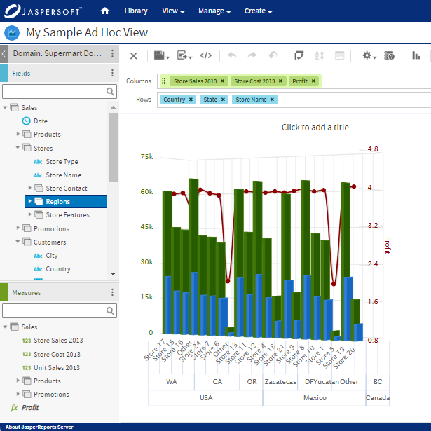
Numerous software and tools, such as Jaspersoft, has great tools for bar chart creation. Most tools provide a user-friendly interface, making the chart creation process relatively straightforward.
Input Your Data
Input your data into the chosen software. This step varies in style as different software has different interfaces for data input. Usually, you will enter your categorical data (bar labels) in one column and corresponding numerical data (bar lengths) in the adjacent column.
Select the Bar Chart Option
Choose the option to create a bar chart from the list of charts offered by the software. You may also find variations such as vertical or horizontal bar charts, stacked bar charts, grouped bar charts, etc. Select the one that fits your data presentation needs the best.
Customize Your Chart
After generating the basic chart, you’ll likely need to refine and customize it. This could entail adding or editing the title, setting your axis labels, choosing a color theme, adjusting the scale on the Y-axis, adding data labels, or any number of other modifications. Ensure each customization enhances the chart's clarity and aesthetic appeal rather than compromising it.
Interpret and Share the Chart
After finalizing the design, share your chart with your peers, colleagues, or intended audience. The most crucial part is to interpret the chart, extract insights, and drive discussions from it. Remember, your goal is not only to create a visually appealing chart but also to tell a compelling data story to enhance understanding or drive decision-making.
Creating a bar chart is relatively simple, but creating an effective one necessitates a good grasp of the data you’re presenting and the story you want to tell. By following the above steps, you'll be well on your way to crafting powerful bar charts that will communicate your data succinctly, provoking thought and facilitating informed decisions.
History and Origin of the Bar Chart
The bar chart, or bar graph as some may call it, has been a beacon of simplicity and clarity in data visualization for centuries. Notwithstanding its simple demeanor, the bar chart has an intriguing history.
The earliest known use of the bar chart dates back to the 14th century. It was a chart depicting the fluctuating prices of wheat, displaying variations over a span of time. The conventional horizontal layout was utilized, and by varying the length of bars, the information was clearly presented.
However, the advent of modern times brings us to William Playfair, an engineer, economist, and pioneer of graphical methods of statistics. He is widely regarded in the annals of statistical history for introducing the bar chart to the world in a more refined form in the late 18th century. Alongside bar charts, he is also credited with the invention of the line and pie charts.
Summary
The field of data visualization is brimming with diverse tools and charts, with one of the most widely utilized being the bar chart. Despite its simplicity, the bar chart is an effective and versatile tool for presenting data, providing visual clarity, facilitating comparative analysis, demonstrating data trends, and accommodating large data sets.
Alternative chart styles, such as line graphs, pie charts, histograms, scatter plots, area charts, and box-and-whisker plots, all have their unique strengths and potential applications, yet none universally outperforms the others. The choice depends on your distinct data and what story you want to tell.
Bar Charts with Jaspersoft
Related Resources
Jaspersoft in Action: Embedded BI Demo
See everything Jaspersoft has to offer – from creating beautiful data visualizations and dashboards to embedding them into your application.
Creating Addictive Dashboards
Learn how to build dashboards that your users will love. Turn your data into interactive, visually engaging metrics that can be embedded into your web application.