What is a Line Chart?
Line charts are graphical representations that succinctly illustrate trends and patterns in numerical data. For quantitative analysis, line charts excel in portraying continuous data over a specific period. This enables swift and comprehensive interpretation for businesses.

Line charts are far more than mere visual aids. They are a dynamic conduit for grasping the essence of data's evolution. Through a sequence of plotted points interconnected by lines, line charts capture the progression of a variable over time or another continuous interval.
These charts provide a concise representation of data dynamics, showcasing fluctuations, trends, and anomalies that may be concealed within raw data. To understand line charts, you need to identify and understand their foundational components.
Defining Line Chart
A line chart, also known as a line graph or curve chart, is a graphical representation used to display data points connected by straight lines. This type of chart is particularly useful for visualizing trends, changes, and relationships in data over a continuous interval, often time. Each data point on the chart represents a value associated with a specific category or time point. The connecting lines between these points allow viewers to discern patterns and variations in the data with ease.
Origins and Evolution
The roots of line charts can be traced back to the 18th century when they were first used by mathematicians and scientists to illustrate various mathematical functions. However, the modern concept of line charts gained prominence in the 19th century, notably with the works of renowned statisticians like William Playfair. His innovations in data visualization laid the foundation for the charts we recognize today. With the advent of computers and advanced software, line charts have become an indispensable tool for analysts, researchers, and decision-makers across diverse fields.
The Time-Tested Utility
Line charts excel in depicting changes over time, making them an ideal choice for tracking trends and identifying patterns in data sequences. By organizing data points along an x-axis (horizontal) representing time and a y-axis (vertical) indicating the data values, line charts provide a clear narrative of how variables evolve. This temporal perspective facilitates the identification of growth, decline, fluctuations, and potential outliers within datasets. Whether it's stock market trends, weather patterns, or population dynamics, line charts unveil stories hidden within the data's temporal dimension.

Types of Data That Can Be Displayed Using Line Charts
As you embark on this exploration of line charts, each data point connected by a line carries the potential to unveil narratives about change, growth, and fluctuations in the data. From their origins in mathematics and statistics to their present role in data-driven decision-making, line charts offer a unique lens through which to comprehend the dynamic nature of information.
Line charts are a versatile tool for visualizing various types of data that exhibit trends, changes, and relationships over time. Here are several types of data that are well-suited for representation using line charts.
Time Series Data
Line charts are particularly effective for showcasing time series data, where data points are collected and recorded at regular intervals over time. This type of data reveals trends, patterns, and seasonality, making it perfect for line charts. Examples include stock prices, temperature variations, sales figures, and website traffic data. By plotting these data points chronologically, line charts provide an immediate visual grasp of how values change over specific time periods.
Continuous Data
Continuous data is characterized by a smooth and uninterrupted flow of values. Line charts work well to display such data, enabling the visualization of gradual changes or fluctuations. These charts allow viewers to identify subtle shifts or trends within datasets. For instance, a line chart can effectively display population growth over years, where the data is continuously changing without abrupt interruptions.
Sequential Data
When data points are related in a sequential order, a line chart can help depict how values progress over the sequence. This type of data is often used to show processes or events that unfold over time. Line charts can illustrate step-by-step progressions, such as a project's timeline, educational attainment levels, or manufacturing stages.
Comparison of Multiple Data Sets
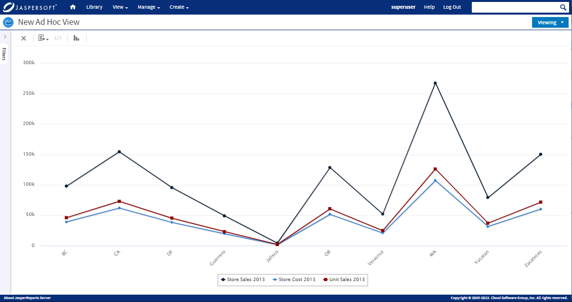
Line charts can also compare multiple data sets with different trends, revealing how their patterns diverge or converge. This is useful when you want to understand how different variables change in relation to each other. For example, a line chart could compare the revenue growth of different product categories over a specific period.
Fluctuations & Trends
Line charts are excellent for highlighting fluctuations and trends in data, even when they are not strictly related to time. These fluctuations could represent changes in any measurable quantity, such as monthly rainfall amounts, quarterly exam scores, or annual inflation rates. By displaying these fluctuations as a continuous line, the chart makes it easy to identify the overall trend while observing variations.
The versatility of line charts extends to various data types, offering an effective way to present insights from diverse fields. From time-based trends to continuous data flows, these charts have the power to make complex data understandable, uncovering valuable insights that inform decisions and strategies.
Continuous Variables & Line Charts
Line charts are especially suitable for visualizing continuous variables, which are numerical values that can take any value within a specific range. These variables often involve measurements that can be broken down into infinitely small increments. Line charts showcase the smooth progression of such variables, capturing their gradual changes and trends. For example, if you're plotting the temperature over the course of a day, the temperature is a continuous variable as it can change in infinitely small increments throughout the day. Line charts help reveal patterns and fluctuations in these variables, making them ideal for illustrating the relationships between different continuous measurements.

Examples of Data Sets & Line Chart Visualization
Here are some examples of data sets that are commonly depicted using line charts:
- Stock Prices: Line charts are frequently used to visualize stock prices over time. Each data point represents the closing price of a stock on a specific day. By connecting these data points with lines, a line chart provides a clear depiction of a stock's price movements and trends, aiding investors in identifying patterns and making informed decisions.
- Temperature Fluctuations: Temperature data, whether recorded hourly, daily, or monthly, can be effectively visualized using line charts. The chart displays how temperatures rise and fall, revealing seasonal changes, daily patterns, and anomalies.
- Population Growth: Line charts can depict population growth over decades or centuries. The chart illustrates how a population increases or decreases over time, helping demographers, sociologists, and policymakers understand demographic trends.
- Financial Metrics: Various financial metrics, such as revenue, profit, or expenses, can be visualized with line charts. These charts reveal trends and fluctuations in financial data, providing insights into the financial health of a company or organization.
- Economic Indicators: Economic indicators like GDP (Gross Domestic Product), inflation rates, and unemployment rates can be effectively represented using line charts. These charts offer a concise way to show the performance of an economy over time.
- Social Media Engagement: Line charts are often used to visualize metrics related to social media engagement, such as the number of likes, shares, and comments over time. This helps marketers and content creators understand the impact of their online content.
In essence, line charts offer a versatile solution for visualizing a wide range of continuous data. They simplify complex information, making it accessible and understandable, whether it's stock market trends, weather patterns, or demographic shifts.
Reading Line Charts
Line charts are effective tools for visualizing trends, patterns, and anomalies in data over time. Interpreting a line chart involves analyzing the plotted lines, identifying trends, and extracting insights.
Analyzing Patterns & Trends
Line charts allow you to spot trends in data easily. When the line slopes upward, it signifies an increasing trend. Conversely, a downward-sloping line indicates a decreasing trend.
Inflection Points, Peaks, & Valleys
Inflection points, where the trend changes direction, are essential to identify. Peaks represent the highest points on the line, indicating the peak values. Valleys, on the other hand, are the lowest points, representing the lowest values. These points offer insights into potential turning points in data trends.
Understanding line charts enables you to extract valuable insights from data trends, aiding decision-making and providing a comprehensive view of how values evolve over time.

Advantages of Line Charts
Line charts offer a range of distinct advantages that contribute to their popularity and effectiveness in visualizing data trends. These advantages make them an invaluable tool for analysts, researchers, and decision-makers seeking to understand and communicate complex data. Here's an in-depth exploration of these advantages:
Simplification of Complex Data
Line charts excel in simplifying intricate data sets. By transforming data points into a sequence of connected dots, these charts condense elaborate information into a clear visual representation. This simplification is especially valuable when dealing with large datasets, as it enables viewers to focus on overarching trends while minimizing cognitive overload. Complex data can be quickly grasped and interpreted.
Enhanced Visibility of Trends
Line charts are unparalleled in their ability to illuminate trends over time. The continuous lines that connect data points provide an immediate overview of how values change across different time intervals. This dynamic representation not only reveals patterns and fluctuations but also showcases the trajectory of data points. This feature is particularly useful for detecting gradual changes and seasonality that might be obscured in raw data.
Effective Communication of Narratives
Line charts are not just visual representations; they tell compelling data-driven stories. They bring data to life, visually illustrating progressions, changes, and trends. This makes them an invaluable tool for communicating insights in presentations, reports, or discussions. For instance, a line chart depicting the upward trajectory of quarterly profits effectively communicates the growth story of a business.
Comparative Analysis
Line charts enable both the visualization and comparison of multiple trends simultaneously. By plotting multiple lines representing different variables on the same chart, viewers can easily discern correlations, relationships, and disparities. This capability enriches data analysis by offering deeper insights into how various data sets interact and influence each other.
Predictive Insights
Line charts are not only descriptive but also predictive tools. By analyzing historical trends, analysts can extrapolate potential future patterns. For instance, studying a line chart displaying past sales figures might reveal consistent spikes during holiday seasons, facilitating informed predictions and strategic planning.
Ease of Interpretation
The innate simplicity of line charts contributes to their widespread appeal. They are straightforward and easy to understand, making them accessible to a diverse range of audiences. Whether the audience comprises data experts or individuals with limited analytical experience, line charts facilitate quick and meaningful insights. This ease of interpretation enhances effective communication of data-driven findings.
Visualizing Continuous Data
Line charts are particularly effective in visualizing continuous data, such as time-series information. As time progresses, line charts offer an uninterrupted visual representation of how values evolve, making them ideal for tracking phenomena that unfold over extended periods. This continuous depiction aids in understanding the patterns and trends that emerge over time.
Limitations & Considerations
While line charts are a versatile and powerful tool for visualizing trends, it's important to be aware of their limitations and consider certain factors when using them. Understanding these limitations and considerations helps ensure accurate and meaningful data representation.
Limited Data Relationships Beyond Trends
Line charts excel in depicting trends over time. However, their effectiveness diminishes when it comes to illustrating complex data relationships or correlations that extend beyond simple trends. For instance, if you need to showcase how multiple variables interact in a multivariate scenario, a different chart type, such as a scatter plot or a bubble chart, might be more suitable.
Data Nature & Suitability
Consider the nature of your data before opting for a line chart. Line charts are most effective for displaying continuous data, such as time-series information or sequences. If your data is categorical or discrete, using a bar chart or a pie chart might better capture its essence. Always choose a chart type that aligns with the inherent nature of your data to ensure accurate representation.
Contextual Clarity
Context is key when interpreting line charts. Failing to provide adequate context can lead to misinterpretation. Make sure to label your axes clearly, provide relevant units, and include descriptive titles. Additionally, adding annotations or explanatory notes can help viewers understand sudden spikes, dips, or anomalies in the data. Contextual clarity ensures that your audience grasps the implications of the trends they are observing.
Avoiding Overcrowding
When plotting numerous data series on a single line chart, the risk of overcrowding arises. Too many lines can lead to a cluttered and confusing visualization, making it difficult to discern individual trends. In such cases, consider using multiple line charts or grouping related data series to maintain visual clarity.
Misleading Visual Perception
Line charts rely on visual perception to convey information. However, this can sometimes lead to misinterpretation. Viewers might perceive a change in slope as a more significant change than it actually is. For example, a minor change in sales might appear drastic due to the visual representation. To address this, consider using a logarithmic scale if your data spans multiple orders of magnitude.
Selecting Appropriate Intervals
When working with time-series data, selecting the appropriate time intervals for the x-axis is crucial. Choosing intervals that are too large can oversimplify trends, while intervals that are too small might overwhelm viewers with data points. Finding the right balance ensures that your line chart effectively captures the patterns you want to showcase.
While line charts are an invaluable tool for depicting trends over time, understanding their limitations and considering the nature of your data is essential for accurate and meaningful representation. By choosing the right chart type, providing proper context, and being mindful of potential pitfalls, you can harness the power of line charts to effectively communicate insights and patterns within your data.
In real-world applications, line charts prove invaluable for deciphering trends, patterns, and changes over time. They simplify complex data into clear visual narratives. This allows line charts to empower professionals to make informed decisions, develop strategies, and gain deeper insights into their respective domains.
Line Charts with Jaspersoft
Related Resources
Jaspersoft in Action: Embedded BI Demo
See everything Jaspersoft has to offer – from creating beautiful data visualizations and dashboards to embedding them into your application.
Creating Addictive Dashboards
Learn how to build dashboards that your users will love. Turn your data into interactive, visually engaging metrics that can be embedded into your web application.
