



What is a Pie Chart?
A pie chart is a type of graph representing data in a circular form, with each slice of the circle representing a fraction or proportionate part of the whole. All slices of the pie add up to make the whole equaling 100 percent and 360 degrees.
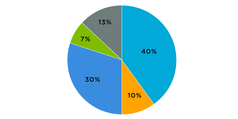
The pie chart represents data in a pictorial form, making it easier to visualize and understand the proportionate parts or composition of a data set. It’s also sometimes referred to as a circle chart.
The slices of the pie are often represented with percentages, signifying their contribution to the whole. This isn’t mandatory; a pie chart can be drawn by directly converting data values into degrees. However, converting into percentages makes data more comprehensible for an average reader.
What is a Pie Chart Used For?
Compared to several other types of charts and graphs, pie charts have fairly limited use-case applications. You can only use a pie chart to represent the parts of a whole. In other words, the data and categories must be subsets of a larger data group of a single category to be denoted via a pie chart.
A pie chart is used to:
- Show parts-to-whole relationship
- Demonstrate each element’s contribution to the whole
- Compare the contribution of different categories to the whole
A pie chart helps us better visualize and comprehend categorical and numerical data that can otherwise be confusing or difficult to understand.
Common Uses of Pie Chart
Here are some examples of how a pie chart can be used in the real world:
- To represent growth areas in businesses, such as profit and loss, what departments/teams/activities generated the most profit during a specific time, or to identify the least growth areas.
- To signify market trends and consumer behaviors
- To identify/display the contribution of different marketing strategies or tools
- To represent sales data
- To show the performance of projects, tools, strategies, or individuals
- To demonstrate employee behaviors
{{cta-1}}
The Advantages of Using a Pie Chart
Despite the fact that a pie chart has limited application compared to many of its counterparts (other types of graphs), it’s widely used in almost every sector. The reason is the many advantages it offers to those working with data.
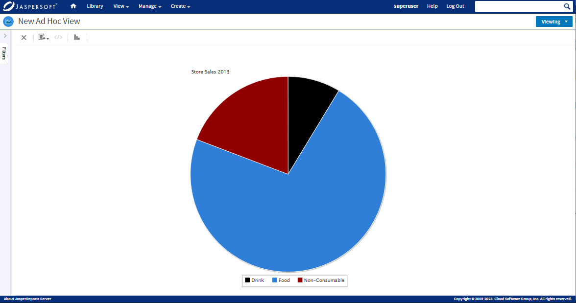
Let’s look at some of the advantages of using a pie chart to represent data to develop a better understanding:
- A pie chart represents data in a simple and easy-to-understand format
- It’s easy to draw. Making a pie chart doesn’t require statistics or data science knowledge. Though most (if not all) people now use computer programs to draw charts and graphs, a pie chart is easy to make manually, too. The process is simple, and so are the calculations for converting data into percentages and degrees.
- The pie chart provides clean and clear data visualization, allowing quick understanding and immediate analysis.
- A pie chart is one of the most (if not the most) efficient and effective tools to share statistical data with the general public.
Best Practices for Using a Pie Chart
Here are some tips and suggestions to make your pie charts more effective and impactful:
Add Annotations
Discerning the proportions or values of the slices of the pie can be very difficult without annotations. Hence, they are almost always used in pie charts.
Don’t Use Too Many Categories
The higher the number of categories or data values, the more slices a pie chart will have. And too many slices will make the chart difficult to read and understand. While there is no rule regarding how many categories you can add to a pie chart, and recommendations also vary, most experts suggest limiting them keeping them to five. If you have a data group with more than five categories, it’s best to consider using a different type of chart or graph.
Merge Smaller Categories
If you must use a pie chart for a bigger data set, consider combining the smallest categories into one slice and label it as “others.”
You may or may not choose to explain what categories the “others” section of the chart includes.
Consider the Order
There is no rule on how you should arrange categories in a pie chart, but the order of slices impacts on user perception and comprehension. A good order for slices of the pie is the cardinal orientation (starting from the top right and moving in a clockwise direction). For data sets that do not include inherent ordering, as is the case with surveys rated on the Strongly Agree to Strongly Disagree scale, you can also arrange slices of the pie in order of size, going from the largest data segment or category to the smallest.
Keep It Simple
You may want to add multiple effects to make your pie chart look good or more impactful. But, more often than not (if not always), they have the opposite effect.
Too many visual elements, like 3-D effects, adding depth, exploding pieces for emphasis, or stretching or squashing the pie, can disrupt visualization, which is the key positive element of a pie chart. They can make it difficult to determine the part-to-whole value or proportion.
When Not to Use a Pie Chart?
Now that we have discussed the pie chart’s most common uses, benefits, and best practices, let’s talk a little bit about what it not suitable for or when not to use it. Some common data sets that a pie chart isn’t fit for include the following:
- When the data cannot be distributed or converted into percentages.
- When the percentages add up to a value greater than 100, as can happen in surveys where the participants are allowed to choose more than one answer.
- When you have a lot of categories, even if the data is in percentages that add up to 100. A pie chart with too many slices will only confuse the data.
- If the values or percentages of your data categories are very close to each other (within 5 to 10 percentage points), it’s best to use some other type of chart/graph to represent them. A pie chart with similar percentages is not impactful. The readers won’t know what to get out of the data.
- When you have continuous data with many possible values, such as age, weight, speed, or temperature.
- When you want to show precise comparisons between different data sets, while a pie chart may show major differences between different data groups, it fails to demonstrate smaller differences efficiently.
- When you don’t have exclusive data categories.
- Don't use the pie chart if you want a visualization tool to show data changes over time.
Any data that complicates or compromises the visual value of the pie chart is better represented via some other type of graph.
The purpose of representing data in the form of a graph or chart is to help make it easier to visualize and understand data. If a particular chart isn’t serving the purpose, use another type.
Common Misuses of Pie Chart
Despite its simple concept, misuses of the pie chart are not uncommon. Some of the mistakes people often make with pie charts include:
- Using Pie Chart for the Wrong Type of Data – People often use pie charts to represent data that does not offer parts to the whole relationship. This mistake is more common with data values are in proportions or percentages. However, they do not belong to the same, larger data set or add up to make 100%.
- Using Pie Chart to Compare Data Groups - Pie charts are meant to highlight the contribution or share of each part to the whole. You may use it to compare different sub-groups within a larger dataset, but you cannot use it to compare different data groups to one another.
Are There Any Disadvantages to a Pie Chart?
There are no disadvantages to a pie chart, per se. But, like any other tool, it has a few limitations. These include:
- A pie chart loses its effectiveness when there are too many data categories.
- It’s only used to represent the components or categories of one data set.
- You need more than one pie chart to compare multiple data sets.
- Using more than one pie chart can make it difficult for an average reader to understand and analyze the data, which kills the whole purpose of using pie charts for their higher visualization value.
{{cta-3}}
What Data Do You Need for a Pie Chart?
Drawing a pie chart is easy. There are a variety of computer software or applications that can draw pie charts for you. Making a pie chart doesn’t require a lot of data, either.
You only need two sets of data variables to make a pie chart. These include:
- Categorical Variables – The various categories that make the whole data set.
- Numeric Variables – The percentage each categorical variable carries in the whole.
In the above-given example, toilet, shower, faucet, clothes washer, leak, and others are the categorical variables, and the percentage each of them carries representing their contribution to the total water use are the numeric variables.
How to Calculate Percentages and Degrees for a Pie Chart?
As mentioned earlier, the sum of all the data in a pie chart must be 360 degrees, and the total value of the slices of the pie should be 100%. Here are the pie chart formulas used to calculate these values:
Pie Chart Formula to Calculate Percentages
(Frequency (of one data variable)/ Total Frequency) x 100
Pie Chart Formula to Calculate Degrees
(Given Data/ Total Value of Data) x 360o
Here are the steps to convert data into percentages and degrees for a pie chart:
- Categorize data
- Calculate the total
- Make categories
- Calculate percentages
- Convert each data segment into degrees
Is a Pie Chart the Same as a Donut Chart?
The donut chart is a variation of the pie chart. While both have quite a few similarities, they aren’t exactly the same. Both, however, essentially serve the same purpose, i.e., help visualize data as parts of the whole. One thing that gives donut charts an edge over the standard pie charts is that they allow for more visual effects – illustrations and iconography. A donut chart also takes less visual space.
The primary difference between a standard pie chart and a donut chart is that the latter can also be used to represent just one data segment or a single percentage.
Pie Chart Alternatives
A pie chart isn’t always the best tool for data visualization. There may also be situations where you have to use different types of charts to prevent your documents from getting monotonous, such as in data-heavy infographics or presentations. In circumstances like these or any other when you don’t want to use a pie chart to represent data, here are some alternatives to pie charts you may choose from:
- Bar Chart – Best for representing data with many categories and comparing different data sets.
- Line Chart – Ideal for visualizing data that represent change over a long period of time but can also demonstrate fluctuations within a small period. Line charts are commonly used to display and measure behaviors and performances over time.
- Dumbbell Chart – This data visualization method shows changes between multiple dataset groups over time. It’s also a good tool for comparing two data groups. Dumbbell charts are easy to read and also simplify complex analyses.
- Donut Chart – The donut chart is the most similar to a pie chart of all these options. Both are used to show the relationship of parts to the whole. A donut chart, however, can also be used to represent a single data percentage.
- Waffle Chart – Living up to its name, a waffle chart is a square grid comprised of multiple smaller square boxes called icons. It typically includes 100 icons in a 10x10 grid, with each icon representing 1%. The icons are filled with different colors according to data values. A waffle chart is also sometimes called a square chart.
- Flowchart – To show relationships between different categories or data sets.
Pie charts are one of the simplest data visualization techniques. They are easy to make and read and, hence, are often a staple in data visualization toolkits across a range of sectors. However, like any other tool, they have a few limitations, too. The effectiveness or the impact of a pie chart depends on the nature of the data that you use it to represent. If you can get that right, a pie chart will be one of the most impactful ways to visualize data.
Ready to give it a spin?
Start your 30-day trial now.

Try Jaspersoft - Free Trial
Efficiently design, embed, and distribute reports and dashboards at scale with Jaspersoft.

Build versus Buy: An In-depth Guide
This whitepaper provides a framework for the decision-making process and critical trade-offs between building or buying an embedded BI and reporting tool.
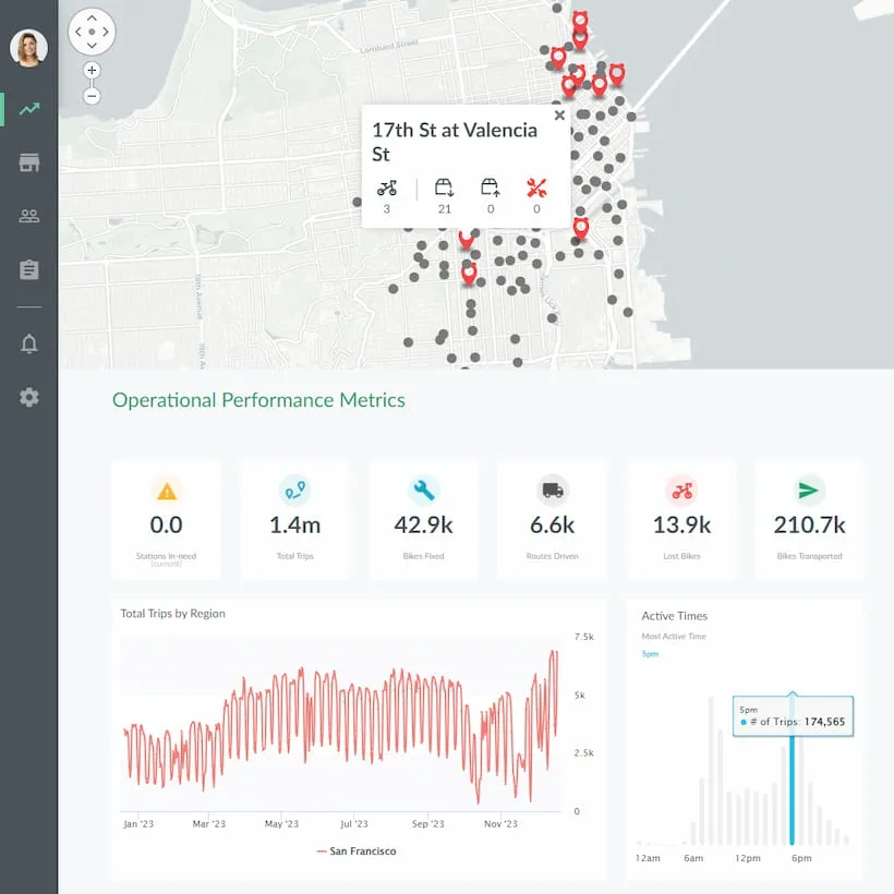
Interactive demo: Bikeshare Embedded BI, supported by Jaspersoft
Experience how to turn data into valuable insights that you and your customers can use to make better decisions.
