What is a Donut Chart?
A donut chart is a type of pie chart that features a hole in the center, similar to a donut. Donut charts present categories in the form of arcs instead of slices. Although, at first impression, the hole in the center may only seem to serve as aesthetic appeal, it serves a greater purpose by helping viewers avoid confusion surrounding the area parameter.

For years, individuals have used donut charts to present complex information. Although donut charts resemble pie charts, they are much easier to interpret due to their ability to help viewers focus on the changes in values instead of stressing the relative sizes of the sectors. Furthermore, donut charts are easy to create and have a more modern appeal than other infographic options.
Types of Donut Charts
Unlike other charts, which may have several different types and variations, donut charts can be divided into only two types: a simple and an exploded donut chart.
Here is how we can differentiate both types of donut charts.
Simple Donut Chart
A simple donut chart is the most commonly used type of donut chart. It features a ring displaying data through a segment. The primary aim of a simple donut chart is to represent the relative options of the varying segments while maintaining a visually appealing and cohesive appearance. The inner ring of the donut chart doesn't include any segments and is often empty. However, some simple donut charts may feature labels, annotations, or additional information.
Exploded Donut Chart
An exploded donut chart is a slightly more complex version of a simple donut chart. These charts have a slightly different construction than a simple donut chart since they feature one or more segments at a distance from the center. This separation allows the chosen segments to explode outward, highlighting those specific cells. Exploded donut charts are usually used to represent hierarchical relationships visually. Separating specific cells can highlight particular categories, allowing the viewers to pay increased attention to the products they represent.
Anatomy of a Donut Chart
The task of learning how to decode a donut chart requires one to understand each component of its structure in detail. Each donut chart component serves an important purpose, allowing viewers to interpret the presented data efficiently. Here is an in-depth look at the anatomy of a donut chart:
Outer and Inner Rings
Upon first glance at a donut chart, the details that a viewer picks up are the inner and outer rings. The outer ring usually represents the entire data set. It is split into a few cells representing a specific data segment or category. The size of every cell can vary and is proportional to the values it portrays within the whole. On the other hand, the inner ring serves as an area for annotations or labels. However, people often choose not to include an inner ring in a donut chart since it can easily be misinterpreted.
Cells (Data Segments)
The cells, often known as data segments or slices, refer to the individual sections within a donut chart. Each cell represents a category and the percentage of the category relative to the whole. The larger the cell, the higher the proportion it represents. The ability to allocate categories and their proportions into individual cells allows viewers to easily depict the distribution of each value across the categories and understand the message the donut chart aims to convey.
Title and Labels
Every donut chart has a title and labels. The title helps convey information about what the donut chart represents as a whole, whereas the labels help classify the purpose and meaning of each cell, helping provide a context. The title and labels help viewers understand the context of the donut chart and evaluate the visual information accordingly to comprehend the statistics or data being presented through the chart.
Legend
The legend is an integral component of a donut chart that helps viewers understand the color coding on the chart. Although not all donut charts have legends, having a legend becomes necessary for charts that might feature various categories. A legend allows for a swift understanding of the association between the different colors within the donut chart. This visual cue also helps reduce instances of confusion or misinterpretation.
Pros and Cons of Donut Charts
Pros
Customization
The extensive customization features of a donut chart are a major advantage, allowing individuals like businessmen, teachers, or students to custom-create charts according to the audience, goals, and context. Custom donut charts can help easily convert complex data from user reports, studies, researchers, and educational materials into an easy-to-understand visual narrative.

Furthermore, donut charts allow one to experiment with varying color palettes that help create visually appealing results. The option to custom-pick the color palette for a donut chart allows you to align the chart's aesthetics with your business's color scheme. Moreover, this can empower data visualizers to create compelling charts by leveraging the art of color psychology and carefully picking colors to evoke the desired emotions.
Additionally, data visualizers can add labels and annotations to donut charts, helping improve their readability and offering a clear link between the visual factors of the chart and the data it represents. The ability to custom-create exploded variations of donut charts can help data visualizers separate important data segments from the rest of the chart, helping divert the viewer's focus to it.
User-Friendly
The user-friendly nature of donut charts is among its most compelling benefits. Donut charts feature an easy-to-draw, circular structure encompassing data cells. The straightforward design of donut charts simplifies the creation process, allowing even individuals with beginner technical skills to create custom donut chart designs efficiently.
Moreover, since donut charts excel in efficiently communicating complex information, they serve as a major advantage when an individual wishes to share complex data with viewers unfamiliar with the ins and outs of data analysis techniques.
The user-friendly characteristics of a donut chart promote inclusivity, allowing more individuals to understand and engage with data insights. These charts benefit several sectors and settings, including education, corporate or healthcare. Additionally, these charts can break free from cultural and language barriers. They can help facilitate conversation and collaboration among professionals from different countries, cultures, and languages.
Easy to Understand
The intuitive and simple nature is a major advantage of donut charts. Their simple design allows even the least experienced individuals, like students or beginners, to comprehend the information easily. Donut charts have a simple way of portraying data and information through cells, allowing each cell and its size to represent how each category contributes to a whole.
The simple relation of the data value and visual response helps reduce the likelihood of the need for complex mental calculations or misinformation. The circular shape of a donut chart also helps viewers leverage their inherent ability to efficiently and swiftly process visual patterns. Therefore, even individuals with zero experience decoding infographics like donut charts can understand the message a donut chart aims to convey.
Moreover, the minimalist attributes of donut charts and the fact that they only include a few critical components like the outer and inner cells, segments, tiles, and legend help prevent issues like cognitive overload, allowing one to learn how to decode the charts easily. The ease of understanding donut charts can be incredibly helpful when data visualizers are required to create visual diagrams that quickly convey information and encourage rapid discussions.
Cons
Not Suitable for Constantly Changing Data
The static attributes of donut charts make them inappropriate for data that might demand real-time updates. The charts feature fixed cells that are difficult to update later on since an attempt to update them usually leads to issues like a cluttered visual display. Furthermore, the circular design of donut charts is not ideal for conveying rapidly changing information. Therefore, for data that is constantly evolving, visualization formats like line charts are more suitable choices.
Limited Categories
Another major limitation of donut charts is that they may only support a limited number of categories. Adding more than a certain number of categories or cells to a donut chart can rapidly cause it to become a disorganized and confusing display of information. As the number of cells on a donut chart increases, the available space remains constrained, resulting in a dramatic drop in clarity. This can result in viewers struggling to interpret disorganized data points, lines, and labels.
Moreover, this can also increase the likelihood of flawed insights and misinterpretations. The excessive amount of information displayed may obscure the significance of each cell, rendering the chart useless for achieving its intended goal. Therefore, it is crucial to follow the principle less is more when curating a donut chart to represent data and focusing on creating fewer categories to enhance the visual integrity of the presented data.
Best Practices for Creating a Donut Chart
As stated above, donut charts come with the risk of misinterpretations and flawed insights. However, there are a few best practices one can follow to ensure they create high-quality donut charts. Here is a list of best practices for creating donut charts.
Avoid Over-cluttering a Donut Chat with Several Categories
It is important to consider the scope of your data presentation when creating donut charts. Donut charts are more effective and easy to understand when they portray limited categories. The human brain can recognize the relationship between only a limited number of data sets at a time.
Therefore, you want to avoid going overboard with the number of categories you add to a donut chart. It can be increasingly challenging to interpret a donut chart as it becomes overcrowded with several categories. This can lead viewers to lose interest in the information being portrayed or have difficulty understanding the proportions and relationships conveyed through the chart. Hence, create a simple display of part-to-whole relationships by limiting the number of data segments.
Clearly Label Each Component of the Donut Chart
One of the key aspects of producing quality donut charts is to have clear labels on each component. Every category on the chart should have easy-to-read and informative labels that can help visitors immediately understand the information the segment represents. By incorporating labels for category names and quantitative details, you can create powerful donut charts that convey complex information through a simple glance.
Furthermore, ensuring the readability of every label should be a priority when creating donut charts. This involves ensuring no labels overlap or blend into the background color. Overlapping labels or improper color selections can significantly impact the visuals of a donut chart, making it difficult for the audience to understand the information being represented.
Prioritize Careful Color Selection
Careful selection of colors is crucial to ensuring the effectiveness of a donut chart. Choosing vibrant, coherent, and visually harmonious colors is essential to distinguish the various categories clearly. A well-thought-out color scheme can help you quickly improve the viewers' ability to pinpoint the information conveyed through each category.
Avoid Using 3D Effects
Sometimes, people may use 3D effects on their donut charts to create a more visually appealing layout. However, it is important to understand that these visual embellishments come with the risk of compromised clarity. 3D effects can significantly distort the alignment of proportions and make it difficult for the audience to interpret the relative sizes of every component accurately.
This distortion stems from the illusion of depth that 3D effects create, leading to categories appearing smaller or larger than they truly might be. Since the goal of creating donut charts is to represent relationships between segments clearly, it is best to avoid design layouts that might hinder you in achieving that. Instead, stick to a simple chart layout by choosing a flat, two-dimensional layout.
History of the Donut Chart
The history of donut charts is closely linked to the broader history of charting techniques like the pie chart. As discussed above, donut charts feature a circular shape, similar to pie charts. However, the one feature that sets them apart is the ring in the center. So before we dive into the history of donut charts, we must discuss how pie charts came about. The discovery of the pie chart is credited to a Scottish economist named Willian Playfair. Playfair introduced the pie chart model during the 17th century.
The main purpose behind the introduction of the pie chart was to find a way to present complex statistical data concisely and understandably. After the pie chart was introduced, various economists came out with varying models of circular graphs, aiming to enhance their effectiveness.
The main goal behind the various attempts at modifying circular graphs like pie charts was to address some of the drawbacks of these charts, including difficulties that people faced in labeling smaller sections or comparing cells.
While it is unclear who introduced the Donut Chart variation of the Pie Chart, the credit for its introduction goes to Willian Playfair since he was the visionary who first introduced circular graphs. As people continued experimenting with the donut chart model and digital design tools took over, creating and customizing donut charts became easier and more accessible. With the introduction of software and tools, it became more convenient and simple for people to present data visually.
Donut charts continue to serve as a popular method of representing data in the 21st century. They are used in various sectors, including healthcare, business, education, and finance. Donut charts have helped revolutionize how we portray complex information and statistics, allowing us to display it in an easy-to-understand manner.
Summary
The data visualization landscape offers various types of diverse charts and tools, with donut charts among the most commonly used data visualization charts. Despite their simple design structure, donut charts efficiently convey complex data with heightened visual clarity.
Although donut charts offer several advantages, like being user-friendly, easy to customize, and easy to understand, they have limitations like fewer categories. Hence, they are not suitable for constantly changing data. Ultimately, whether you should use a donut chart depends on your preferences and the type of data you wish to portray.
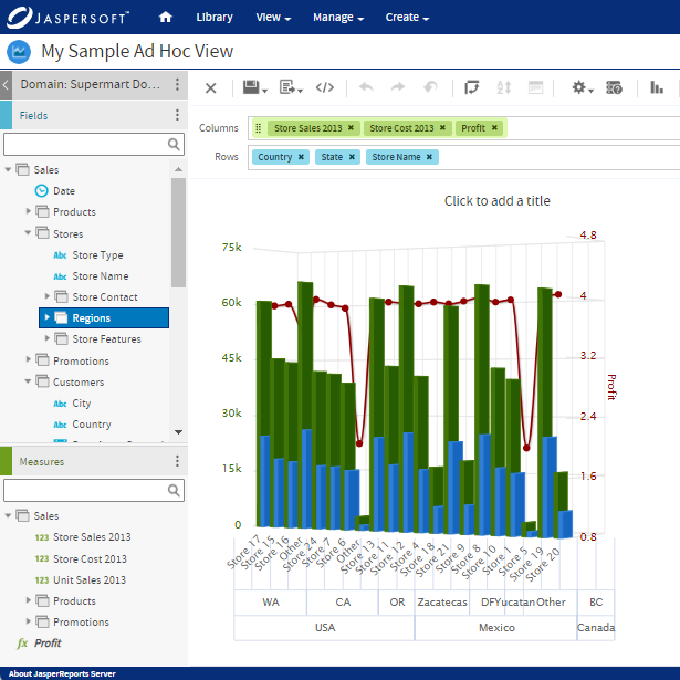
Donut Charts with Jaspersoft
Related Resources
Jaspersoft in Action: Embedded BI Demo
See everything Jaspersoft has to offer – from creating beautiful data visualizations and dashboards to embedding them into your application.
Creating Addictive Dashboards
Learn how to build dashboards that your users will love. Turn your data into interactive, visually engaging metrics that can be embedded into your web application.