What is an Area Chart?
An area chart is a visual representation of data that utilizes both lines and filled areas to convey information. This type of chart is particularly effective in showcasing data trends and variations over a specified period or across different categories.

It is a key tool used by businesses to transform insights into a compelling visual. It is part of a larger chart network used in business intelligence to promote better decisions.
As businesses, researchers, and individuals grapple with copious amounts of data, the need to present this information in a coherent and visually engaging manner has become paramount. The area chart is a fundamental tool of the data visualization.
It serves this purpose by providing a clear and intuitive representation of data over time or across categories. Area charts harness lines and shaded areas, an area chart unveils the story behind the numbers within its body. This makes it easier to comprehend complex data relationships, trends, and fluctuations.
Understanding Area Charts
Unlike traditional line charts that only depict data with lines, an area chart introduces an additional layer by filling the space between the lines and the x-axis with color. This creates a visual “area” context for understanding the magnitude and distribution of data points.

Representation of Data
The core principle behind an area chart involves using lines to connect data points and filling the area below these lines to the x-axis. Each data series contributes to the formation of a distinct shaded region. This emphasizes its contribution to the overall trend.
As the data points fluctuate, the shaded areas expand or contract. As a result, the area provides an immediate visual insight into the changes within the dataset. The shaded regions in an area chart hold significant meaning.
The vertical space between the line and the x-axis represents the values of the data points at a given moment or category. By analyzing the width and height of these shaded areas, viewers can understand both the individual data values and their cumulative effect. As a result, it enhances the comprehension of trends, contrasts, and relationships within the dataset.
Introduction of the Z-Axis
While area charts primarily employ the x-axis for categories and the y-axis for data values, the introduction of the z-axis adds depth to the visualization. This three-dimensional approach is known as a 3D area chart.
The z-axis accommodates an additional data dimension, which could be represented by color or height. However, it's important to note that while a 3D area chart can add depth, it may also introduce complexities and challenges in interpretation due to potential distortions caused by the third dimension.
Understanding these foundational aspects of area charts sets the stage for harnessing their potential to unravel data intricacies and present insights in an accessible and impactful manner.
Components of an Area Chart
An area chart is a powerful data visualization tool that combines the simplicity of a line chart with the emphasis on cumulative values. It effectively showcases the evolution of various data series over time or categories, highlighting both individual trends and the overall pattern.
To fully understand the intricacies of an area chart, it's essential to grasp its key components, each contributing to its informative and visually appealing nature.
X-Axis: Providing Context & Progression
The x-axis, often referred to as the horizontal axis, serves as the foundation of an area chart. It represents the categories or time intervals under consideration. Whether displaying monthly sales performance or tracking the progress of a project over quarters, the x-axis provides context for interpreting the data points plotted on the chart.
Each point along the x-axis corresponds to a specific category or time unit. This, in turn, creates a logical progression that aids in visualizing trends.
Y-Axis: Quantifying & Scaling
The y-axis, or the vertical axis, is where the quantitative values of the data are represented. It provides a scale that allows viewers to understand the magnitude of the data points. Each tick mark on the y-axis corresponds to a specific numerical value. This scaling helps viewers accurately assess the variations and relationships between different data points.
Data Series: Visualizing Trends
The core of an area chart is formed by one or more data series. A data series consists of a line that connects data points representing the values of a specific variable. These lines are drawn along the y-axis, with each point's height corresponding to the value of that data series for the given category or time period.
By including multiple data series on a single chart, comparisons and contrasts between different variables become clear. The different colors assigned to each data set further enhance the difference between them, also known as the filled area.
Filled Area: Depicting Cumulative Values
One of the distinct features of an area chart is the shaded region between the data series lines and the x-axis. This filled area represents the cumulative values of the data points in each category or time interval.
As the lines of the data series rise and fall, the filled area beneath them visually emphasizes the growth or decline in cumulative values. These rises and falls become more apparent due to the color and shading within.
Color & Shading: Enhancing Visual Discrimination
Color plays a pivotal role in distinguishing between various data series. Each data series is assigned a unique color, and the filled area beneath the line is shaded with that color. The color differentiation allows viewers to quickly identify which data series corresponds to which color, even when the lines intersect.
Shading enhances this distinction and provides an intuitive visualization of the cumulative contributions of each data series. It also helps viewers make important distinctions between different datasets with a single peak.
Legend: Clear Reference Guide
To prevent confusion, area charts often include a legend. This legend provides information about the color coding used for each data series. It offers a reference guide that helps viewers associate colors with specific variables or categories, allowing for a seamless interpretation of the chart.
Here's a table summarizing these components along with definitions and examples:
| Component | Definition | Example |
|---|---|---|
X-Axis |
The horizontal axis indicating categories or time. |
Months (Jan, Feb, Mar, ...) |
Y-Axis |
The vertical axis showing numerical values. |
Sales Revenue ($) |
Data Series |
Lines connecting data points of the same category. |
Data Series A, B, C |
Filled Area |
Shaded region between lines and x-axis. |
Area below Data Series A |
Color and Shading |
Different colors for data series to aid distinction. |
Blue for A, Green for B |
Legend |
Guide explaining color-coding and data series. |
A: Sales, B: Expenses |
Types, Use Cases & Benefits
Area charts come in various types, each serving specific analytical needs. Let's delve into the different types of area charts and explore their applications:
- Traditional Area Charts: These charts are ideal for showcasing how a single dataset changes over time. By plotting a single data series as a filled area, they help in visually tracking trends, identifying patterns, and understanding fluctuations.
- Stacked Area Charts: Stacked area charts are invaluable when you want to not only show individual data series but also their cumulative composition. This type of chart is particularly useful for comparing the total magnitude of different categories while maintaining the insight into the contribution of each sub-category.
- 100% Stacked Area Charts: These charts are similar to stacked area charts, but they depict the relative proportions of different data series as percentages. This type is advantageous for highlighting the distribution of elements within a whole over time.
Use Cases
Area charts find their utility across various scenarios, offering several benefits in data representation:
- Trend Analysis: Area charts excel in displaying trends over time. Whether it's sales figures, website traffic, or stock prices, an area chart allows you to observe patterns, shifts, and seasonality.
- Comparison: When dealing with multiple data series, an area chart provides an efficient way to compare their trends and relationships. The stacking mechanism visually highlights the combined impact while still distinguishing individual components.
- Part-to-Whole Relationships: Stacked and 100% stacked area charts are exceptional for depicting part-to-whole relationships. Whether you're presenting the sales contribution of different products or the demographic breakdown of your customer base, these charts offer a clear representation.
- Visual Clarity: The visual representation of filled areas in an area chart enhances the clarity of data interpretation. The shaded regions make it easier to grasp the magnitude of changes and variations.
- Data-Driven Decisions: The insights drawn from area charts empower decision-makers. By identifying trends and comparing data series, businesses can make informed choices about resource allocation, marketing strategies, and more.
Incorporating area charts into data analysis not only enriches the visualization of information but also aids in communicating insights effectively to both experts and non-experts. Their versatility in capturing trends, proportions, and comparisons makes them a valuable asset for executives.
Interpreting Patterns in Area Charts
Interpreting area charts goes beyond mere visual observation; it involves understanding the dynamics of the shaded areas and how they represent the underlying data. Some key interpretations include:
- Trends Over Time: If you're using time periods on the x-axis, observe the patterns formed by the shaded areas. A rising area indicates an increase over time.
- Comparing Data Sets: Stacked area charts allow you to compare the total size of different data series. The total height of the stacked areas at any point illustrates the cumulative value of all data series.
- Part-to-Whole Relationships: 100% stacked area charts reveal how individual parts contribute to the whole. This is particularly useful for showcasing proportions.
Potential Pitfalls & Misinterpretations
While area charts are valuable tools for visualizing data, there are potential pitfalls and misinterpretations that can arise if not used and presented correctly. Being aware of these issues can help ensure accurate and insightful data communication.
Lack of Contex
One common mistake is presenting an area chart without providing sufficient context. Failing to include relevant information about the data source, units of measurement, or the time frame being depicted can confuse readers.
Always accompany the chart with a clear title, labels for the axes, and any necessary annotations to offer viewers a comprehensive understanding of what they're observing.
Unclear Axes Labels
Clear labeling of the x-axis and y-axis is crucial for accurate interpretation. Without proper labeling, viewers might struggle to understand the significance of the data being presented. Ensure that the labels clearly indicate what each axis represents.
Improper Scaling
Improper scaling can lead to misinterpretations. For example, if the y-axis is not scaled appropriately, the differences between components might be exaggerated or minimized, distorting the true proportions. Choose a scaling that accurately represents the data without emphasizing minor fluctuations.
Misleading Stacking
While stacked area charts provide insights into cumulative values, they can also mislead if not used carefully. If the data series are stacked in a way that obscures comparisons or if the colors chosen don't offer sufficient contrast, readers might misinterpret the proportions between components.
Ensure that the stacking order is logical and that colors are distinct and easily differentiable.
Data Distortion
Overloading an area chart with too many data series or using complex data that doesn't fit well with the visualization type can lead to confusion. Keep the chart focused. If the data is too complex, consider other visualization types that might be better suited, such as waterfall charts, box charts, scatter plot charts, and more.
This shows that while area charts are effective tools for visualizing data trends and proportions, users must be cautious of potential pitfalls that could lead to misinterpretations. Make sure you analyze your data beforehand to use area charts properly and in a way that you can convey data to your audience properly.
Combination of Area Charts
Expanding the horizons of data visualization often involves combining different chart types to derive deeper insights and convey complex relationships. The area chart, in its versatility, seamlessly integrates with various other chart types, resulting in a more comprehensive visual representation.
Line Chart & Area Chart Combination
A powerful amalgamation arises when the area chart joins forces with the line chart. The line chart, known for tracing continuous data trends, can be layered on top of an area chart to create a multi-layered visual. This combination is particularly effective when showcasing multiple data series that share the same x-axis, such as time.
The result is a harmonious depiction where the area chart, with its shaded regions, provides a clear understanding of data trends across categories, while the line chart overlays the precise trajectory of a specific data series. This synergy allows viewers to grasp both the broader trend and the specific variations, leading to a richer interpretation of the data.
Stacked Area Chart
When dealing with datasets composed of multiple categories or components, the stacked area chart becomes a valuable asset. In this combination, individual area segments are stacked on top of each other, culminating in a composite shape that portrays both the overall trend and the contribution of each category to that trend.
The stacked area chart facilitates the comparison of data components while maintaining the focus on the cumulative whole. This combination is particularly effective in illustrating data distribution and proportions within a larger context, providing insights into how different categories contribute to the overall pattern.
Area Chart with Bar Chart
Combining an area chart with a bar chart introduces an intriguing dynamic that enhances data comprehension. This fusion works best when illustrating the progression of a continuous variable alongside discrete data points. For instance, visualizing sales revenue (continuous) over time while overlaying marketing campaign expenditures (discrete) as bars offers a comprehensive snapshot.
The synergy between area charts and bar charts aids in identifying correlations and discrepancies between trends and discrete data points. This combination is instrumental when juxtaposing continuous trends with significant discrete events, providing a holistic narrative of how the two interact and influence each other.
Heatmap with Area Chart
Integrating the area chart with a heatmap intensifies the exploration of trends across both time and categories. Heatmaps visually represent data values through color gradients, and when combined with an area chart, they offer a multi-dimensional view of data behavior.
By superimposing the area chart on a heatmap, patterns become more pronounced, aiding in the identification of intersections, overlaps, and disparities. This combination is particularly beneficial when seeking to comprehend intricate relationships within data sets spanning multiple dimensions.
The combination of area charts with various other chart types magnifies the analytical potential and storytelling capabilities of data visualization. By thoughtfully selecting the right chart combinations, creators can enrich their data narratives and uncover insights that might otherwise remain hidden.
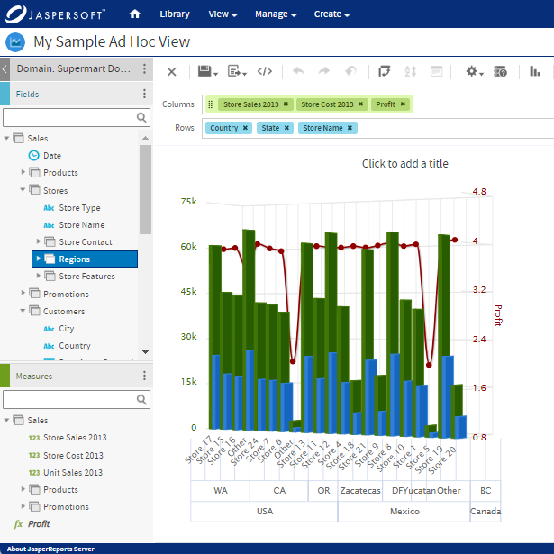
Area Charts with Jaspersoft
Related Resources
Jaspersoft in Action: Embedded BI Demo
See everything Jaspersoft has to offer – from creating beautiful data visualizations and dashboards to embedding them into your application.
Creating Addictive Dashboards
Learn how to build dashboards that your users will love. Turn your data into interactive, visually engaging metrics that can be embedded into your web application.