What is a Stacked Chart?
A stacked bar chart is a type of bar chart that portrays the compositions and comparisons of several variables through time. Stacked charts usually represent a series of bars or columns stacked on top of one another. They are widely used to effectively portray comparisons of total values across several categories.

Unlike other types of charts that may have several applications, stacked charts have limitations in terms of the scenarios where they can be used. However, by understanding their purpose and what scenarios to use them in, data analysts can leverage them to represent and compare complex data sets.
Types of Stacked Charts
Horizontal Stacked Bar Chart
Horizontal stacked bar charts are a variation of the standard stacked chart. The key distinction between both is that horizontally stacked charts feature a horizontal layout. They usually extend from left to right. This type of layout is especially beneficial when dealing with datasets featuring numerous totals.
A computer screen's width can often be more accommodating than vertical space. Therefore, horizontally stacked charts allow for a comprehensive data view without continuous scrolling. Moreover, this variation of stacked bar charts is especially useful when comparing various data segments in confined screen spaces.
Percentage Stacked Bar Chart
Percentage-stacked bar charts display data segments as proportions of a whole, with each bar divided into segments representing different categories. The height of each segment within the bar reflects the percentage it contributes to the total. This enables the audience to grasp the proportions and distribution of the data components immediately.
Percentage-stacked charts prove especially useful when your goal is to compare the relative size of categories across several bars. These charts are beneficial in scenarios where the goal is to understand data composition within different groups. For example, portraying the market share across multiple products or demographic distributions in different countries. By displacing the proportions into easily comparable visuals, percentage-stacked bar charts allow a convenient way of conveying part-to-whole relationships.
When to Use Stacked Charts?
As stated above, stacked charts may only apply to a few situations. One of the top scenarios where stacked charts can be useful is when your goal is to portray the individual components and their cumulative total within a dataset. These charts are promising tools for when you wish to illustrate the composition of a data set. They do a great job of displaying how different categories contribute to the total value. Moreover, unlike other charts that may not do well in portraying real-time shifts in trends, stacked charts are among some of the best visualization tools for tracking changes over a period.
Scenarios Where Stacked Charts Can Be Useful
Measure Website Traffic Sources
Stack charts can benefit digital marketers looking to represent the different sources of a website's traffic (organic, direct, referral). By leveraging a stacked chart to create a visual representation of how much each source contributes to a website's total traffic, they can better understand the role of each source in contributing to their website traffic. This information can allow them to focus their marketing efforts on the sources that contribute the most to website traffic.
Get Sales Insights
Stacked charts can be a powerful tool for those in the retail industry. They can be used in several ways. For example, teams can use them to effectively portray the sales distribution across several product categories. This can help retail stores identify categories that contribute most to their revenue, allowing them to invest more into stocking up on those categories.
Demographic Distribution
A stacked chart can also be useful for individuals working in the field of social sciences. Social scientists can use them to convey the demographic distribution of varying genders, ethnicities, and ages and visualize the composition of a population in a region. These charts can be a helpful tool for social scientists looking to present their findings to an audience.
Keep Track of Project Progress
Project managers can use stacked charts to track and portray the progress of different tasks to an audience of project heads or stakeholders. Stacked charts offer an easy way for project managers to conduct status assessments and keep track of pending tasks. Additionally, keeping track of each project's progress through these visualizations empowers project managers to avoid delays and ensure every project gets completed before the deadline.
Budget Allocation
Stacked charts can simplify the task of budget allocation by showing how a budget is allocated to different departments. This offers insight into every department/category's proportion in the entire budget. Visualizing the categories and proportions that comprise an entire budget can allow companies to make well-informed decisions and improve budget allocation.
Pros and Cons of Stacked Charts
Pros
Illustrate Part-to-Whole Relationships
One of the major benefits of stacked charts is their ability to display the relationship between individual data components and their collective entirety. Stacking segments on top of one another can help create a visual representation that clearly shows how different categories merge to form the total.
This clarity allows observers to easily determine the proportion that every segment holds within the dataset. This feature is even more beneficial when the goal is to understand the importance of different components that create the whole.
Moreover, besides simplifying the visualization process, the stacking feature within these charts also helps speed up comprehension. A simple look at the chart can help viewers understand the contributions of the different categories to the total.
The effortless way of representing part-to-whole connections can empower individuals, including decision-makers and analysts, to make informed decisions. By leveraging this visualization tool, these professionals can pinpoint the dominant categories and abnormalities and understand data composition in-depth.
Portray Trends
Another advantage of stacked charts that makes them stand out as a promising visualization tool is their ability to display trends over time. This unique characteristic allows stacked charts to offer insight into how each category changes over time.
This representation helps individuals identify the changes in data across a period and capture the broader trend that forms the dataset. By using stacked charts to showcase changing trends, analysts can quickly detect important factors like areas that underwent the most shifts and any other issues that need to be addressed.
For example, a sales analyst must explain a new product's sales progression since it was launched five months ago. He can use a stacked chart to visually display the progression and performance of the product from launch to five months later. This visualization can allow the sales analyst to conveniently get the message across to the audience, allowing stakeholders and decision-makers to determine whether the product was successful.
Efficient Comparative Analysis
Stacked charts are a common choice for comparative analysis tasks. These charts can highlight the proportion of individual data components and their proportional relationships. Hence, they help portray the absolute values of varying segments and their relationship with one another.
Stacked charts prove incredibly beneficial in the business sector, allowing CEOs and different teams to easily assess factors like market share or budget allocation and represent them in a simplified way. Additionally, stacked charts can also prove helpful in tasks like financial planning since they can help display how the budget is divided across expenses.
Stacked charts offer an immediate visual comparison of categories, allowing decision-makers to determine patterns, issues, and trends. They can help foster informed decision-making and risk management by allowing for efficient comparative analysis.
Save Space
Stacked charts are the ideal visualization tool in scenarios where there is a need for efficient data representation in confined spaces. These charts allow you to incorporate several charts in a single visual. Their ability to portray complex information without taking up much screen space makes them a useful tool for data communication.
Moreover, switching from chart to chart to convey different narratives can impact the efficiency of your presentations and reports and increase the likelihood of audiences losing interest or track of what was being conveyed. You can avoid this by using stack charts and efficiently conveying abundant information on the changes in data components without overwhelming the viewers.
Cons
Potential for Misinterpretation
Although stacked charts offer several benefits to users, they can also have several limitations. One of the top limitations of stacked charts is their potential for being easy to misinterpret. The likelihood of this happening increases even more when representing multidimensional datasets through stacked charts.
Although the technique of stacking segments can help viewers understand cumulative proportions, it can also sometimes end up hiding the proportions of individual components. This usually occurs due to the segment overlapping. When the segments of a category are concealing portions of other segments, you can expect viewers to get confused or incorrectly interpret your stacked chart.
Furthermore, there is also the risk of smaller segments blurring the larger ones. The potential for these issues highlights the importance of data analysis to focus on the limitations of stacked charts when creating them. Doing so can help them make informed choices about their stacked chart layout based on the dataset's complexity.
Segment Order Can Create an Improper Narrative
How you arrange segments in a stacked chart greatly impacts how the audience perceives and understands the data. The order in which you stack the segments influences the interpretation of proportions. Moreover, it can introduce bias into the conclusions the audience draws from the chart.
For example, placing larger segments at the lower end of the stack may dominate the composition. This can result in the audience only focusing on the larger segments and ignoring the smaller ones above. Therefore, this type of arrangement can cause the audience to believe the larger segments are more important than they might be.
This can completely distort their understanding of the data being presented. Therefore, focusing on the strategic placement of segments within a stacked chart is critical to ensure the audience doesn't misread the visualization.
Limited Component Comparison
Although stacked charts do a commendable job of showing how many categories work together to form a whole, they have a limitation in regard to direct comparisons. Stacked charts might not be suitable if you wish to visualize data to compare the same component through several categories.
One of the major reasons behind this limitation is the chart's segments' tendency to overlap. When this occurs, it can be challenging for viewers to accurately tell the differences because of how segments stack on top of one another. Therefore, when your objective is to compare the size of specific components spanning categories, other visualization techniques may provide a sharper depiction.
Ultimately, it's important to thoroughly evaluate the data's nature and desired insights when using stacked charts. It is always advisable to seek alternative visualization approaches when comparing the sizes of certain components in other categories.
Mastering Stacked Charts: Best Practices
Order Segments Carefully
How segments in a stacked chart are arranged significantly impacts how a viewer perceives the data. The arrangement of segments can influence the proportions and emphasis on every component. Although adding larger segments at the bottom may seem best, it is important to understand that this can magnify their significance. This can cause viewers to believe larger segments are more important than their actual contribution. Therefore, strategic arrangement of segments is essential to ensure you accurately portray the true composition of data and avoid unintentional bias.
Maintain High Accuracy Through Double-Checking
The best way to ensure a high-quality visualization is to maintain the data's accuracy. One way to achieve this is to double-check all proportions and percentages on your stacked chart to ensure no errors. Even a minor change in the values can impact viewers' perception of the entire data.
Besides, a mistake can lead to misguided decision-making and misinterpretations. Moreover, it is also important to remember to provide information on the methodology or data sources you use. Doing so allows viewers to understand the content and trust the information being presented.
Pick Colors Carefully
Individuals new to the world of visualization techniques may overlook colors' impact on visualizations like stacked charts. Color can allow you to guide the viewer's subconscious mind to focus on specific details that might be important. Moreover, you can leverage color psychology to get the desired reaction out of audiences.
When creating a stacked chart, pick colors that complement each other to avoid viewers getting distracted or the chart appearing cluttered. Additionally, avoid excessive contrasting hues to maintain consistency and prevent cognitive overload.
Stacked Chart Alternatives
Although stacked charts are an efficient tool for visually displaying comparisons, other alternatives are equally excellent visualization tools.
Pie Chart
The pie chart can be a great alternative to a stacked chart when working with a sole bar. Although pie charts may be challenging to interpret in certain situations, they do a commendable job of presenting information accurately.
Moreover, it is easier for viewers to locate the middle variable quantities on a pie chart. However, pie charts can only be used with only one dataset. Therefore, the other alternatives below may be more suitable for visualizing more than one data set.
Grouped Bar Chart
It is easier to observe differences in individual elements when bars are not stacked and variables are added next to one another. However, this also comes with a drawback since the charts are no longer able to depict the category totals properly. Therefore, it is crucial to consider what is more important for the chart to represent to determine whether a grouped bar chart will be a better alternative to a stacked chart.
Mosaic or Marimekko Chart
A Mosaic chart might be useful if the data you want to display is excessively complex for a stacked chart. These graphs divide stacked bar charts in two directions. Although the audience may need to compare box areas - which makes interpretation more difficult - a Mosaic chart is preferable for several data variables.
Area Chart
An area chart can better visually represent the data when the main variable is continuous. Instead of having several bar charts, the cohesiveness of the area chart could emphasize the continuous data.
Wrapping Up
Stacked charts serve as a link between datasets and comprehension because they communicate part-to-whole relationships efficiently and offer comparative insights. They also serve as the ideal visualization tool for unveiling trends. Moreover, they can be used by a diverse range of professionals working in different industries, like finance, healthcare, and education.
By leveraging stacked charts, professionals and companies can transform complex data narratives into engaging and insightful visuals. Ultimately, stacked charts are an excellent visual tool to master. They can help ensure strategic decisions, data-driven narratives, and the accurate communication of complex data.
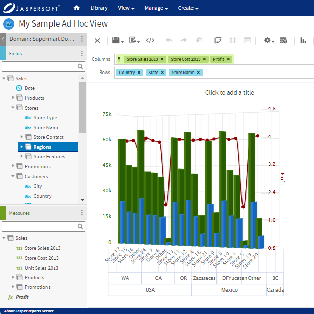
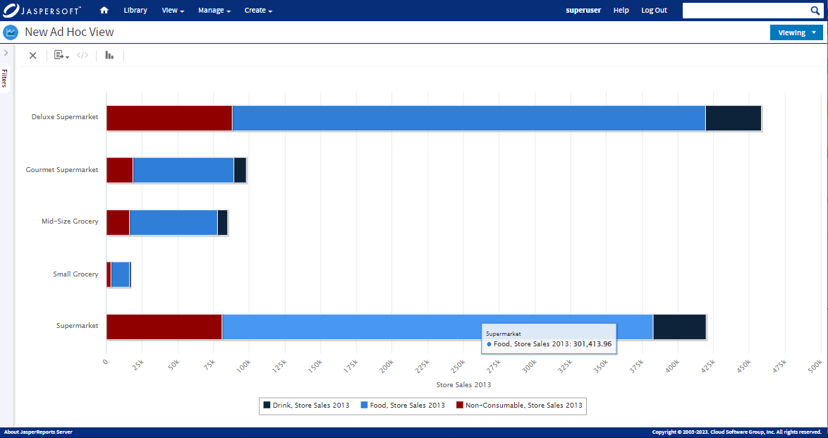
Stacked Charts with Jaspersoft
Related Resources
Jaspersoft in Action: Embedded BI Demo
See everything Jaspersoft has to offer – from creating beautiful data visualizations and dashboards to embedding them into your application.
Creating Addictive Dashboards
Learn how to build dashboards that your users will love. Turn your data into interactive, visually engaging metrics that can be embedded into your web application.