What is a Parallel Coordinate Plot?
A parallel coordinate plot is graphical method where each observation or data point is depicted as a line traversing a series of parallel axes, corresponding to a specific variable or dimension. This arrangement allows for the exploration of relationships, trends, and variations that might be obscured in raw data.

The primary advantage of a parallel coordinate plot lies in its capacity to handle the visualization of multivariate data. It may seem complicated, but this is because each observation possesses several attributes.
Unlike traditional two-dimensional plots, the parallel coordinate plot can effectively portray the interplay between multiple variables, facilitating the identification of correlations, outliers, and complex patterns. By visually connecting data points through lines that span the axes, the parallel coordinate plot provides a holistic view of how these variables interact with each other.
parallel coordinate plots find applications in various domains, including data analysis, engineering, scientific research, and business intelligence. They are particularly useful when exploring the relationships between data points with multiple dimensions. This aids in identifying trends, anomalies, and potential insights that might not be apparent through other visualization methods.
The ability to discern intricate connections within data makes the parallel coordinate plot an essential tool in the toolkit of data analysts and researchers seeking a comprehensive understanding of complex data sets.
Understanding Parallel Coordinate Plots
Parallel coordinate plots are NOT a straightforward chart. They tend to be more sophisticated for visualizing multivariate data. It involves representing each data point as a line that traverses a series of parallel axes. Each axis corresponds to a specific variable or dimension.
By connecting these lines across the axes, parallel coordinate plots provide an insightful depiction of the relationships and interactions between multiple variables within a dataset. Each axis represents a distinct variable or dimension of the data.
The data points, represented as lines, intersect these axes at positions corresponding to their respective values on each variable. As a result, the lines create a complex network that reveals the patterns, trends, and relationships between variables. These connections become particularly significant when examining how changes in one variable correspond to changes in others.
Parallel coordinate plots offer a remarkable advantage in their ability to uncover intricate data patterns that might remain concealed in other forms of visualization. They help reveal correlations, clusters, outliers, and trends that emerge from the interaction of multiple variables.
Patterns such as parallel lines, converging lines, or patterns that diverge can provide valuable insights into the underlying data relationships. We’ll discuss these in more detail in a later section.
Scenarios Where Parallel Coordinate Plots Are Particularly Useful
Parallel coordinate plots prove exceptionally useful in various scenarios where understanding multivariate relationships is crucial:
- Multidimensional Data Exploration: Parallel coordinate plots are ideal for datasets with multiple variables where understanding the interactions and correlations between these variables is essential. This is particularly common in fields like scientific research, engineering, and social sciences.
- Feature Analysis: In data analysis and machine learning, parallel coordinate plots can help explore how different features contribute to specific outcomes. This is invaluable for feature selection and model interpretation.
- Anomaly Detection: Parallel coordinate plots can highlight anomalies and outliers that may not be evident in individual variable plots. Patterns that deviate from the norm can stand out in a PCP.
- Cluster Identification: Clusters of similar data points often manifest as distinct patterns in a PCP. This can aid in identifying subgroups within a dataset.
- Dimensionality Reduction Validation: When using dimensionality reduction techniques like PCA (Principal Component Analysis), parallel coordinate plots can validate the effectiveness of the reduction in preserving meaningful data relationships.
- Business Intelligence: In business contexts, parallel coordinate plots can help decision-makers understand how different variables influence key performance indicators, enabling informed decisions.
- Scientific Data Visualization: In scientific experiments with multiple measured variables, parallel coordinate plots can provide a comprehensive view of how changes in one variable relate to changes in others.
They essentially reveal intricate data interactions and relationships. Consequently, they empower analysts, researchers, and domain experts to extract valuable insights from complex multivariate datasets. They offer a holistic view of data dynamics, aiding in decision-making, pattern recognition, and the discovery of meaningful trends.
Components of a Parallel Coordinate Plot
A parallel coordinate plot comprises two fundamental components:
- Parallel axes
- Data lines
These components work in tandem to create a visually informative representation of multivariate data.
Parallel Axes
The parallel axes in a parallel coordinate plot are the vertical lines running across the plot. Each axis corresponds to a specific variable or dimension within the dataset. These variables can represent diverse attributes, such as time, temperature, pressure, or any other measurable quantity. Each axis serves as a reference for a particular data feature, allowing for direct comparisons between data points.
Data Lines
The data lines in a parallel coordinate plot are the connecting lines that traverse the parallel axes. Each data point in the dataset is represented by one of these lines. The position where a data line intersects a particular axis corresponds to the value of the variable represented by that axis for the specific data point.
As a result, data lines weave through the axes, creating a dynamic network that visually demonstrates the relationships between the variables. A significant aspect of data lines is their ability to cross multiple axes. This allows the representation of multivariate relationships.
Parallel lines, converging lines, and diverging lines can all indicate distinct relationships between the variables they represent.
The components of a parallel coordinate plot collaboratively illustrate the intricate connections between multiple variables within a dataset. The parallel axes establish the framework for representing these variables, while the data lines provide a tangible visual representation of how these variables relate to each other.
This unique visualization approach empowers analysts to glean insights from the complex interrelationships of multivariate data, making it a valuable tool in various fields such as data science, engineering, social sciences, and beyond.
Interpreting Parallel Coordinate Plots
Interpreting a parallel coordinate plot involves deciphering the intricate patterns, trends, and relationships that emerge from the visualization. The strength of parallel coordinate plots lie in their ability to provide insights into complex multivariate data, enabling viewers to discern valuable information that might be less apparent through other visualization methods.
Parallel coordinate plots offer a visual landscape where data clusters, outliers, and correlations can be identified with relative ease. Data points that share similar trends often form clusters of parallel lines, reflecting consistent relationships between the associated variables.
Conversely, outliers – data points that deviate significantly from the expected patterns – stand out as lines that conspicuously diverge from the overall trend. Spotting these anomalies allows analysts to delve deeper into understanding their underlying causes.
Correlations between variables are also discernible through the crossing and convergence of data lines across axes. When data lines consistently cross over or converge at specific points on multiple axes, it indicates a potential correlation between the corresponding variables.
This correlation may indicate that changes in one variable are associated with changes in another, enabling a deeper exploration of causal relationships.
Introducing the Z-Axis: Three-Dimensional Parallel Coordinate Plots
While traditional parallel coordinate plots operate within a two-dimensional space defined by parallel axes, the introduction of a third dimension – referred to as the Z-axis – adds a new layer of complexity to the visualization.
Three-dimensional parallel coordinate plots extend the capabilities of parallel coordinate plots by accommodating an additional variable, enhancing the representation of data relationships. In a three-dimensional parallel coordinate plot, each data point is represented by a line that traverses three parallel axes.
The position of the line on each axis corresponds to the value of the variable it represents. The intersections of these lines within the three-dimensional space convey the intricate interactions between three variables simultaneously. This extension enables analysts to explore and understand more complex relationships and trends that involve three variables.
Interpreting parallel coordinate plots requires a keen eye for patterns, outliers, and correlations that emerge from the interplay of multiple variables. Leveraging the visual cues provided by the axes and data lines helps analysts:
- Uncover Hidden Insights
- Validate Hypotheses
- Make informed decisions based on a comprehensive understanding of multivariate data.
With the introduction of a third dimension, the potential for revealing even deeper insights into complex data relationships expands, offering an advanced tool for those seeking to navigate the intricacies of multidimensional datasets.
Advantages of Using Parallel Coordinate Plots
Parallel coordinate plots offer a range of distinct advantages that make them a valuable tool in the realm of data visualization. These advantages stem from their unique ability to visually represent complex multivariate data in a comprehensible and insightful manner.
Visualizing Complex Multivariate Data
One of the primary strengths of parallel coordinate plots lies in their capacity to handle and display complex multivariate data. Traditional plots, such as scatter plots or bar charts, may struggle to effectively visualize datasets with numerous variables.
In contrast, parallel coordinate plots effortlessly accommodate a multitude of variables by aligning them along parallel axes. This arrangement provides viewers with a holistic view of how these variables interact, helping to reveal intricate relationships and patterns that may remain hidden when using other visualization methods.
Revealing Insights Beyond Conventional Plots
Parallel coordinate plots excel at unveiling insights that might not be readily apparent in other types of plots. The visual arrangement of data lines crossing multiple axes enables the identification of correlations, clusters, and outliers that might be challenging to spot in conventional charts. This depth of understanding allows analysts to draw accurate conclusions about the interplay of variables and their impact on observed trends.
Navigating High-Dimensional Data
In situations where datasets contain a high number of variables or dimensions, parallel coordinate plots become especially valuable. Conventional two-dimensional plots struggle to capture the complexity of such datasets, often leading to oversimplification.
Alternatively, parallel coordinate plots provide a mechanism to navigate high-dimensional data by accommodating multiple axes and effectively preserving the richness of information.
Detecting Anomalies & Outliers
Parallel coordinate plots are adept at highlighting anomalies and outliers within datasets. Outliers, which might indicate data errors or important deviations from the norm, are visually conspicuous as data lines that deviate significantly from the overall pattern.
This allows analysts to investigate the reasons behind these anomalies and gain deeper insights into the underlying factors that contribute to them.
Facilitating Decision-Making & Hypothesis Testing
The intuitive nature of Parallel coordinate plots makes them an excellent tool for decision-making and hypothesis testing. The visual clarity of parallel coordinate plots aids in the communication of findings, ensuring that stakeholders understand the insights derived from the data.
Challenges & Considerations
While parallel coordinate plots offer powerful insights into multivariate data, they are not without challenges. Understanding and addressing these challenges is crucial for making the most of this visualization technique.
Scalability & Overplotting
One notable challenge when working with parallel coordinate plots is scalability, especially as the number of variables or data points increases. As more axes are added to accommodate additional dimensions, the plot can become crowded, leading to overplotting.
Overplotting occurs when data lines overlap to the extent that individual patterns or relationships become obscured.
Mitigation Strategies
Several strategies can help mitigate the challenges posed by scalability and overplotting. Data normalization is one such technique, where variables are rescaled to comparable ranges. This ensures that no single variable disproportionately influences the visualization.
In turn, it ends up reducing the risk of overplotting. Interactive parallel coordinate plots, which allow users to filter and focus on specific subsets of data, provide a way to navigate through large datasets and explore details without overwhelming the plot.
Data Preprocessing
Another consideration is the importance of data preprocessing. Outliers, missing values, and data inconsistencies can distort the patterns within parallel coordinate plots. Therefore, it's crucial to address data quality issues through techniques like outlier detection and imputation before constructing the plot. Proper data preparation enhances the reliability of insights derived from parallel coordinate plots.
Axis Arrangement & Interpretation
The arrangement of axes in a parallel coordinate plot can significantly impact interpretation. Poorly chosen axis orderings might obscure relationships or make patterns difficult to perceive. Selecting the most meaningful order for axes requires domain knowledge and exploration.
Additionally, the interpretation of relationships between variables depends on their spatial alignment along the axes, making it essential to choose an arrangement that maximizes clarity.
Interactive Exploration
Parallel coordinate plots often benefit from interactive exploration features. These allow users to manipulate the plot, such as rearranging axes, highlighting data lines, and zooming in on specific regions. Interaction fosters a deeper understanding of the data by enabling users to dynamically adjust the visualization to suit their analytical needs. Interactive parallel coordinate plots enhance engagement and facilitate the discovery of nuanced insights.
Choosing the Right Variables
Selecting the appropriate variables for a parallel coordinate plot is pivotal. Not all datasets are well-suited for this visualization technique. It's important to choose variables that are meaningful and likely to exhibit interesting patterns or relationships. Including irrelevant or redundant variables can clutter the plot and dilute its effectiveness.
Domain Expertise
Domain knowledge is vital for constructing and interpreting parallel coordinate plots accurately. Understanding the variables, their relationships, and potential patterns requires subject-matter expertise. Collaborating with domain experts ensures that the parallel coordinate plot accurately captures the nuances of the data and produces insights that are actionable and relevant.
Comparison With Other Visualization Techniques
Parallel coordinate plots offer a unique approach to data visualization that sets them apart from other common techniques, such as scatter plots and bar charts. Understanding how parallel coordinate plots compare to these methods and when they excel is essential for choosing the right visualization strategy.
Parallel Coordinate Plots vs. Scatter Plots
Scatter plots are a widely used technique for visualizing relationships between two variables. They display data points as individual dots on a two-dimensional plane, with each axis representing a different variable.
While scatter plots are excellent for visualizing bivariate relationships, they become limited as the number of variables increases. Parallel coordinate plots overcome this limitation by accommodating multiple dimensions on parallel axes. This makes parallel coordinate plots particularly suitable for exploring multivariate data, where relationships involve more than two variables.
Parallel Coordinate Plots vs. Bar Charts
Bar charts are effective for comparing discrete categories or values. Each category is represented by a separate bar, and the length of the bar corresponds to the value being represented. However, bar charts are most suitable for categorical or discrete data.
Parallel coordinate plots are for continuous and multivariate data, revealing patterns and correlations across multiple dimensions. Bar charts may not always be able to handle as much data.
Advantages of Interactive Parallel Coordinate Plots
Interactive parallel coordinate plots introduce a dynamic element to data exploration. They allow users to manipulate the visualization, such as rearranging axes, selecting data lines, and zooming in on specific areas. This interactive capability enhances data exploration and understanding.
Users can tailor the visualization to their specific needs, focusing on patterns of interest and gaining deeper insights. Interactive parallel coordinate plots provide a more flexible and adaptable way to engage with complex data compared to static visualizations.
Enhancing Data Exploration Through Interaction
Interactive parallel coordinate plots empower users to uncover insights that might remain hidden in static visualizations. Users can selectively highlight and explore specific data subsets, facilitating the discovery of clusters, outliers, and relationships.
For instance, by selecting a subset of data points in the parallel coordinate plot, users can instantly see how those data points behave across all dimensions. This capability allows for hypothesis testing, pattern recognition, and the identification of anomalies that might be crucial for decision-making.
Situational Suitability
The choice between parallel coordinate plots and other visualization techniques depends on the nature of the data and the analytical goals. Parallel coordinate plots shine when dealing with datasets that have multiple dimensions, allowing analysts to identify complex relationships and trends.
When it comes to data visualization, parallel coordinate plots stand as a powerful and versatile tool. They enable the exploration of complex datasets from unique perspectives. These plots excel at unraveling relationships, trends, and patterns within multivariate data that might otherwise remain concealed.
Today, data is abundant and multidimensional. The need for tools that can handle the complexity is paramount. Parallel coordinate plots offer a bridge between data and understanding, enabling us to extract knowledge from datasets that might otherwise overwhelm us. Their ability to transform complex data into intuitive visual narratives makes them an indispensable resource for tackling the challenges of modern data analysis.
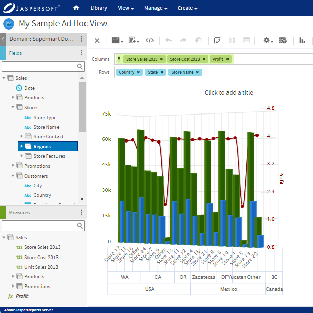
Parallel Coordinate Plots with Jaspersoft
Related Resources
Jaspersoft in Action: Embedded BI Demo
See everything Jaspersoft has to offer – from creating beautiful data visualizations and dashboards to embedding them into your application.
Creating Addictive Dashboards
Learn how to build dashboards that your users will love. Turn your data into interactive, visually engaging metrics that can be embedded into your web application.