What are Tabular Reports?
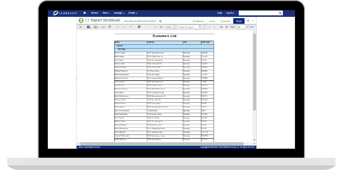
Tabular reports are a structured way of presenting data in rows and columns, resembling a table. The primary purpose is to organize and communicate information clearly, concisely, and systematically. Tabular reports are widely used in various fields to analyze data, make informed decisions, and present findings to stakeholders.
In the realm of data analysis, tabular reports serve as a foundational tool for organizing and summarizing information. They allow users to compare, contrast, and draw insights from datasets, making them an invaluable asset in business intelligence, research, finance, and many other domains.

Key Components of Tabular Reports
Rows and Columns
By utilizing rows and columns, information can be easily understood and analyzed. Each row represents a unique record or observation, allowing for easy identification of individual data points. On the other hand, columns house specific attributes or variables related to the data, enabling users to locate and interpret the desired information quickly. This structured arrangement enhances readability and facilitates effective decision-making based on the presented data.
Headers and Footers
Typically found at the top of the report, headers serve as signposts that guide readers through the content by clearly labeling each column. By providing concise and descriptive names, headers enhance the readability and comprehension of the report.
On the other hand, footers positioned at the bottom can offer valuable summary statistics or supplementary details that further elucidate the data presented. Just like headers, well-crafted footers contribute to the overall clarity and cohesiveness of the report, ensuring that readers have all the necessary information at their fingertips.
Together, clear headers and informative footers create a seamless reading experience, making it easier for readers to navigate and interpret the contents of a report.
Data Cells
Data cells serve as the fundamental building blocks of any data presentation. These cells act as the intersection points between rows and columns, providing a platform to showcase the actual information. A wide range of content can be included within these cells, such as numerical values, text, or even a combination of both. The versatility of data cells allows for the effective representation of various types of data, catering to each dataset's specific needs and nature.
Sorting and Filtering
Tabular reports also allow users to sort and filter large amounts of information efficiently. Sorting allows users to arrange data in a specific order, whether ascending or descending, based on criteria that are important to their analysis. Users can easily identify trends and patterns within the information by sorting data.
On the other hand, filtering enables users to extract only the relevant data by setting conditions on specific columns. This helps streamline the analysis process by eliminating unnecessary information and focusing solely on what is needed for decision-making purposes.
Types of Tabular Reports
Simple Tabular Reports
Simple tabular reports are a valuable tool for clearly and concisely presenting data. Their straightforward format allows users to easily understand and analyze information without getting lost in complex relationships. These reports are particularly effective when dealing with basic datasets that consist of standalone records.
By organizing data into rows and columns, simple tabular reports provide a structured framework that is easy to navigate. Whether it's sales figures, survey responses, or inventory data, these reports offer an efficient way to present information without overwhelming the reader.
Cross-Tab Reports
Cross-tab reports, or pivot tables, are an invaluable tool for data analysis. They go beyond simple tables by providing a comprehensive summary of information across two dimensions. With cross-tab reports, you can easily identify and analyze relationships between two categorical variables. This allows you to gain deeper insights into your data and make informed decisions based on emerging patterns and trends.
Master-Detail Reports
Master-detail reports are an essential tool for analyzing hierarchical data. By showcasing a primary table (master) and a related table (detail), these reports offer a more comprehensive and interconnected view of information. With this format, users can easily identify the relationships between data points and gain deeper insights into their data.
These reports are particularly useful when working with complex datasets that have multiple levels of information. By visually representing the connections between different tables, master-detail reports help users understand the underlying structure of the data and make informed decisions based on these insights.
Summary Reports
By condensing complex information into key insights, summary reports offer a comprehensive overview of the data at hand. They go beyond raw numbers and utilize aggregate functions like sums, averages, and counts to provide meaningful analysis. With summary reports, decision-makers can quickly identify trends, patterns, and outliers that may otherwise be buried in the data.

Designing Effective Tabular Reports
Organizing Data
Efficiently organizing data is crucial for optimal data management. By grouping related information together and logically arranging columns, we can greatly enhance the readability and usability of the data.
It is important to consider the natural flow of how users might consume the information, as this will enable them to easily navigate through the data and extract the insights they need. A well-organized data structure improves user experience and allows for efficient data analysis and decision-making processes.
Choosing Appropriate Fonts and Styles
Selecting appropriate fonts and styles is crucial to creating visually appealing reports. When it comes to readability, clarity is key. Choosing clear and legible fonts ensures that users can easily absorb the information presented in the report. Additionally, the right font style can enhance the overall aesthetic of the document, making it more visually engaging.
Color Usage for Clarity
It's important to strike a balance when it comes to color usage. While colors can undoubtedly enhance the visual appeal of any design, they should be employed thoughtfully and sparingly. The strategic application of color can effectively draw attention to key information or convey specific data conditions, ultimately facilitating easier interpretation for the audience.
Utilizing White Space
Utilizing white space in design is visually appealing and plays a vital role in preventing information overload. By strategically incorporating adequate spacing between rows, columns, and sections, a report's overall aesthetics and readability can be greatly enhanced.
When there is proper white space, the content is given room to breathe, allowing important elements to stand out and be easily digestible for the reader. This clean and uncluttered look not only creates a more professional impression but also helps to guide the reader's eye smoothly through the document.
Challenges and Solutions in Tabular Reporting
Dealing with Large Datasets
Dealing with large datasets can be daunting, as they often require significant processing power and can be difficult to read and analyze. However, several strategies can help make this process more manageable.
One such strategy is pagination, which involves dividing the data into smaller, more digestible sections. By breaking the dataset into pages, users can easily navigate the information and focus on specific sections of interest.
Additionally, using summary tables can be beneficial in highlighting key points within the dataset. These tables provide a condensed overview of the data, allowing users to quickly identify important insights without having to sift through extensive amounts of information.
Ensuring Data Accuracy
To ensure the utmost accuracy of your tabular report, it is crucial to prioritize data accuracy. This can be achieved by consistently validating and updating datasets and implementing robust data validation rules.
By doing so, you can be confident that the information presented in your report is reliable and up-to-date. Additionally, employing effective data governance practices further enhances the accuracy of your data.
Accessibility and User-Friendliness
When it comes to tabular reports, accessibility and user-friendliness should always be a top priority. By designing reports with accessibility standards in mind, we can ensure that everyone, regardless of their abilities, can easily access and understand the information presented.
This includes using appropriate font sizes and colors, providing alternative text for images, and ensuring proper keyboard navigation. Additionally, incorporating user-friendly features such as search functions and filters can greatly enhance the overall experience for users, allowing them to find the information they need quickly.
Balancing Detail and Simplicity
Finding the sweet spot between offering in-depth explanations and presenting a clean, intuitive tabular report can be daunting. It requires a careful juggling act to ensure that users receive all the necessary details without feeling overwhelmed by excessive information.
Through an iterative testing process and soliciting feedback, we can fine-tune our approach and strike the perfect balance. By continuously refining our reporting methods based on user input, we can create a seamless experience that effectively communicates complex data while remaining user-friendly.
Real-world Applications of Tabular Reports
Business and Finance
In the realm of business and finance, tabular reports serve as invaluable tools for a variety of purposes. From budgeting to financial analysis and performance tracking, these reports provide a comprehensive overview of an organization's financial standing.
They go beyond mere numbers and delve into the details, offering insights into revenue streams, expenditure patterns, and key performance indicators. By presenting this data in a structured format, tabular reports enable decision-makers to make informed choices that drive growth and efficiency.
Healthcare
In healthcare, tabular reports are critical in managing patient data, devising treatment plans, and conducting outcome analysis. These structured reports are essential tools that medical professionals rely heavily on to make informed decisions.
By organizing data in a clear and concise format, tabular reports provide a comprehensive overview of a patient's medical history, test results, and progress over time. This allows healthcare providers to quickly assess the effectiveness of different treatments and interventions, ultimately leading to better patient care and improved outcomes.
Education
Educational institutions rely on tabular reports to track and analyze various aspects of student performance. These reports provide valuable insights to educators and administrators, allowing them to assess academic progress and identify areas that require improvement.
By documenting attendance records and grading information in an organized manner, tabular reports make it easier for educational professionals to evaluate the effectiveness of their teaching methods and tailor their approach to meet students' needs.
Moreover, these reports serve as a useful tool for communication between teachers, parents, and students, fostering a collaborative environment that promotes academic success.
Research and Analytics
Researchers and analysts use tabular reports to communicate their research findings, survey results, and data analysis. These reports serve as a solid foundation upon which conclusive insights are drawn, and data-driven decisions are made.
By presenting information in a structured manner, tabular reports allow researchers to easily identify patterns, trends, and correlations within the data.

Future Trends in Tabular Reporting
Integration with Artificial Intelligence
Integrating artificial intelligence (AI) into tabular reporting tools is a growing trend. AI capabilities can enhance data analysis, automate insights generation, and provide predictive analytics. By leveraging AI algorithms, businesses can uncover patterns and trends in their data that would be difficult to identify manually. These AI-powered tools can also help make more accurate predictions about future outcomes based on historical data.
Enhanced Visualization Features
In addition to infographics, charts, and graphs, future tabular reporting tools will likely incorporate even more enhanced visualization features. Users will be able to create visually stunning reports with just a few clicks effortlessly.
These advanced features may include interactive elements, such as hover effects and drill-down capabilities, allowing users to dive deeper into the data and gain valuable insights. Furthermore, customizable templates and themes will enable users to easily match the visual style of their reports to their brand or personal preference.
Cloud-Based Reporting Solutions
The shift toward cloud-based reporting solutions is expected to continue as more organizations recognize the benefits they offer. Besides scalability, accessibility, and collaborative features, cloud platforms provide enhanced security measures protecting sensitive data.
This makes them an attractive option for businesses of all sizes, especially those with diverse reporting needs. By utilizing cloud-based reporting solutions, organizations can streamline their reporting processes and gain real-time insights into their data.
Collaboration and Sharing Capabilities
The future holds great promise for improved collaboration and sharing capabilities in the ever-evolving landscape of tabular reporting tools. As businesses strive to enhance productivity and efficiency, these tools are expected to offer advanced features that will revolutionize teamwork and decision-making processes.
Real-time collaboration will no longer be limited to just editing documents simultaneously but will encompass a comprehensive set of tools that enable seamless communication and brainstorming among team members.
Additionally, commenting functionalities will allow for easy feedback exchange, facilitating the refinement of ideas and driving innovation. Furthermore, the ability to share insights effortlessly with stakeholders will empower organizations to make more informed decisions based on real-time data, ultimately leading to better outcomes.
Wrapping Up
As technology continues to advance, so does the realm of tabular reporting. The ongoing evolution brings forth new tools, features, and trends that empower and help users extract meaningful insights from their data more efficiently.
So, whether you're a data enthusiast, data analyst, or business professional, embracing best practices, staying informed about tools and trends, and understanding real-world applications will allow you to use tabular reports to make more accurate, informed decisions in an ever-evolving data-driven landscape.
Tabular Reports with Jaspersoft
Related Resources
Jaspersoft in Action: Embedded BI Demo
See everything Jaspersoft has to offer – from creating beautiful data visualizations and dashboards to embedding them into your application.
Ebook: Data as a Feature – a Guide for Product Managers
The best software applications are the ones with high engagement and usage. And those that stick, empower their users to realize the full value of their data. See how you can harness data as a feature in your app.
