What is Visual Analytics?
Visual analytics is a powerful form of reasoning that combines data analytics with interactive visual interfaces. By using interactive visual representations of data, users can easily interpret large volumes of information and uncover the hidden insights within. Unlike simple data visualizations, which answer the "what" questions, such as "What are the trends?" visual analytics digs deeper, answering the "why."

What Sets Visual Analytics Apart?
The power of visual analytics lies in its ability to incorporate both data analysis and interactive visual elements, going beyond the constraints of a templated dashboard. Users can swiftly create various visualizations to understand trends better or answer specific questions, enabling them to explore the data in a more comprehensive manner.
While data visualizations are useful for answering "what" questions, their inherent limitations impede users from understanding what drives these trends. That's where visual analytics steps in - by simplifying complex data analysis using visual components and enabling users to delve into the "why" of their data.
Exploring the Past, Present, and Future of Analytics
Analytics can offer invaluable insights to organizations and businesses, driving growth, profitability, and optimization. Broadly speaking, there are three primary types of analytics: descriptive, prescriptive, and predictive. The following sections delve deeper into these analytics types, using simple examples to illustrate their applications and benefits.
Descriptive Analytics
The most basic of the three types is descriptive analytics. Descriptive analytics is a fundamental component of any organization's data analysis strategy. This type of analytics is dedicated to the meticulous study of events that have already taken place. The objective is to thoroughly dissect the root cause of these events, allowing organizations to gain insightful and useful knowledge.
Companies can examine past performance by closely tracking changes in sales revenue or monitoring the number of website visitors. The ultimate goal is to gain an in-depth understanding of each and every past event, enabling organizations to identify areas for improvement and capitalize on past successes.
The complexity of descriptive analytics can be attributed to the attention to detail and the comprehensive nature of the analysis involved. In order to accurately interpret past data, a highly specialized approach is required.
Prescriptive Analytics
Prescriptive analytics is an advanced approach to data analysis that delves deeper than descriptive analytics, striving to truly unlock the potential for companies to improve overall performance and profitability. With the ability to learn from past events, organizations can glean valuable insights that shape future tactics and strategies, ultimately leading to better outcomes for the company as a whole.
It's a method that considers the complexities of business decision-making and acknowledges that success is more nuanced than raw data alone can reveal. Companies can refine their strategies by analyzing past marketing campaigns, targeting their audience more effectively, and increasing their return on investment.
The power of prescriptive analytics lies in the potential to integrate insights from multiple sources, continuously learning and adapting to improve performance as market conditions evolve over time.
Predictive Analytics
Predictive analytics is a powerful tool that enables companies to gaze into the crystal ball of the future. Unlike descriptive or prescriptive analytics, which focus on understanding and learning from past data, predictive analytics provides advanced insights into emerging trends.
By using historical data to identify patterns and behaviors, organizations can plan proactively for future scenarios. Not only does this save time and resources, but it also ensures a more accurate forecast of the potential success of upcoming marketing campaigns. While it may seem complex, predictive analytics has become integral to modern marketing strategies, allowing companies to stay ahead of the competition and make data-driven decisions.
In a constantly changing and evolving landscape, predictive analytics allows companies to anticipate and prepare for market shifts accurately.
Visual Analytics and Data Visualizations: Is There a Difference?
While data visualizations and visual analytics may seem interchangeable, the two are quite different.
- Data visualization and visual analytics are quite different, although we often use them interchangeably. Data visualization means creating graphs, charts, or other visual representations of data to depict trends, patterns, and relationships. With visualizations, users can see complex data in a more accessible form, making it easier for them to make sense of the data they have in front of them.
- Visual analytics, on the other hand, goes beyond simple visualizations. It allows users to explore their data in-depth and discover the “why” behind it. Visual analytics allows users to dissect complex data and grasp big-picture information effectively. The tools in visual analytics make it possible to identify the root cause of trends, patterns, and correlations that are more complex than basic visualizations. By examining sales figures, users can probe factors such as price variance, demographic differences, location, season, and much more.
- With visualizations, users can analyze data in real-time and see patterns emerge immediately. Such graphics allow us to identify correlations and causation. With visual analytics, these data insights can be used to contextualize and build more intricate data usage models. Visual analytics allows us to watch data develop and evolve in real-time, proactively revealing new opportunities for business development, problem resolution, or better service.
- Visual analytics brings both art and science to the table, utilizing machine learning, data science, and AI technologies to provide insights and recommendations. Users can interact with their data through an intuitive, easy-to-use interface, observing patterns, trends, and correlations.
The ability to experiment with data, modify queries, and reconfigure data models gives people the power to perform more robust analyses and get the most out of the information they have.
The Power of Visual Analytics
Unlocking the Power of Interactive Exploration
Modern data analysis necessitates a deeper appreciation of dynamic, interactive exploration. Conventional analysis tools, such as dashboards and templates, restrain insight potential by limiting customization and spontaneity. Visual analytics provides a much-needed respite from these restrictions, permitting data exploration that is concurrent, tailored, and adaptable, abiding by the specific needs of users.
With the power to manipulate data sets on the fly, filter, and drill down to the most granular level of specificity, users can unlock an entirely new realm of discovery. The ability to seamlessly analyze data with such depth and flexibility represents a significant turning point for industries and sectors across the board.
The effectiveness of visual analytics, coupled with its customizable and real-time capabilities, makes it an essential tool for any entity that values harnessing the full potential of its data.
Simplifying Complex Data Analysis with Visualization Techniques
In the world of data analysis, simplification is key. Yet, this can become quite a challenge with an ever-increasing amount of data at our disposal. That's where visual analytics comes into play.
Utilizing a variety of visualization techniques such as heat maps, scatter plots, and treemaps, visual analytics offers a more comprehensible and engaging experience to transform complex data analysis into something more manageable. By presenting data using such methods, users can easily detect high-level trends and patterns and build a solid foundation for diving deeper into data exploration.
Visual analytics provides a unique advantage in that it allows users to analyze data in ways that would be otherwise difficult, if not impossible, through traditional data analysis methods. As a result, visual cues, such as those offered through visual analytics, enhance users' understanding of complex data - a highly valuable tool in today's world.
Strengthening Collaboration and Communication through Visual Analytics
Visual analytics is a highly versatile tool that has proved itself to be a valuable asset in the realm of data analysis, especially in terms of its ability to strengthen collaboration and communication among team members. By utilizing a wide range of interactive reporting and visualization techniques, this tool fosters seamless communication and problem-solving within teams, thus promoting collective decision-making.
Furthermore, these techniques allow for the exchange of valuable insights and findings among team members, which in turn helps to foster a more unified and interdisciplinary approach to data analysis. With the aid of visual analytics, teams can leverage their collective intelligence to unlock hidden opportunities within their data, leading to more astute and well-informed decisions.

Machine Learning and Visual Analytics
When coupled with machine learning, visual analytics becomes even more powerful.
- Visual analytics provides us with an intuitive and user-friendly way of analyzing large datasets. It enables us to plot graphs, charts, and other visual aids to spot patterns and trends in data. However, visual analytics has limitations when it comes to interpreting complex data, particularly in large data sets. This is where machine learning comes in. Machine learning can help us identify patterns and correlations that we would otherwise miss with standard visualization techniques. For example, we can train a machine learning algorithm to identify patterns and correlations that would be difficult for humans to detect, such as identifying fraud in large datasets.
- The combination of machine learning and visual analytics can provide a more in-depth understanding of the data. With machine learning, we can drill down into complex data and generate insights that we might miss with visual analytics alone. For example, we can utilize machine learning to identify the root cause of errors in complex data sets and detect anomalies that are difficult to detect using just visual analytics.
- The relationship between machine learning and visual analytics is symbiotic. Machine learning provides insights that can inform the selection of visualization techniques, and visual analytics provides the context around which we can understand machine learning insights. In other words, visual analytics can help us understand the context around our machine learning models, and machine learning can help us select the right visualizations for better insights.
- Machine learning can also assist in automating the visualization process. For example, unsupervised learning can generate complex visualizations automatically, enabling analysts to explore new data sets with little oversight. This level of automation can help save time and resources and allow analysts to focus their efforts on other aspects of analysis, such as interpretation and intervention.
Visual Analytics: A Tool for Everyone
Marketing
Visual analytics plays a crucial role in helping marketers make strategic decisions by identifying trends, patterns, and insights in data. They use a variety of visualizations, such as graphs, charts, dashboards, heat maps, scatterplots, and pie charts. These tools are especially important in today's digitally-driven business world, where understanding consumer behavior, enhancing product offerings, and optimizing marketing campaigns are essential for success.
- Accurate Insights: Visual analytics enable marketers to interpret data more accurately than raw data. Interactive reports with visual graphics and charts allow them to understand the significance of various metrics easily. This helps marketers draw meaningful conclusions that significantly impact their business strategies.
- Uncovering Valuable Trends and Patterns: Visual analytics reveal patterns and trends that might otherwise go unnoticed. For instance, heatmap visualizations can track user activity on a website, helping marketers create content that engages users on popular pages.
In summary, visual analytics is an indispensable tool for marketers, providing accurate insights and uncovering valuable trends and patterns needed to make data-driven decisions in a constantly evolving digital landscape.
Supply Chain
Big data visual analytics is a game changer for supply chain management. This powerful tool empowers managers by providing them with instant insights into complex data, highlighting key performance indicators (KPIs), and enabling interactive data exploration.
- Big data visual analytics can uncover hidden connections between disparate data sources, offering an essential resource for supply chain managers in making strategic decisions. By integrating and analyzing various data sets, managers are able to identify patterns and relationships that would otherwise remain concealed quickly.
- Interactive exploration provides a dynamic method for supply chain managers to examine data. With the ability to customize visualizations, managers can delve deep into the data and uncover insights tailored to their specific needs.
Sales
Salespeople generate a lot of daily data, including leads, prospects, deals closed, and customer feedback. Visual analytics in sales makes it easier for sales teams to understand, analyze, and visualize this data. Sales organizations that use visual analytics to their advantage experience a significant increase in their win rates and overall revenue. Visual analytics in sales helps identify the trends and opportunities essential to the business's growth.
- Better forecasting with visual analytics in sales: Sales forecasting with traditional methods has been a challenge for businesses. Visual analytics helps businesses analyze their current sales trends, which helps them better forecast future sales. For instance, a business can analyze its sales data for a particular time period from its CRM and can accurately forecast future sales for the upcoming months. This insight could lead to more informed business decisions, such as scaling production or hiring more staff to manage increased demand.
- Improving sales performance with visual analytics: Visual analytics in sales can help managers and executives quickly identify areas for improvement in their sales activities. For example, sales managers can spot low-performing salespersons and adjust their sales strategies accordingly. Visual analytics can help identify patterns and trends, which can be used to adjust the sales process on an ongoing basis. This way, sales teams can optimize their skills and expertise with the help of data-driven insights.
- Enhancing customer engagement with visual analytics in sales: Visual analytics can help businesses better understand their customers by analyzing customer behavior data. Businesses can analyze customer engagement trends to identify which customers are most open to their products and services. This helps businesses adjust their customer communication strategies accordingly, leading to more efficient and effective communication with customers.
- Saving time with visual analytics in sales: Using visual analytics in sales can save a lot of time for businesses. The use of visuals, such as charts and graphs, can allow businesses to spot trends and patterns in their data quickly. Automation in sales report preparation reduces the time taken to analyze data, allowing sales team members to spend more time on direct selling activities.
Human Resources
Human resources are the backbone of any organization. The people working in this department are primarily responsible for hiring employees, managing employee benefits, and ensuring the organization runs smoothly. In recent years, the field of HR has undergone a massive transformation. Technology and software have made HR processes much more efficient, and visual analytics is one such software that is making a big impact in the field.
- Data-informed decisions: By analyzing data using visual tools, HR professionals can identify patterns and trends that provide key insights and enable them to make more informed decisions. For example, it can help identify which employees are most likely to leave the company and why. With this knowledge, HR professionals can take proactive steps to improve retention rates, such as implementing better employee policies or offering more training opportunities.
- Timely Decisions via real-time data: With access to real-time data, HR professionals can quickly identify and address issues before they become bigger problems. For instance, visual analytics can help identify the departments where employees are experiencing the most stress or dissatisfaction. HR professionals can then take immediate action to address issues in those departments, such as offering additional training or a more flexible work schedule.
- Improvements in employee engagement: By analyzing data and identifying patterns, HR professionals can gain insights into what motivates employees and what they want from their jobs. This can enable organizations to develop customized employee programs that better meet the needs of their employees. For example, if visual analytics show that a particular department is experiencing high levels of stress, HR professionals can work with that department to create a more supportive and positive work environment.
Conclusion
Ultimately, Visual Analytics is a tool that enables businesses to draw meaningful insights from large volumes of data. It armors them with the ability to instantly recognize patterns, making it easier for the business to be more successful by understanding its operations’ performance at an even higher level.
As we access ever-expanding data volumes, Visual Analytics can help us discern actionable information that will enable us to make better decisions faster and more accurately.
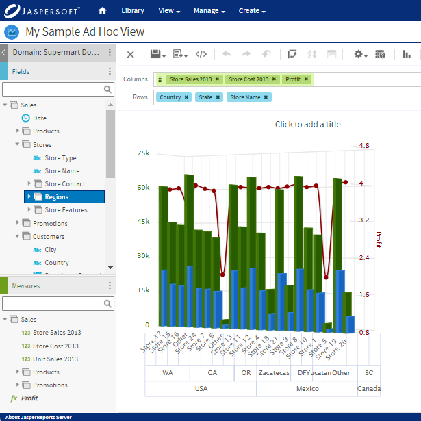
Visual Analytics with Jaspersoft
Related Resources
Jaspersoft in Action: Embedded BI Demo
See everything Jaspersoft has to offer – from creating beautiful data visualizations and dashboards to embedding them into your application.
Ebook: Data as a Feature – a Guide for Product Managers
The best software applications are the ones with high engagement and usage. And those that stick, empower their users to realize the full value of their data. See how you can harness data as a feature in your app.