



What is a Column Chart?
A column chart is a technique for data visualization where categories are represented in the form of vertical columns. The column height of each category is proportional to the values plotted. Hence, a column chart is also referred to as a vertical bar chart.
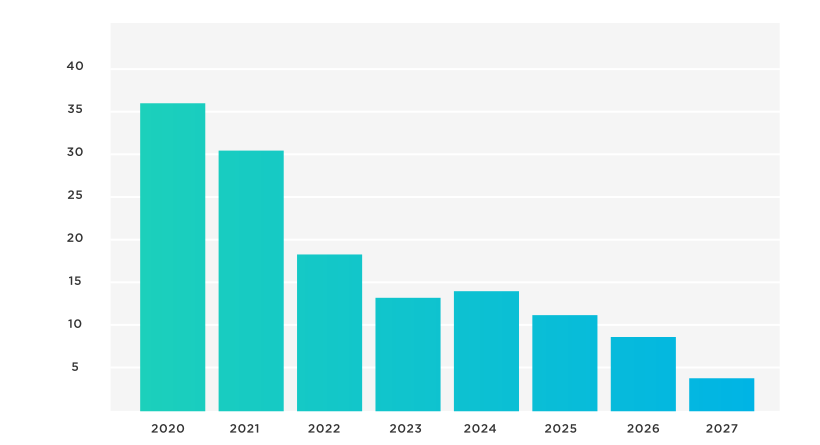
As all columns in the chart start from the zero baseline, it becomes easier to compare them against numerous items. The data in the column chart format is easier to comprehend and understand. Users can instantly identify trends and collect crucial insights from the data represented in the column chart.
Different Variants- Types of Column Charts
There are multiple types of column charts. These include the following:
Traditional Column Chart
As the name suggests, this is the basic form of a column chart where each category data is displayed using vertical columns/bars. The categories are listed on the horizontal axes, while the values are displayed on the vertical axes. The category column height is proportional to the value.
Grouped Column Chart
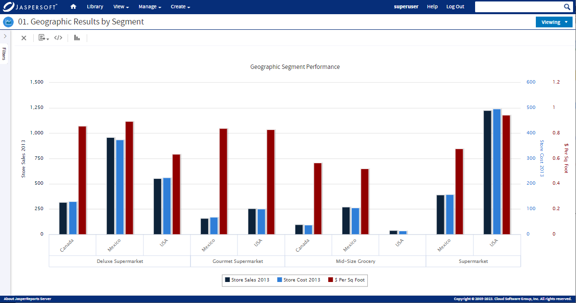
This type of column chart is also called the clustered chart. It is logically the same as the traditional chart but uses two categorical variables instead of one. Hence, it helps users to delve deeper and extract better conclusions. The clustered column chart helps compare variables within a group and with other groups displayed in the chart. Every category has a specific color for easy data visualization and comparison.
Stacked Column Chart
Similar to the group column chart, the only difference is that the stacked column chart represents data stacked on top of each other to complete the total value. For example, it can be the total sales of a product category or a specific year. This type of column chart is your best option when comparing parts of a whole.
For example, you can create a stacked column chart to display the age of new clients per quarter. Hence, every column in the chart will represent the total number of clients for every quarter, while the subgroups will display the percentage of each age range. The displayed information will enable you to understand the changes in different age groups during every quarter of the year and extract quality insights. These insights are valuable for making real-time decisions and implementing new strategies to achieve targeted results.
Column Line Chart
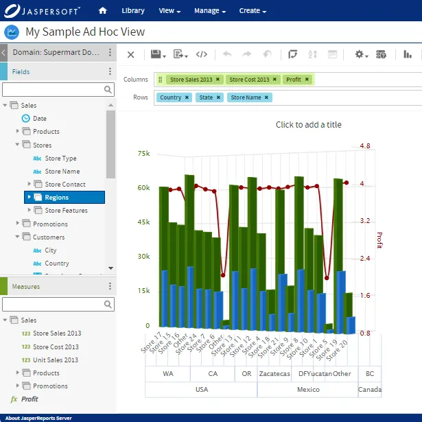
A column line chart, or a combination chart, combines column and line chart elements in a single visualization to generate advanced visuals for deeper insights. The chart features a dual axis for value comparison with different units of measure.
This allows you to display two types of data on the same chart, providing a comprehensive view of your data. For instance, you can represent one data set using columns and another data set using lines on the same chart. This is particularly useful when showing relationships or trends between variables, such as comparing sales (columns) and profit margins (line) over time.
{{cta-1}}
When To Use Column Charts
Column charts are ideal and feasible to use in various situations as they are easy to understand. Needless to say, using column charts, crucial information can be displayed and conveyed clearly and logically. In general, column charts should be used when:
- You have data in discrete categories that are small in number or have a single value.
- You want to compare values of different categories, visualize proportions, highlight differences, and show trends.
- Your goal is to make information easy for people to understand. Decoding information through column data is quite simple. Viewers can instinctively understand the changes in trends by looking at the height of each category.
Why Do You Need Column Charts?
Here are the many reasons you may need a column chart:
Comparison of Value in Related Categories
A column chart is useful for comparing different categories via a single measure. Hence, comparison on a column chart enables users to judge how every listed category performs relative to the other categories.
Moreover, by sorting the columns, you can quickly learn about the changing trends (lowest and highest categories). A good example of this is measuring sales performance using column charts.
Understanding the Dependent Variable Changes Over a Given Period
A column chart is crucial for understanding changes in the variables dependent on each other over a given timeframe. For example, a column chart is useful for organizations when they want to assess their sources of web traffic for a given year. Simply stated, a column chart is an excellent way to map data sets for a specific period.
Contribution Comparison of Different Category Members
You may require a stacked column chart when comparing the contributions of different members in the category. It shows the contribution of each category member to the total, giving you a part-to-whole perspective of the given data. Furthermore, a stacked column chart is straightforward and can be used for comparing different geographies, products, and timelines between different members in a single category.
Comparison of Positive and Negative Values
Most chart types can’t display negative data. Therefore, using a column chart to represent and visualize data with positive and negative values is best. Using a column chart, you can:
- Show data extremes
- Compare the performance of the categories against the benchmark
- Perform deviation analysis seamlessly
Best Practices for Making Column Charts
A column chart is possibly the easiest to make and comprehend compared to other charts because of its simple layout and design. However, different variants of column charts can add a little bit of complexity to the mix; they can be seamless to navigate through if you keep the best practices in consideration. Here are some of them:
Rule #1 - Zero Should Be Your Starting Point on the Y- Axis
The rule of thumb is to start from zero on the Y- axis when making a column chart. This is because when people look at the column chart, they instantly measure the height of the columns for comparison. Hence, if the column begins at some arbitrary point, it can mess up the viewer’s perception of how the columns compare. This may further lead to wrong data conclusions.
However, you can crunch the scale at some other number only in some situations. For example, if all data for visualization starts at 1000. Then you can start at 1000. However, it is only feasible if it is not misleading.
Rule #2 - Increase the Column to Background Ratio
By default, some tools have thin columns in the chart. It shows more background than columns, making it difficult for the viewer to comprehend. Therefore, it is a good practice to increase the ratio of the columns to the background.
Simply go to the option ‘Gap Width’ in the column setting to fix the width. The default setting is 219 percent, but you can change it to 40 to 60 percent.
Rule #3 - Add Labels and Titles
A column chart may have a simpler layout than other charts, but understanding the graph’s message can be tricky without text and labels. Poor labeling and missing titles can result in data misinterpretation and wrong conclusions. Therefore, it is suggested to add a proper title to explain the chart’s purpose and message.
Rule #4 - Use Colors to Create Focus
By default, all the columns that you create in the chart will be generated in the same color. This can confuse the viewer and make it difficult for them to focus on the most important column. Hence, one of the best practices to instantly convey crucial information in the graph is to use colors. However, when doing so, it is vital to keep the colors subtle and don’t go overboard. It is because too much color on the graph can overwhelm the viewer. Therefore, keep it somewhere in between.
Rule #5 - Sort the Categories
Make sure to sort the columns of your graph in a meaningful order. This is crucial if you have multiple categories listed in one graph. Sorting charts with multiple categories helps in different ways. Firstly, it eliminates confusion. When the data is sorted and organized, grasping the vital information presented in the chart becomes easier. Besides this, sorting clarifies the pictorial data representation and facilitates better interpretation.
You can sort column charts in alphabetical, chronological, and descending order. Nonetheless, the best way is to keep the highest category on the left side unless there is a natural data order like the age category.
Top Benefits of a Column Chart
Here are the top benefits of a column chart:
Provides Quality Visual Display of Diverse Data Categories
Different and diverse categories can be instantly summarized through column charts into visually appealing formats. Such a chart gives viewers the flexibility to understand data across categories at a glance through quality visual representation.
Offers Excellent Heuristics
As column graphs are easily understood, you can check them instantly for basic accuracy and assess if the data makes sense.
Helps Make Real-Time Decisions
Data interpretation through column charts is quick, which helps viewers/end users to act fast and make real-time decisions without delays.
Easy to Identify Data Trends
By observing the height and patterns of the columns, Viewers can spot trends and variations in data over time or across different categories by observing the height and patterns of the columns. This helps in identifying fluctuations and making informed decisions.
Effective Way to Communicate Data-Driven Information
Column charts are a staple in business presentations, reports, and academic settings. Their visual appeal and simplicity make them an effective way to communicate data-driven information to a broad audience.
Column Chart Limitations
Here are the limitations of column charts, which don’t often make them the best choice for data representation. Take a look:
It’s Difficult to Represent and Interpret Large Data
A column chart with limited space on the category axis begins to look cluttered and confusing with many data points. The cluttered visual representation can further compromise the user experience and lead to wrong conclusions. So, when you have over ten data points, it is advisable to use other charts for data visualization, such as bubble clouds, pie charts, and donut charts.
It’s Hard to Compare Stacked Segments
Although you can use a stacked column chart to compare a sub-group with another sub-group of a different category, it may not give the best result. It is predominantly because of the absence of a common baseline for measuring two different sub-groups at a glance. In other words, you must manually compare each sub-group with others to determine their performance. It is time-consuming and may cause delays in the decision-making process. Hence, to save time and ensure the best results, consider alternatives to stacked bar charts like donut charts, dot matrices, and pictograms.
Understanding the Difference Between a Column Chart and Histogram
As a histogram and column chart look similar, it is no wonder why many people get confused. Though they look identical, both charts are drastically different. Knowing the key differences between the two types of data visualization will help you understand when to use which one to accurately represent your data.
A column chart is used to graphically visualize and compare discrete categories. It requires two values (X and Y) where X can be date/time, log, string, numeric, etc. On the other hand, the value on the Y axis is only numeric. Each column represents a category with a different length.
On the other hand, a histogram (which visually resembles a column chart) represents numerical data via vertical bars. It compares non-discrete values. For instance,t the number of students who scored marks in a test in various ranges. Furthermore, to render a histogram chart, you only need one set of the numerical values to render a histogram chart. The y-axis shows the occurrence count, while the x-axis shows the value range.
{{cta-3}}
Column Chart History- Tracing the Roots
The roots of the column chart can be traced to the works of early statisticians and scholars who sought effective ways to present quantitative information.
One of the earliest instances of column-like charts can be found in the work of William Playfair, a Scottish engineer and economist, in the late 18th century. Playfair is credited with introducing various graphical forms, including bar charts, to represent economic data. His charts used bars to represent quantities and were a precursor to the modern column chart.
However, it wasn't until the 19th and 20th centuries that column charts became more refined and widely used. With more systematic data collection and statistical analysis, column charts became a valuable tool for visually presenting categorical and numerical data. The availability of modern printing techniques and graphic design further contributed to the widespread adoption of column charts in academic, business, and scientific contexts.
In the digital age, the transition from paper to electronic media led to the development of software tools that made creating and customizing column charts easier. Spreadsheet software, played a significant role in popularizing column charts as a staple visualization for analysts, researchers, and educators.
Today, column charts remain a fundamental and versatile visualization method. They're employed in diverse fields, from business analytics and finance to social sciences and education. The evolution of column charts showcases the timeless importance of effective data visualization in conveying insights and patterns to a wide audience.
Key Takeaways
As we reach the end of our column chart guide, we hope you are now familiar with the concept, its benefits, and its limitations. Column charts are the best data visualization technique for beginners. Its simple visual layout makes column charts an easy technique for people to display and compare data across categories.
When used correctly, data through column charts can significantly boost your analytical efforts and provide valuable insights for prompt decision-making. Though a column chart has certain limitations, you can leverage its performance by putting it in a professional key performance indicator (KPI) dashboard with other KPIs. Column charts can become crucial to your complete analytical analysis, empowering you to use data for operational and strategic decisions.
Ready to give it a spin?
Start your 30-day trial now.

Try Jaspersoft - Free Trial
Efficiently design, embed, and distribute reports and dashboards at scale with Jaspersoft.

Build versus Buy: An In-depth Guide
This whitepaper provides a framework for the decision-making process and critical trade-offs between building or buying an embedded BI and reporting tool.
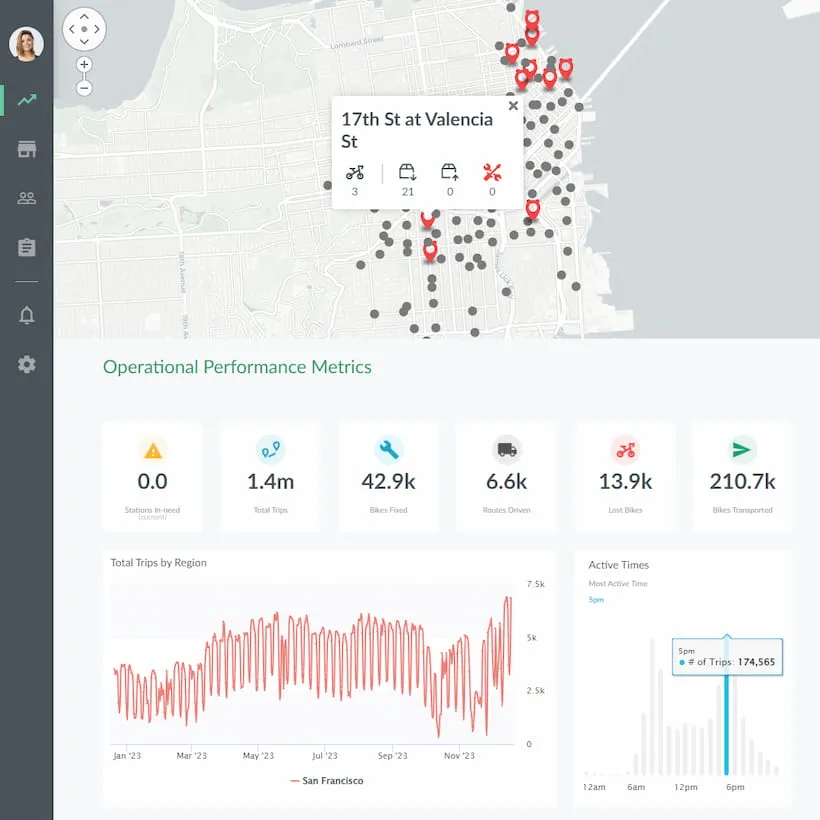
Interactive demo: Bikeshare Embedded BI, supported by Jaspersoft
Experience how to turn data into valuable insights that you and your customers can use to make better decisions.
